
Designing the path from “is this normal?” to a booked appointment
Role
Design Lead
Project Team
Me, 1 strategist
Duration
12 weeks
Scope
Stakeholder Interviews & Surveys, Competitive & Industry Analysis, Information Architecture, Wireframing, Visual Design
About
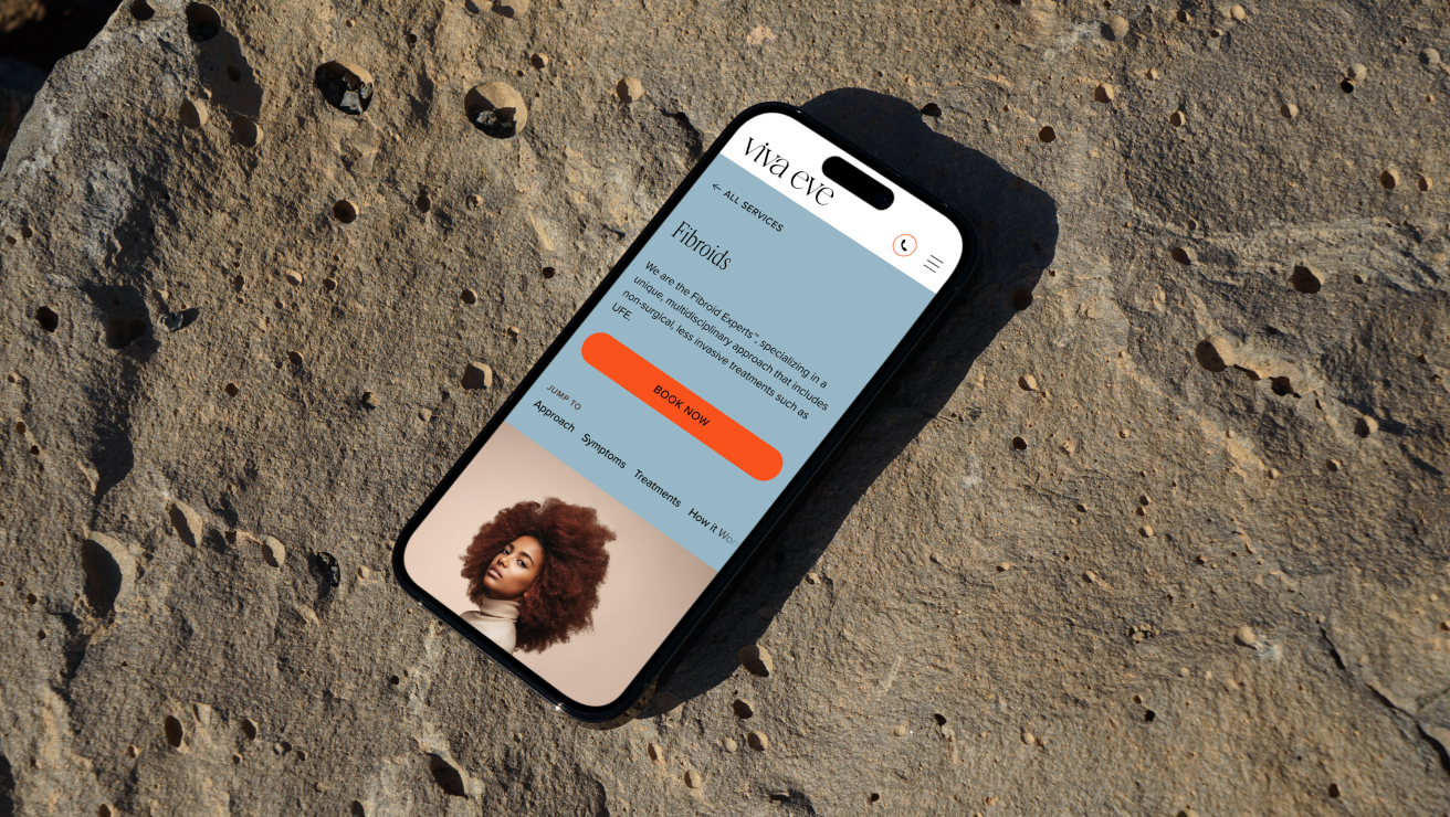
Viva Eve treats uterine fibroids and provides OB/GYN care, a specialty where patients routinely normalize symptoms for years before seeking help. I designed the digital experience that merges two clinics into one brand, turns dense clinical content into self-assessment tools, and repairs a booking flow that was sending patients off-site mid-decision.
Responsibilities
I was the sole designer on this engagement. I owned the surveys, information architecture, the design system, the visual language, the symptom quiz and treatment-comparison tools, and the booking flow redesign. I collaborated with strategist Mae Beerman on stakeholder interviews, which I synthesized into design requirements, and onboarding screens. I presented directly to Viva Eve’s leadership throughout.
3+
locations now running on the scalable architecture—Forest Hills, Astoria, and a Manhattan flagship
12,000
sq-ft Manhattan flagship opened as the practice expanded, followed by an on-site surgical suite
28
designed pages
The Challenge
A condition hiding in plain sight
More than 26 million women in the U.S. struggle with debilitating fibroid symptoms—heavy bleeding, severe cramps, pelvic pain—yet these are widely dismissed as “normal,” and diagnosis is delayed by years on average. Every point of friction between “maybe I should look into this” and a booked consult loses patients who took years to get there.
Two brands becoming one
Two established practices with separate brand equity in their communities, merging under a refreshed identity. They each came with growth plans for new locations and services that the old architecture couldn’t hold. Additionally, a booking experience stitched from third-party tools (Salesforce forms, Calendly) that asked patients to repeat information and leave the site at the exact moment of highest intent.
What the research said
Stakeholder interviews and surveys, plus a teardown of FemTech and healthcare leaders like One Medical, Maven, and Kindbody shaped the architecture. Where signal was secondhand—patient feedback relayed by clinic staff—I treated it as hypothesis and designed for validation.
Key Decision 1
Decision-support tools instead of denser copy
Women who’ve normalized symptoms for years don’t need more clinical paragraphs, they need a way to convert private uncertainty into a concrete next step. I designed two tools to do that work.
The call
↪︎ A 10-question fibroid symptom self-assessment, launched from the Symptoms section. It reframes “is this normal?” from a question patients ask themselves into one the site can help answer — and its result lands with a clear next step into booking.
↪︎ A comparison tool that puts fibroid care options side by side in patient language, supporting Viva Eve’s actual differentiator: they offer the less-invasive options many OB/GYNs don’t lead with.
Key Decision 2
Repairing booking at the moment of highest intent
The old flow sent patients off-site, asked them to repeat information, and demanded insurance details mid-flow—exactly the moment a patient who spent years avoiding this decision is most fragile. I redesigned it as two clear pathways that never visibly leave the site.
The call
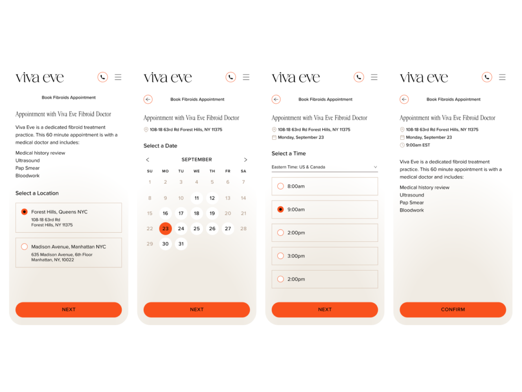
↪︎ Two straightforward entry points—Fibroid care and OB/GYN care—with button language that sets expectations for what’s ahead. The third-party integrations still power the plumbing, but merged behind one coherent front so steps feel continuous instead of stitched.
The constraint
↪︎ Replacing Calendly outright wasn’t in scope or budget. The design problem was making infrastructure I couldn’t remove feel like one system—sequencing steps, carrying information forward, and keeping visual continuity across the seams.
Key Decision 3
Merging two brands without losing either
Both clinics had real equity in patients who knew and trusted each name. The merge had to preserve that recognition while landing the refreshed identity.
The call
↪︎ An introductory carousel—borrowed from app onboarding—walks returning patients through the new brand. A persistent homepage introduction catches latecomers, and journey-stage navigation gets both clinics’ patients to their path immediately.
What we rejected
↪︎ An alert banner announcing the merger. Banners get dismissed reflexively, and a one-line notice can’t re-orient two patient communities arriving over months from bookmarks, search, and referrals.
What shipped
Viva Eve had limited brand assets like color, typography, and patterns, but I needed to evolve and expand it for a digital environment. In doing so, I was able to create a digital experience that balances professionalism with comfort. Vibrant orange was used for high-impact calls to action, while calming earth tones shaped a sense of trust and approachability throughout the site. I designed custom iconography to extend the brand’s visual language, making differentiators instantly clear. Gradient imagery acted as a visual metaphor for different treatments, adding softness and reinforcing the brand’s patient-first ethos. Together, these elements translate Viva Eve’s identity into a modern, welcoming, and story-driven healthcare experience.
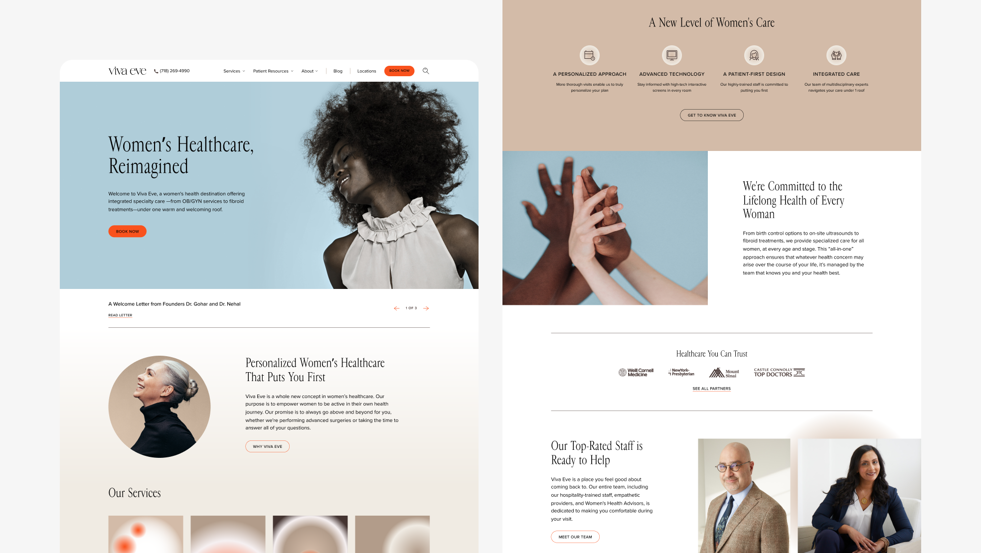
Desktop Homepage.
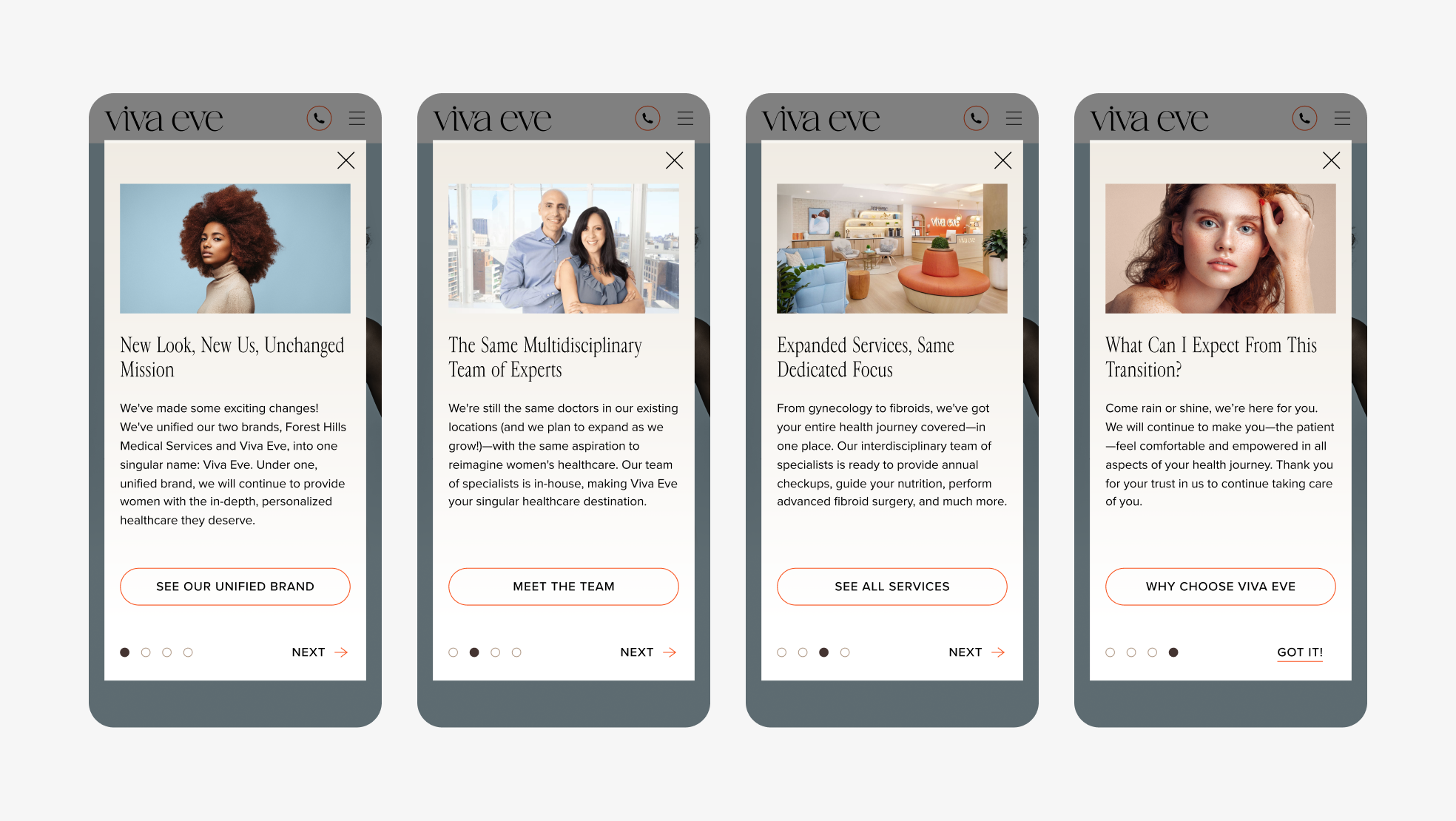
Introductory screens that appear when users land on the site to help orient them to the new brand.
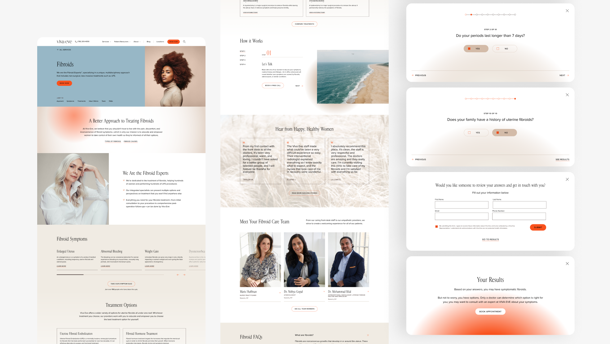
Desktop view of Fibroids Services page. The Fibroids Symptoms section includes a button that launches a 10 question sympton quiz that’s pictured to the right.
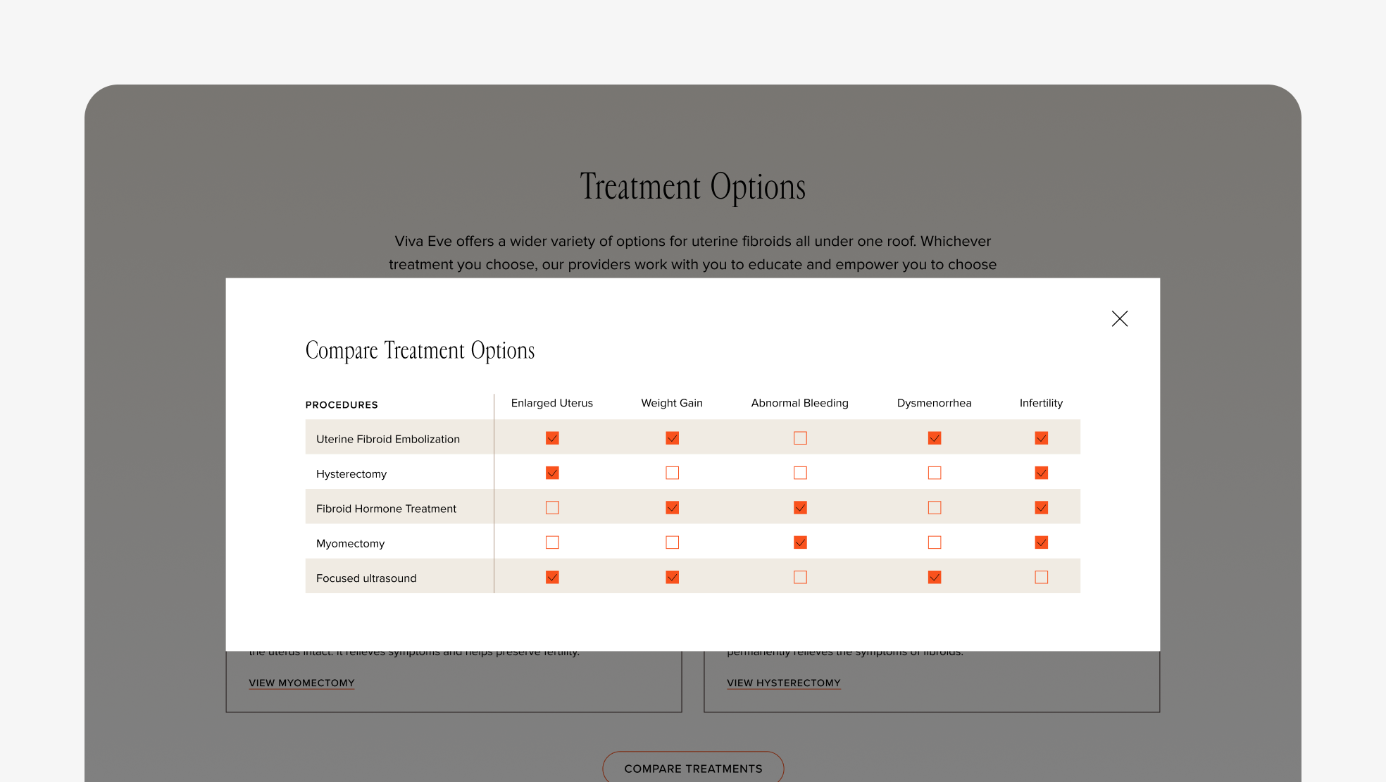
Another desktop view of Fibroids Services page. The Treatment Options section includes a button that launches a treatment comparison that lets users understand what’s best for them.
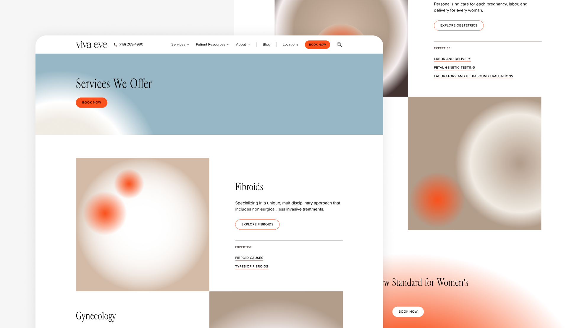
Desktop view of Services overview page.
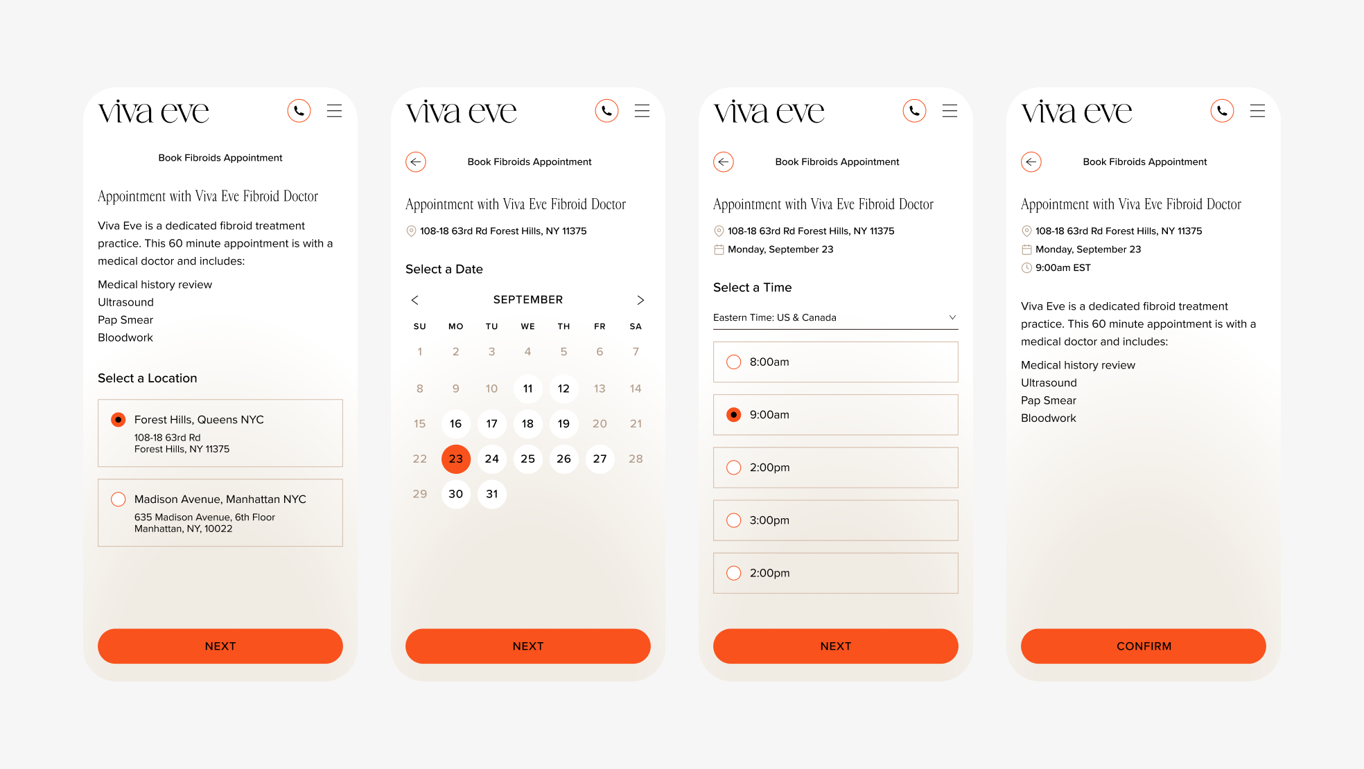
Mobile booking flow for fibroids appointment.
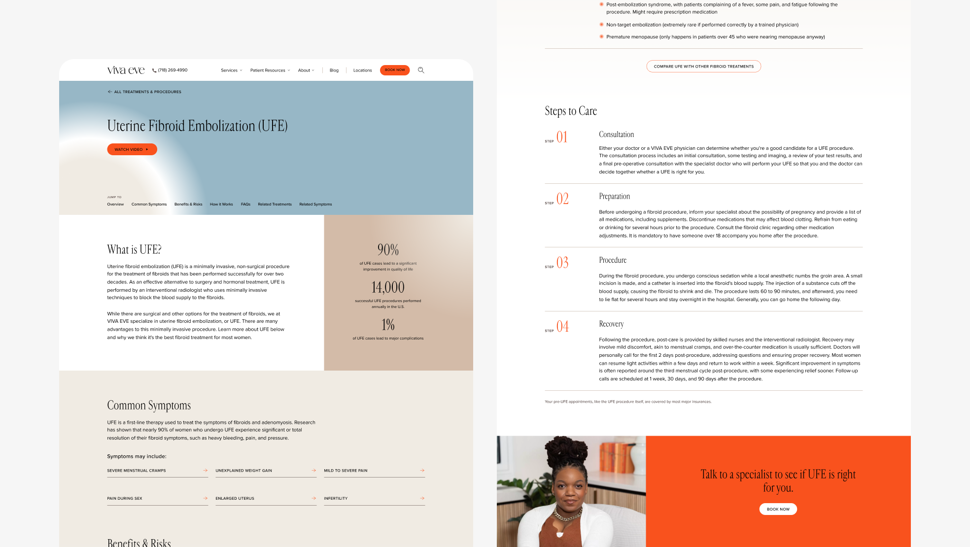
Desktop view of Uterine Fibroid Embolization (UFE) Treatment & Procedures page.
Designed at 829 Studios in collaboration with strategist Mae Beerman.