
Booking a vet who comes to you, in fewer steps
Role
Design Lead
Project Team
Me, 1 supporting designer, 1 strategist
Duration
12 weeks
Scope
Stakeholder Interviews & Surveys, Competitive & Industry Analysis, Information Architecture, Wireframing, Branding, Visual Design
About
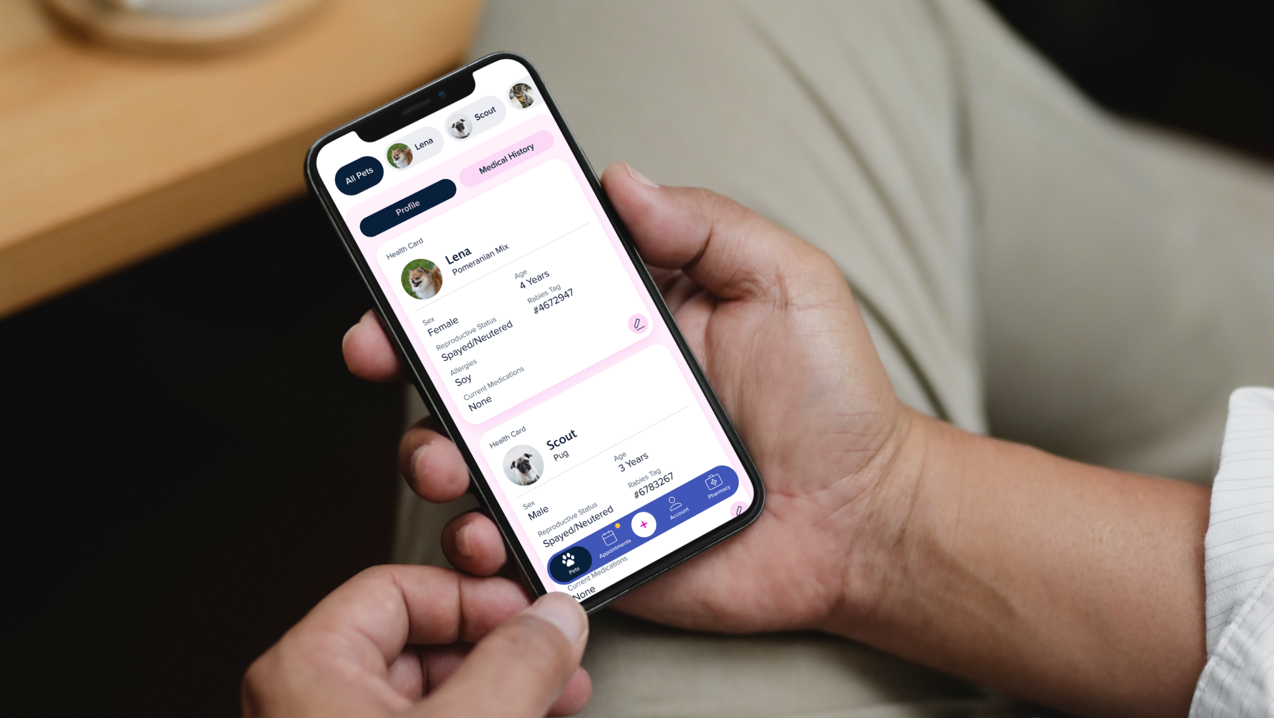
Two veterinarians founded BetterVet to bring care to the pet instead of the pet to the clinic. I led design of the brand and the app from zero—where every booking is revenue, every abandoned flow is a sick pet unseen, and the entire business runs through one scheduling experience.
Responsibilities
I was the design lead for both brand, website, and product. I owned the visual identity, information architecture, journey maps, all core app flows—onboarding, booking, pet profiles, ratings, notifications—and the design system connecting brand to product. Supporting designer Bowie Wong assisted on the website landing page under my direction; strategist Mae Beerman led stakeholder interviews for the landing page, and collaborated on personas. I presented to BetterVet’s founders at every milestone.
4.87
stars across 687 reviews on third-party aggregators
30+
locations across the U.S.
50
screens designed
The Challenge
The business reality
A startup with vets in vans: no bookings means idle staff and burned runway. Unlike a clinic with walk-ins, 100% of revenue flows through the app’s scheduling flow. Booking friction wasn’t a UX annoyance, it was the existential risk.
The product reality
Two fundamentally different services (a van dispatched to your home vs. a video call), multiplied by multi-pet households, each pet carrying age, weight, allergies, medications, vaccines, and history. The raw information model was heavy; the experience couldn’t be.
What the research said
User research revealed shared needs across three personas, all relying on remote veterinary care. Simplicity and accessibility were essential for users like Margaret and Jordan, while tech-savvy users like Alex prioritized speed and transparency. Across the board, users valued trustworthy virtual services, flexible scheduling, and easy access to pet health records—insights that shaped a user-centered, reliable, and accessible app experience.
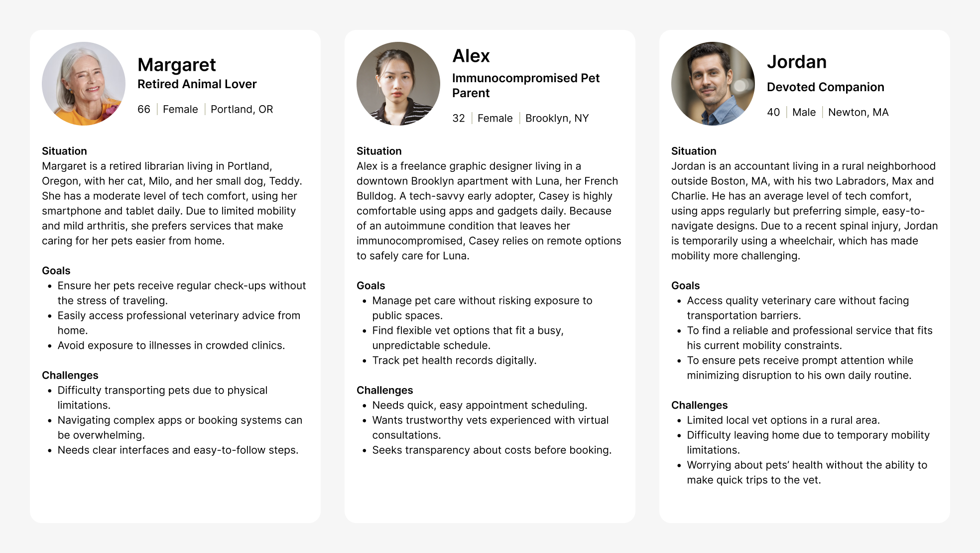
User personas.
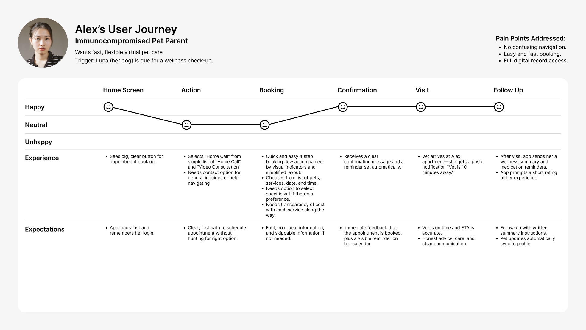
The journey map exposed where anxiety peaks (pre-visit uncertainty) and where drop-off threatens (mid-booking). These are the two moments the design defends hardest.
Key Decision 1
Two services, one booking muscle
Home visits and video consults differ in logistics, pricing, and prep, but users shouldn’t need to learn two systems. I designed both pathways on one interaction pattern with a hard ceiling: four steps, visible progress, no dead ends.
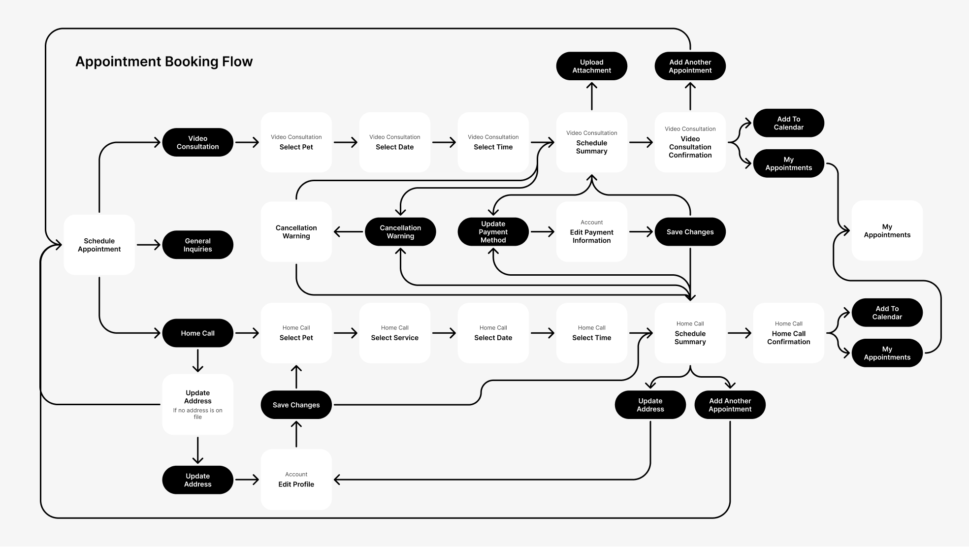
Appointment booking flow for both Home Call and Video Consultation.
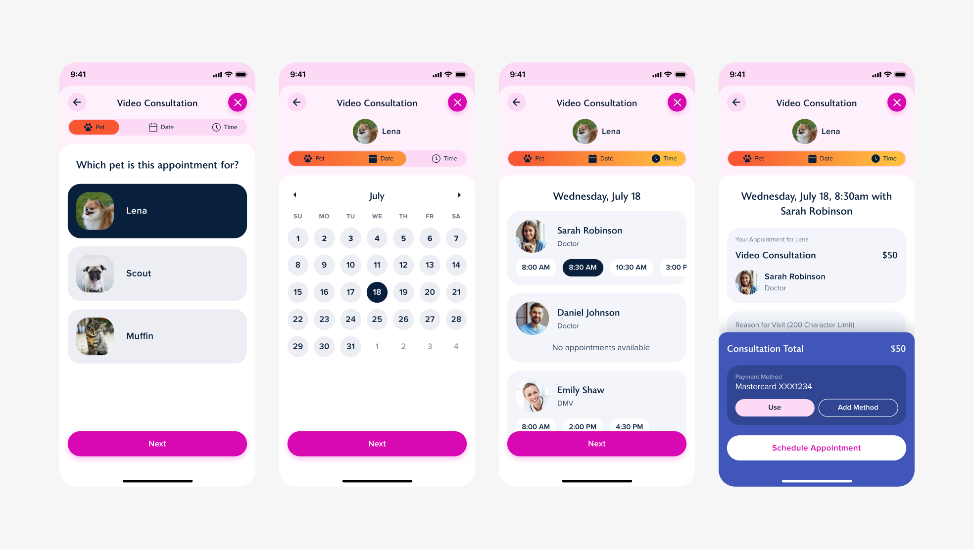
Video Consultation appointment booking flow.
Key Decision 2
Pay the data cost once: front-loaded pet profiles
A pet’s record—age, weight, allergies, medications, vaccines, conditions, visit history—has to exist somewhere. The question was when the user pays that cost. I moved it to onboarding, when motivation is highest, so every later moment stays light.
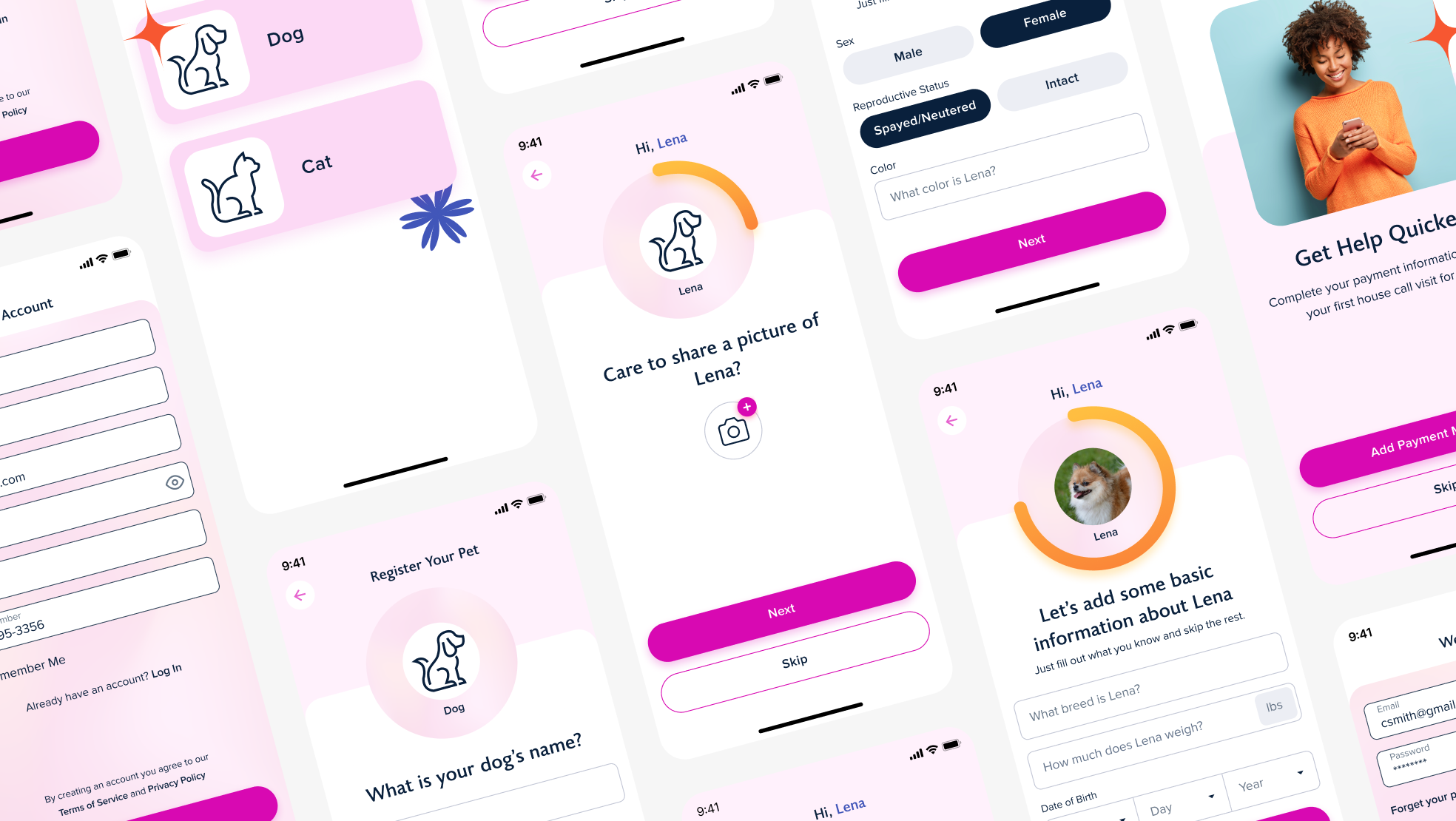
Sign up process.
Key Decision 3
Reminders people don’t mute
Pet health has real deadlines like vaccines, medications, and a van en route. But an app that pings about everything gets its notifications turned off, and then nothing lands. I designed the notification system around user control and layered redundancy instead of volume.
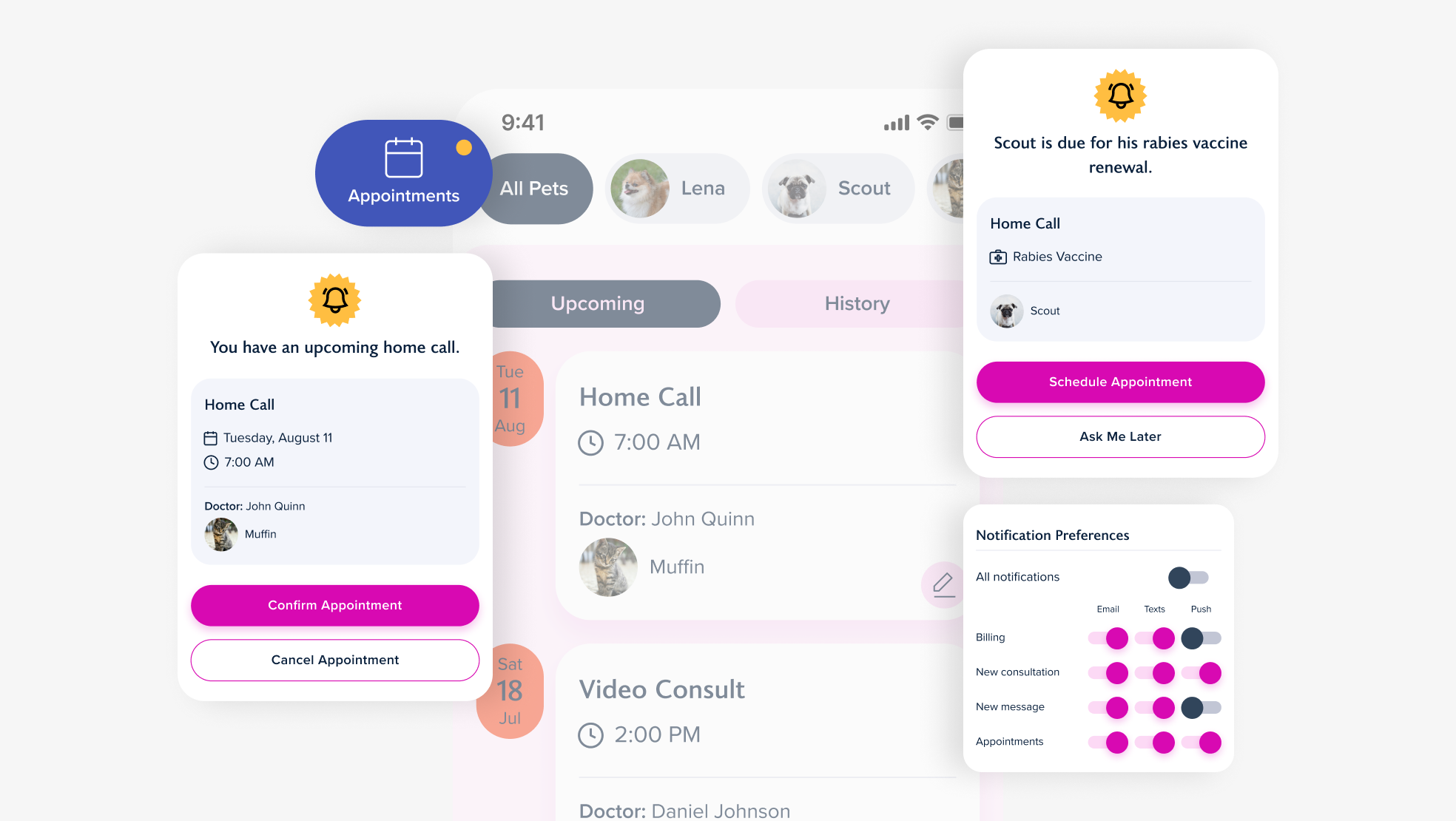
Different Notification alerts and Notification Preference toggles.
The Brand
An identity built for the living room, not the clinic
I brought the BetterVet brand to life through a warm, modern visual identity that instantly conveys comfort, trust, and compassion—core values for pet owners looking to avoid the stress of traditional vet visits. From its playful gradients and friendly typography to imagery that captures real moments of connection between pets and people, every touchpoint feels personal and approachable. I wanted to ensure that the design doesn’t just look good, but tells a story of stress-free, veterinary care designed to meet pet owners where they are—literally and emotionally.
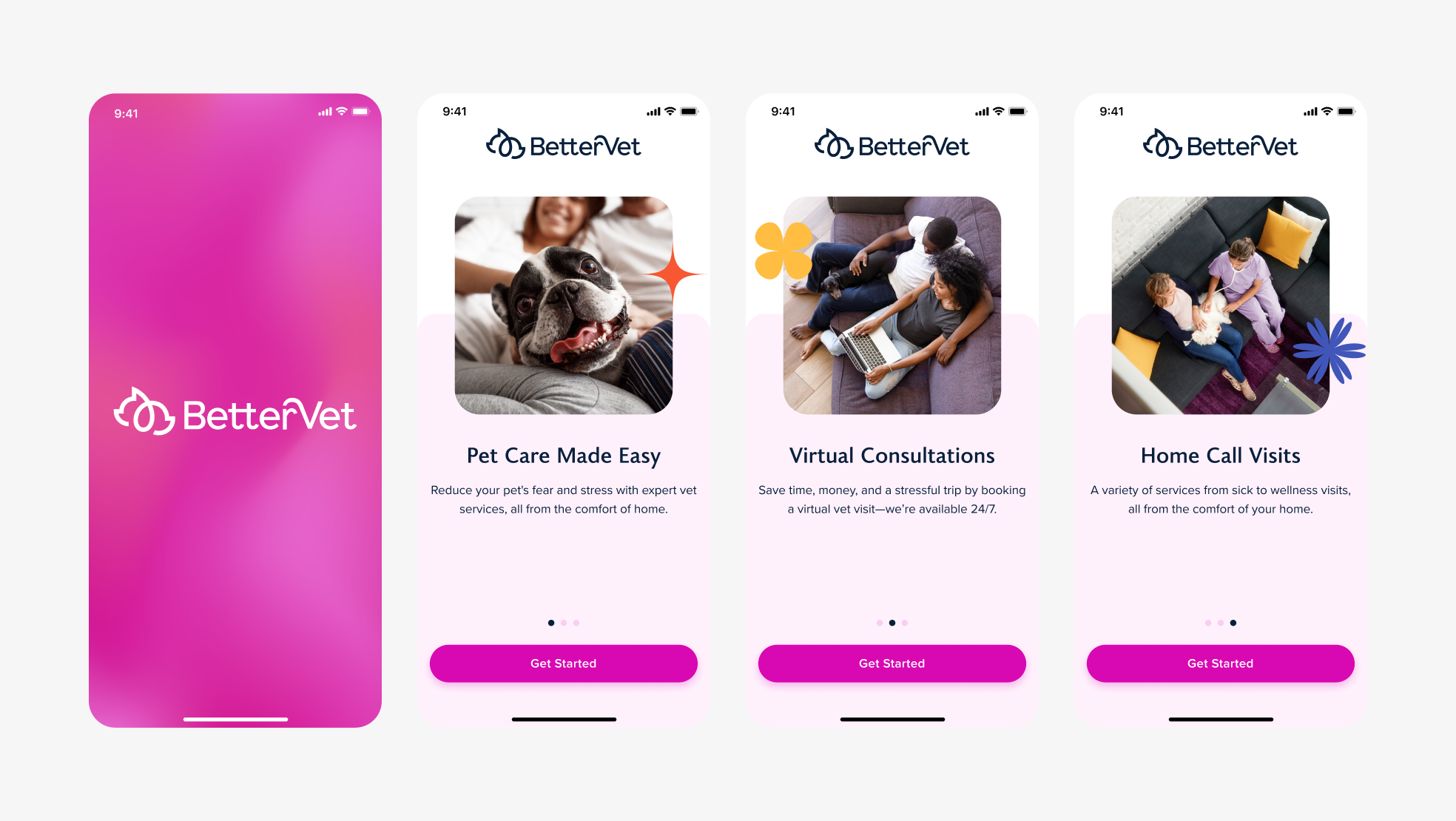
App onboarding screens that highlight a single key benefit. Clear hierarchy and generous white space makes content easy to digest. Consistent button placement and progress indicators guide users smoothly through onboarding.
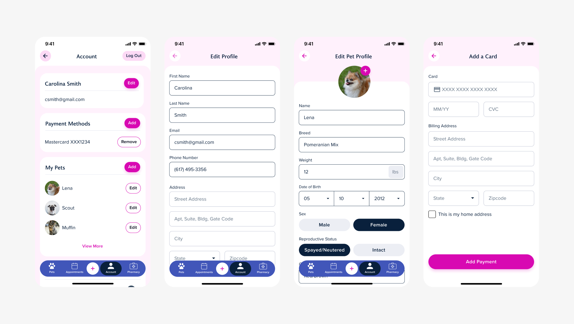
Account, Edit Profile, Edit Pet Profile, and Add a Card views.
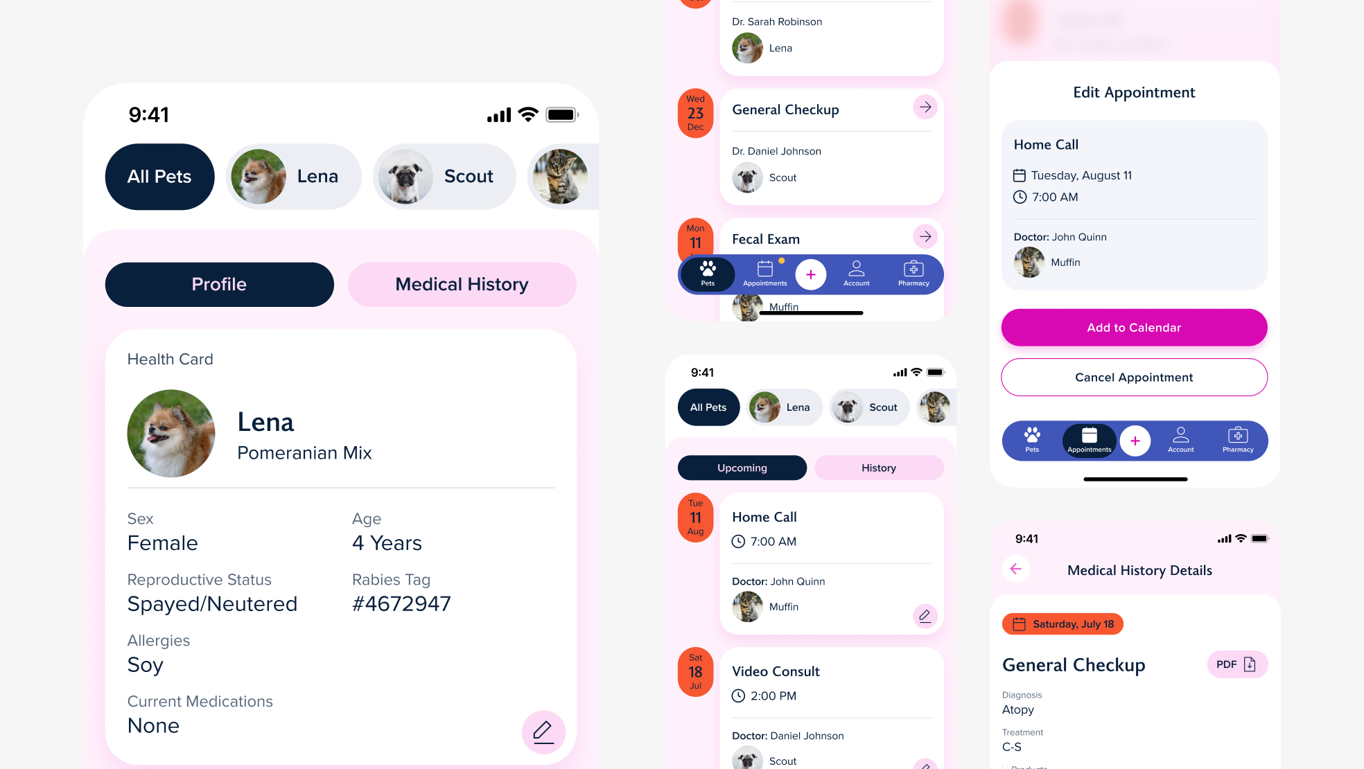
Pet Profile view along with Pet Medical History tab, Pet Medical History details, Upcoming Appointments, and Edit Appointment view.
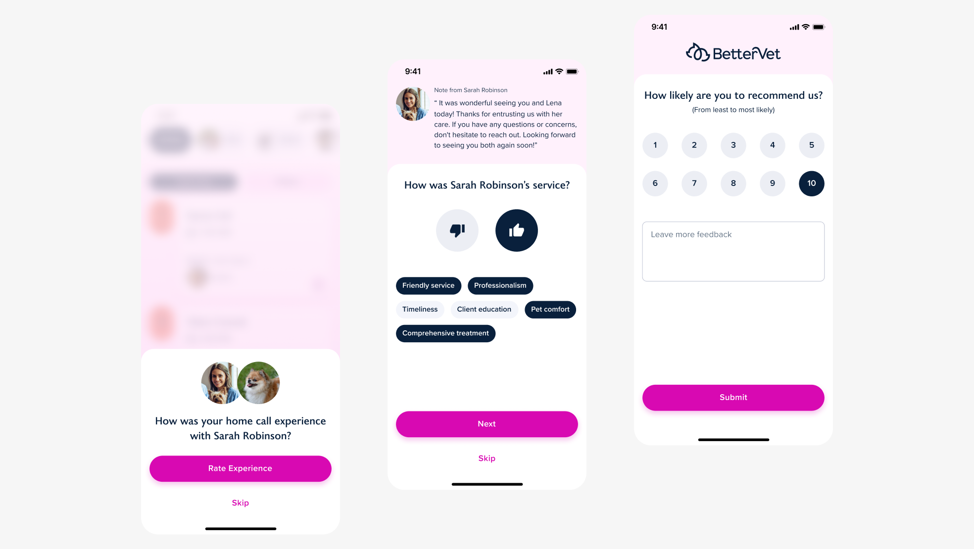
Experience rating flow.
Reflection
The experience rating flow was added late in the engagement, so I designed it on competitive analysis and industry conventions rather than primary research. It shipped clean, but rating flows carry decisions that deserve evidence: when to prompt, how to phrase the ask, and where the line sits between response rate and annoyance. Given the timeline again, I’d have pushed for even a lightweight round of validation instead of trusting patterns borrowed from other products.
Designed at 829 Studios in collaboration with supporting designer Bowie Wong and strategist Mae Beerman.