
Making a business school’s best idea legible to the people it was invented for
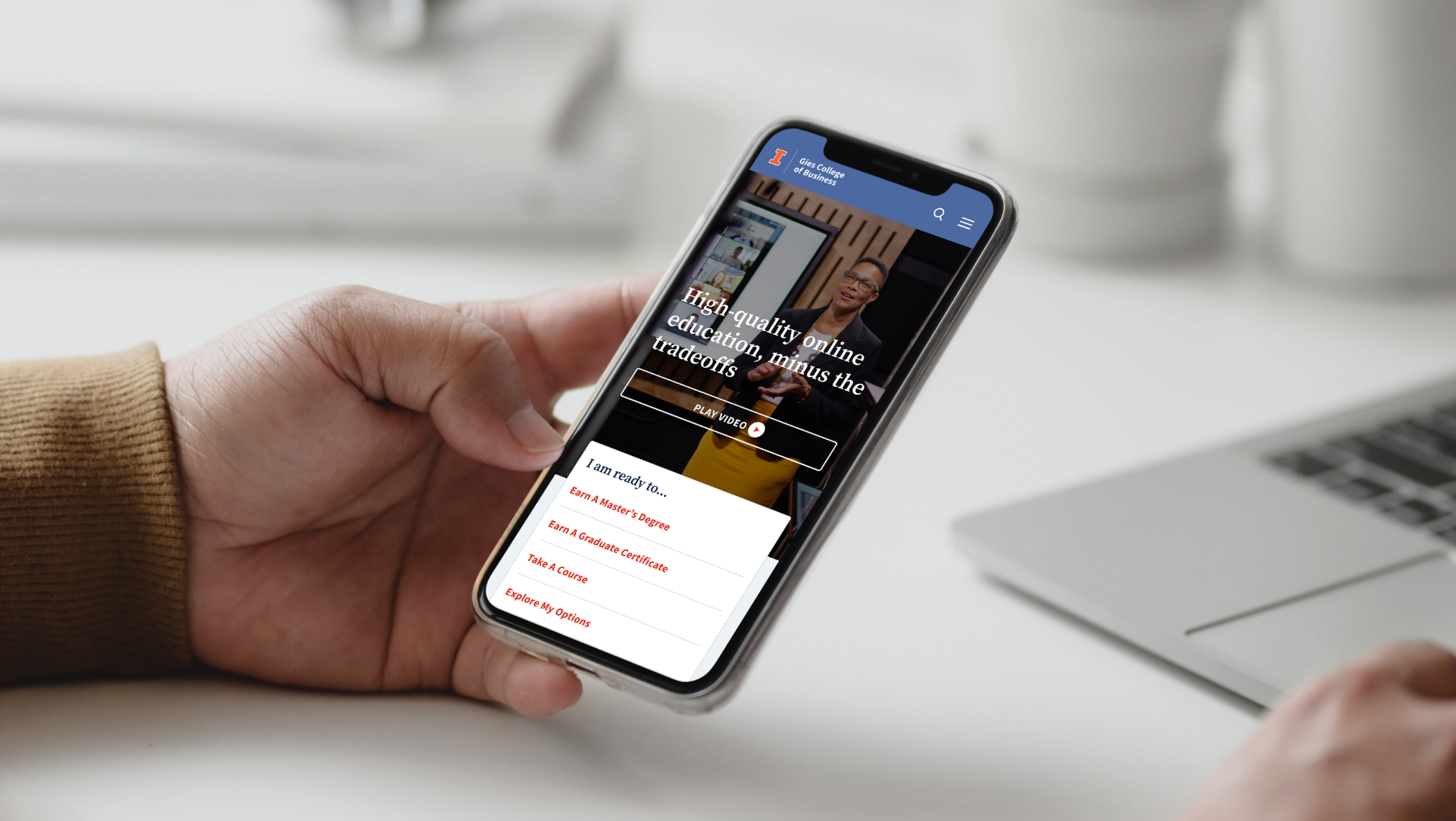
Role
Design Lead
Project Team
Me, 1 supporting designer, 1 strategist
Duration
16 weeks
Scope
Stakeholder Interviews & Surveys, Competitive & Industry Analysis, User Personas, Information Architecture, Wireframing, Usability Testing, Visual Design
About
For more than 100 years, University of Illinois’ Gies Business has intentionally designed its innovative programs, leading-edge curriculum, and experiential learning opportunities to empower and prepare students to turn big ideas into meaningful actions. The main objective was to create a centralized hub for Gies Online by consolidating all domains. We wanted to do this in a way that would reinforce their leadership position, with their new platform serving as a comprehensive catalog of online programming.
Responsibilities
I was the design lead. I owned wireframes, the design system, surveys, testing synthesis, and visual design. Supporting designer produced some secondary page designs under my direction; I collaborated with strategist Gabrielle Richter on IA and stakeholder interviews, which I then synthesized into design requirements. Gies ran the moderated usability sessions with their own participants, and I analyzed the session recordings and translated the findings.
20%
increase in site traffic post-consolidation
24
custom designed pages
6
different sites consolidated into one
313
page sitemap
The Challenge
Three audiences, one front door
This wasn’t a boutique program. Gies’ online portfolio is anchored by the iMBA—called the fastest-growing MBA in the world, and grown from 114 students at launch to thousands of enrolled learners. A prospective MBA student, a professional browsing one certificate course, and an enrolled student checking events all land on the same homepage with completely different intents. A typical hero with one primary CTA would serve one audience and fail two.
A 100-year-old institution’s constraints
Legacy brand guidelines, a signature orange that failed accessibility contrast in key uses, multiple stakeholder groups with equity in the existing sites, and beloved internal vocabulary—stackability—that the institution had coined and championed. Consolidation meant negotiating all of it.
What the research said
My research revealed the need for a website that balances flexibility, value, and community. Degree-seekers need structured paths, explorers want low-commitment options, and current students seek connection and support. Across all personas, transparency around cost, strong networking opportunities, and clear career outcomes are critical. These insights informed a design focused on flexible learning paths, community connection, and clear value communication.
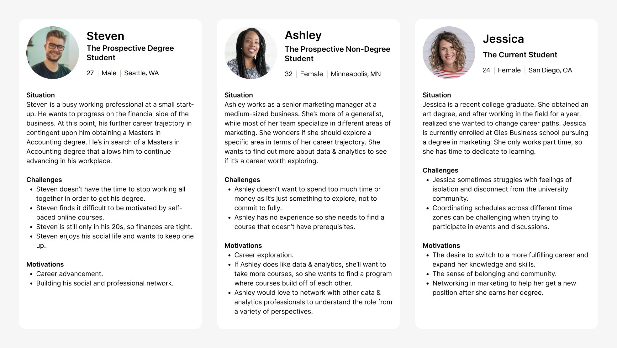
User personas.
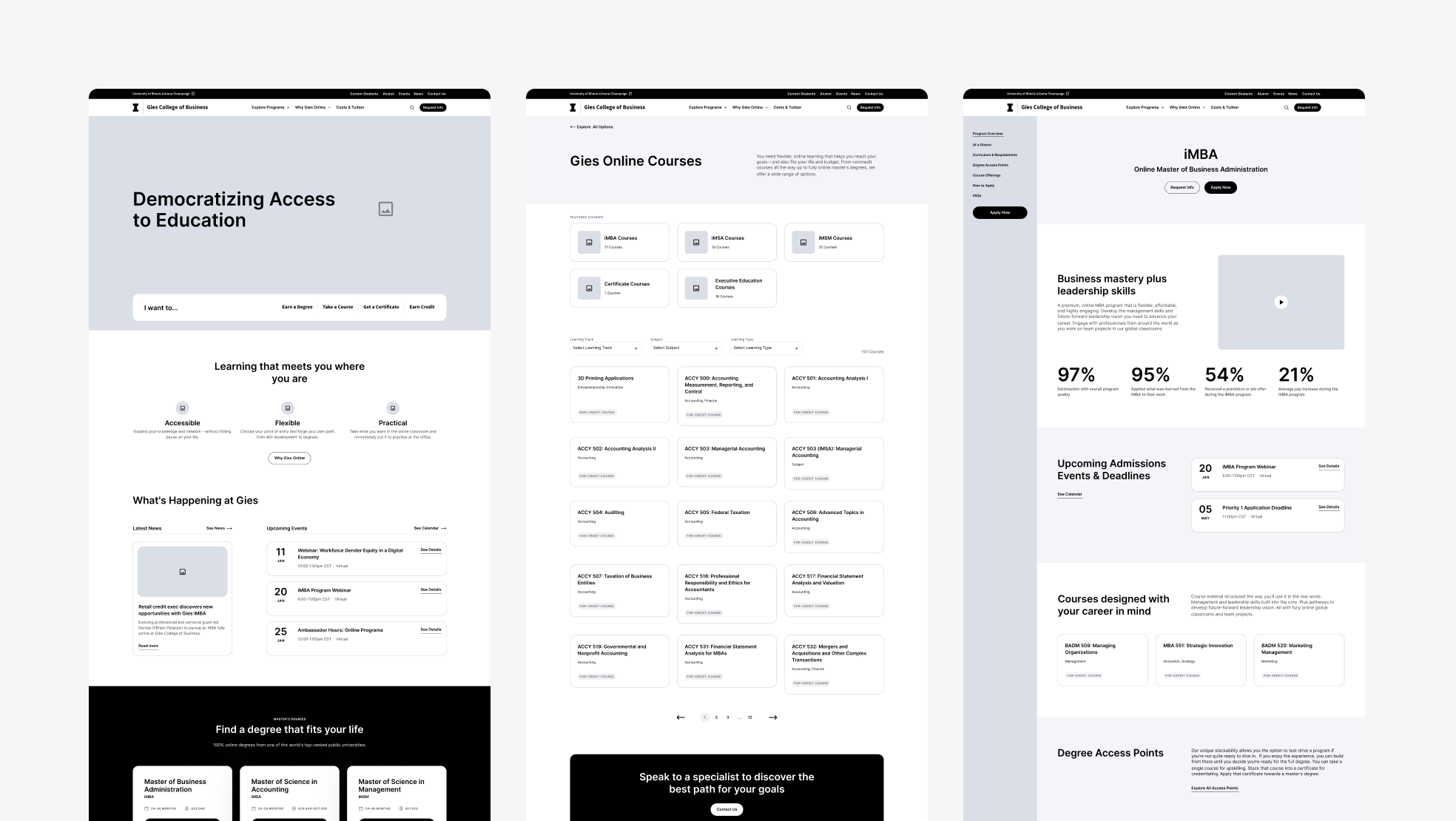
Desktop wireframes for Homepage, Course Catalogue, and Degree Profile.
Usability Testing
I analyzed moderated usability testing outcomes into design solutions.
Users felt overwhelmed by the many learning tracks and wanted a way to compare and explore all offerings in one place.
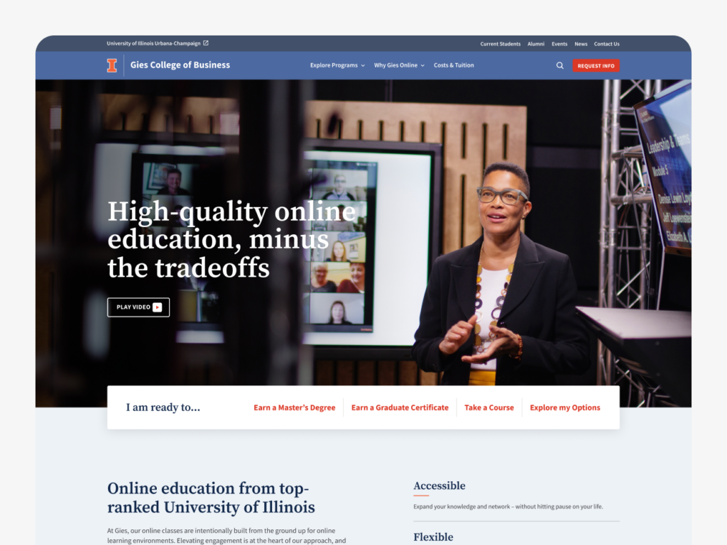
↪︎ I included an “Explore my Options” link in the hero navigation.
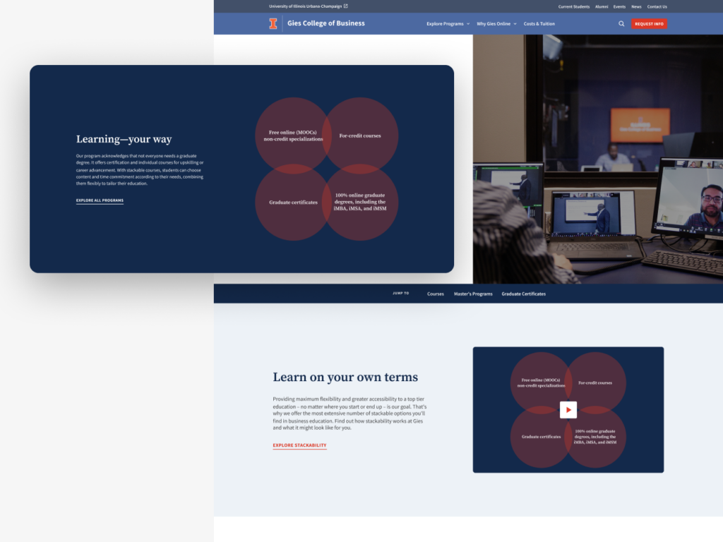
Users did not understand the “stackable” course concept and how courses build on each other.
↪︎ I used simple, universal language and graphics throughout the site to explain how courses stack.
Users wanted to preview subject matter more clearly, rather than just seeing course formats.
↪︎ I swapped the hierarchy between learning format and subject matter within the course cards.
Users had difficulty finding key details like course cost and duration.
↪︎ I reorganized course cards and included cost and duration information.
Users did not immediately understand the connection between Gies Online and the University of Illinois.
↪︎ I added “University of Illinois” to the sub-hero headline to highlight the affiliation.
Key Decision 1
One front door for three journeys
The homepage couldn’t privilege one audience without abandoning the other two.
The call
↪︎ An in-hero navigation that immediately communicates Gies’ learning tracks, letting each audience self-select a path in the first screenful. In addition to this is a streamlined main navigation with related content grouped into clear categories.
What we rejected
↪︎ A traditional hero with a single primary CTA. It would serve degree-seekers and fail explorers and current students.
↪︎ An audience-picker (“I am a…”) gate, which adds a step for everyone to solve a problem good IA should solve silently.
Key Decision 2
Earning the right to say ‘stackable’
The irony was sharp: industry press had celebrated Gies’ stackable model as a signature business-school innovation, while our testing showed the term itself meant nothing to the prospective students it was invented for.
The call
↪︎ Lead with plain language and explanatory graphics and videos, so the structure is visible rather than explained. Once the concept lands, “stackable” appears sparingly on interior pages.
What we rejected
↪︎ Leading with the term and defining it via tooltips or a glossary. That asks users to learn vocabulary before they can evaluate the offering.
↪︎ Dropping the term entirely. It’s the university’s brand equity, and the industry knows it. The fix was sequencing, not deletion.
Key Decision 3
Two ways into the catalog, one visible ladder
Overwhelm isn’t solved by offering less—Gies’ breadth is the point. It’s solved by giving users a way in that matches their certainty.
The call
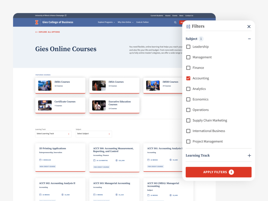
↪︎ Two browsing modes. A featured section for focused exploration within a track, followed by the full catalog with filtering. Decisive users drill down, uncertain users browse a curated slice first.
↪︎ Cards rebuilt on evidence. Testing showed users wanted subject matter before course format, and hunted hardest for cost and duration. I swapped the card hierarchy and surfaced both at card level—no click required to answer the two questions everyone asks.
↪︎ A visible ladder. Every learning track lists the programs within it, so how courses climb toward certificates and degrees is shown structurally rather than explained. On lengthy degree profiles, a sticky sidebar keeps navigation — and the apply action — reachable at any scroll depth.
Key Decision 4
A system the university could grow with
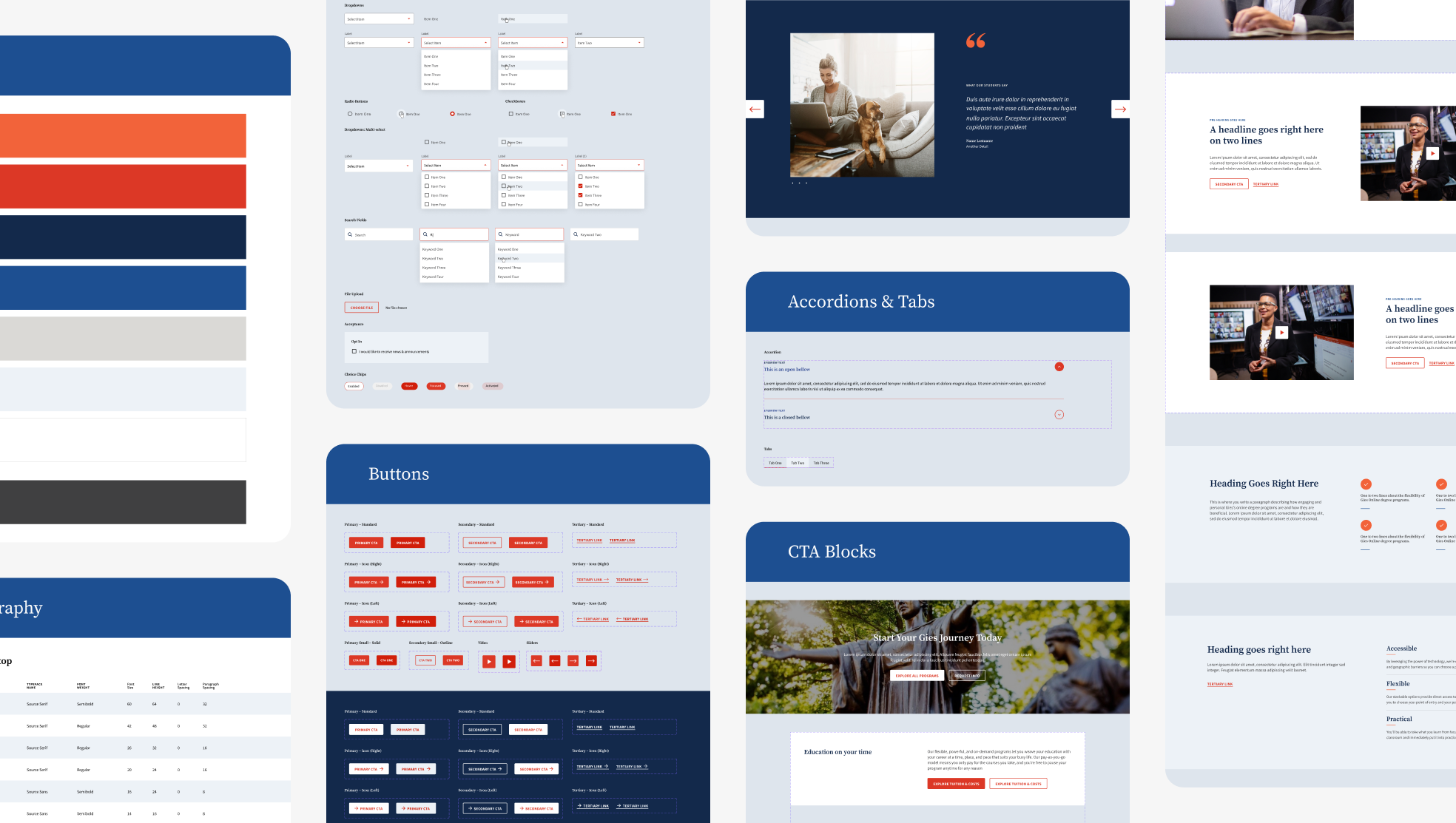
I built a robust design system using the atomic design framework, creating a flexible, scalable block library to streamline development and ensure consistency. Starting with foundational elements like typography, color, and spacing, I designed accessible components with clear hierarchy and multiple interaction states for buttons, forms, and navigation. The system improved collaboration across teams and enabled a cohesive, user-friendly experience as the site evolved.
Design system
What shipped
Designing for a legacy institution like the University of Illinois meant honoring a well-established brand while evolving it for the digital space. Working within their existing guidelines, I fine-tuned key elements like tweaking the signature orange for better accessibility and giving colors purpose and hierarchy to improve clarity across the site. I also expanded their typography, increasing flexibility while staying true to the university’s voice. The result is a visual language that feels both familiar and refreshed that’s true to University of Illinois, but built for today’s web.
24
custom designed pages
#
design system components
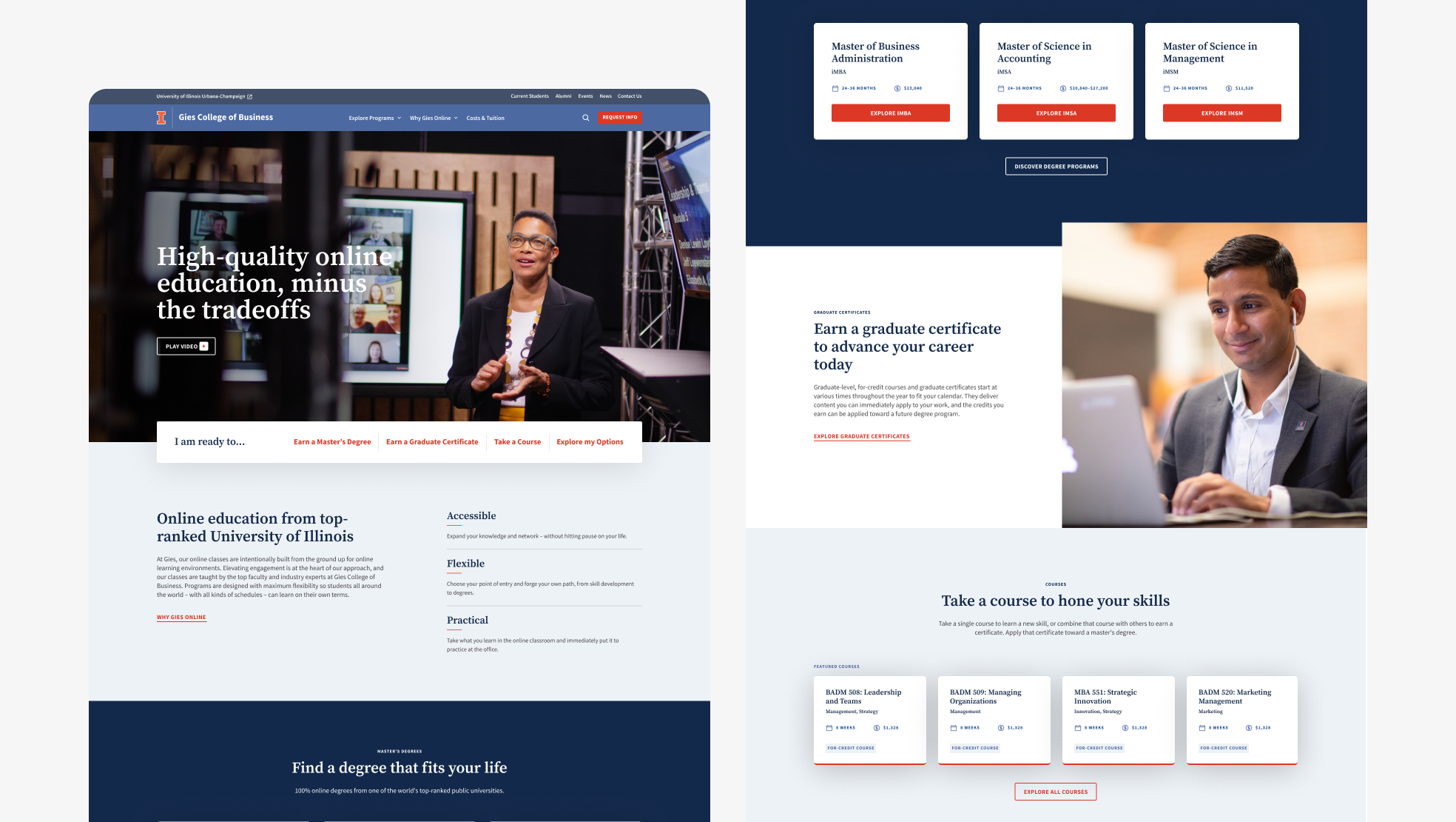
Desktop design for Homepage.
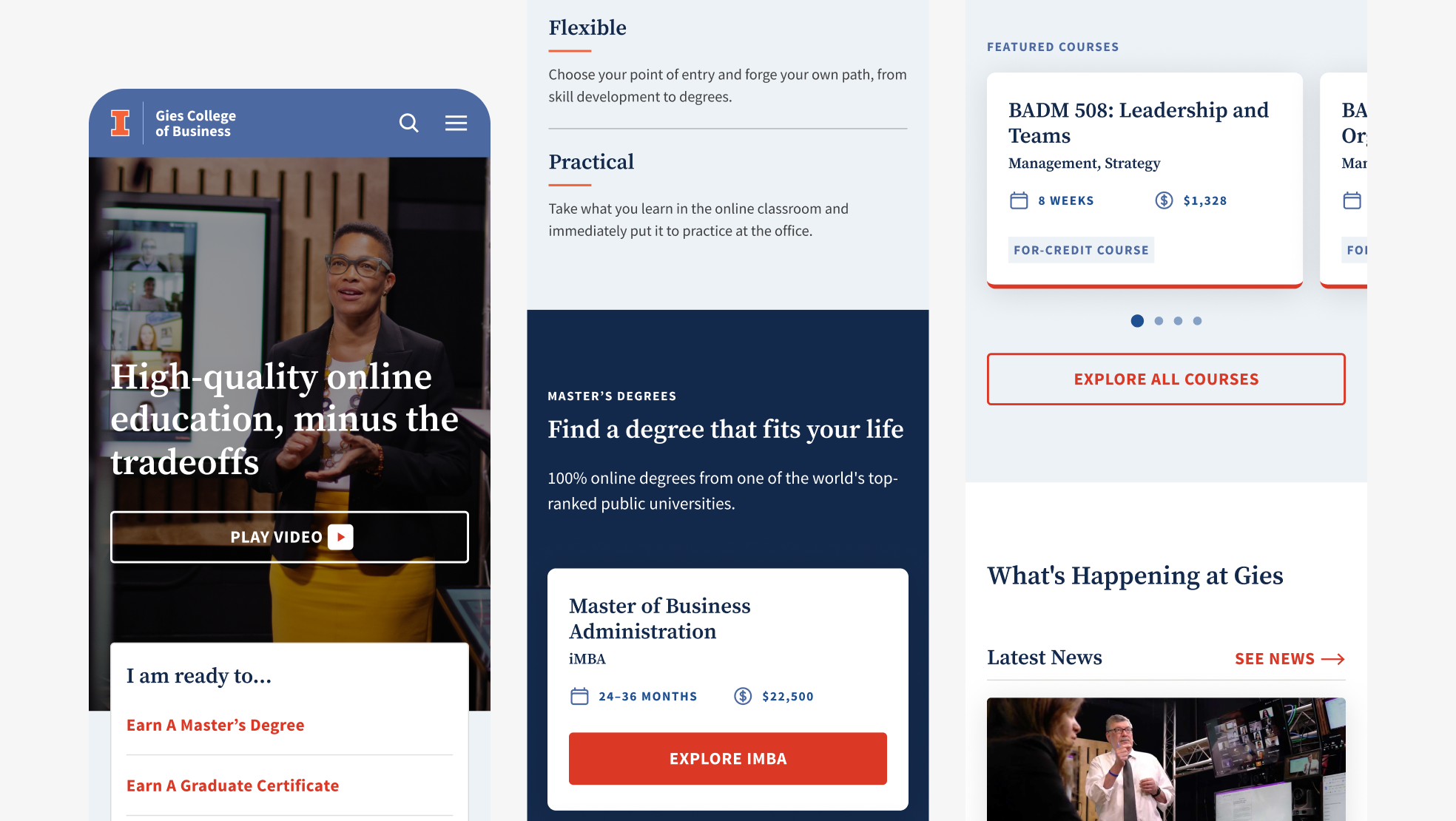
Mobile design for Homepage.
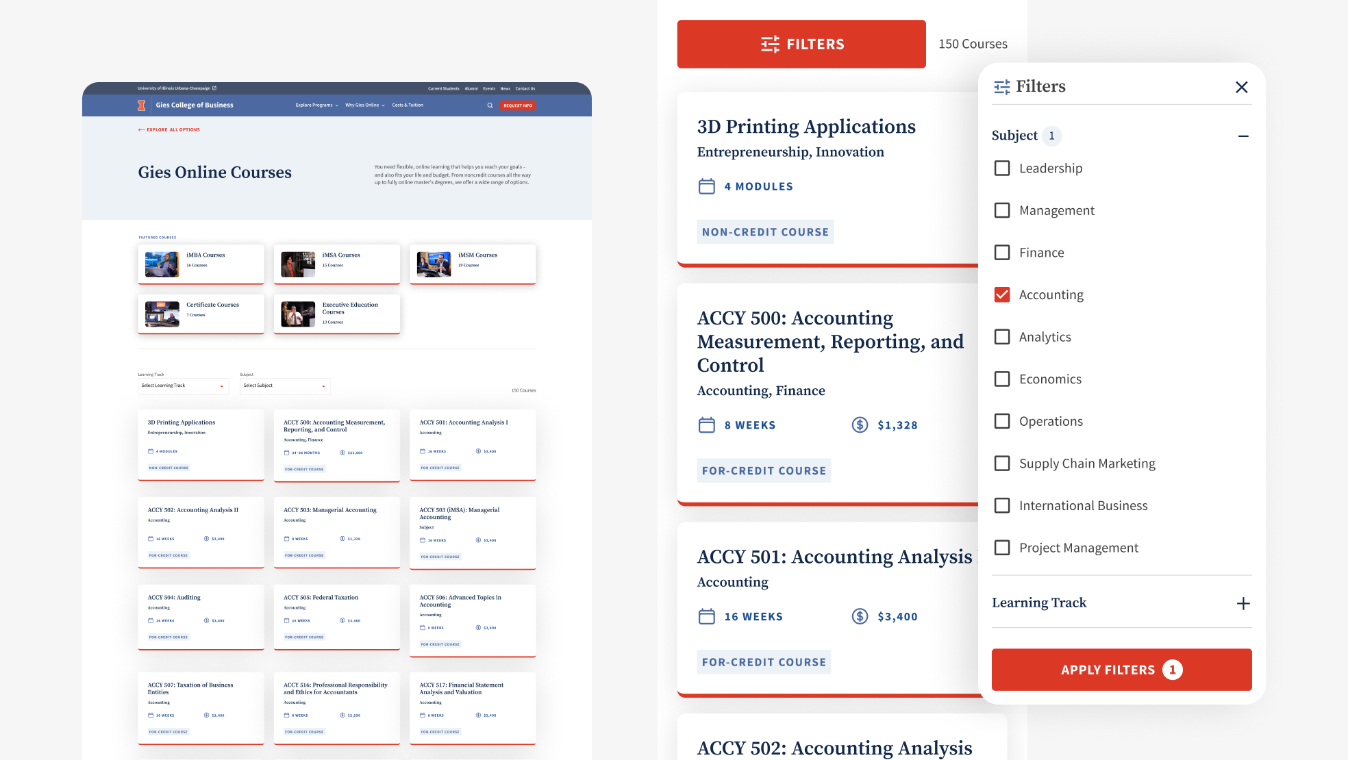
Desktop design for Course Catalogue with mobile view of filtering menu.
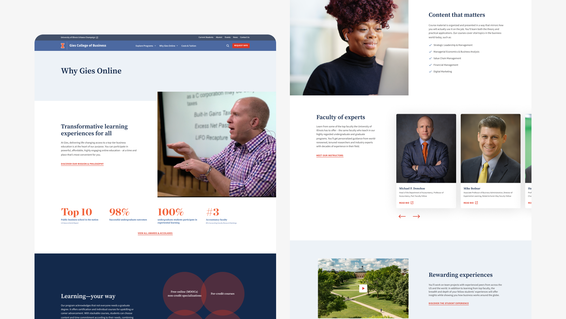
Desktop design for Why Gies Online.
Reflection
I’d fight harder for direct access to testing participants rather than working from recordings. Synthesis from video catches what people do, but moderating catches the why behind hesitations, and some of our changes would have benefited from follow-up questions in the moment.
Designed at 829 Studios in collaboration with supporting designer Anna Yeo and strategist Gabrielle Richter.