
Designing a cycle tracker where privacy is the product
Role
Design Lead
Project Team
Me, 1 supporting designer, 1 strategist
Duration
~18 weeks over 2 years
Scope
Stakeholder Interviews & Surveys, Competitive & Industry Analysis, App, E-commerce site, Information Architecture, Wireframing, Iconography
About
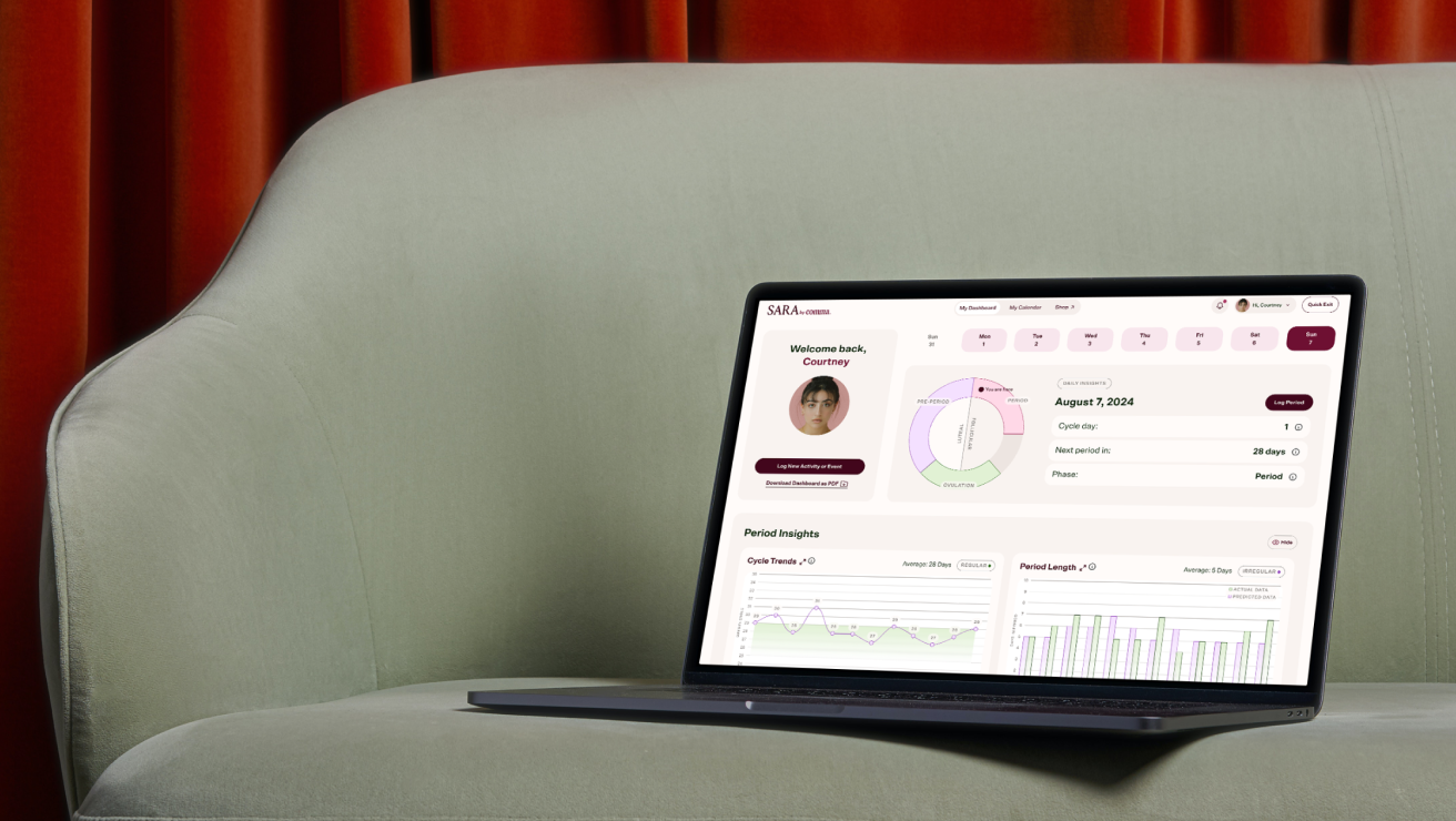
Comma set out to change period care with sustainable products. I led design across two engagements: first their e-commerce site—launched before they had a product to sell—and, when they returned a year later, a HIPAA-compliant cycle tracking app, plus the site updates that real user feedback demanded.
Responsibilities
I was the design lead. I owned information architecture for both app and e-commerce, the design system, and all core flows—onboarding, dashboard, calendar and logging, account, and the storefront. Supporting designer Masha Zaytseva produced some e-commerce site pages under my direction, and I collaborated with strategist Brianna Feldott on stakeholder interviews and research synthesis. I presented directly to Comma’s founder at every milestone.
$2M
seed round announced alongside the app’s public launch
1yr
after the site launched, Comma returned with the app brief
8
designed pages
30
designed app screens
The Challenge
The market moment
Femtech privacy had become national news. In 2021, the FTC settled with Flo Health over sharing users’ cycle data with third parties. Whether period apps could be subpoenaed became a mainstream fear. Users were deleting trackers, not downloading them. Designing a tracker people would actually trust meant treating privacy as the product’s core promise, not a policy page.
A brand launching in reverse
The original SOW covered only an e-commerce site for a company with no product yet for sale. The budget was MVP-sized, but the architecture couldn’t be: the site had to pivot from promotional to fully shoppable the day inventory existed. When Comma returned a year later for the app, the brief expanded again: an app that could flex from cycle tracking to fertility to pregnancy as users’ lives changed, and a site that now had to integrate it.
What the research said
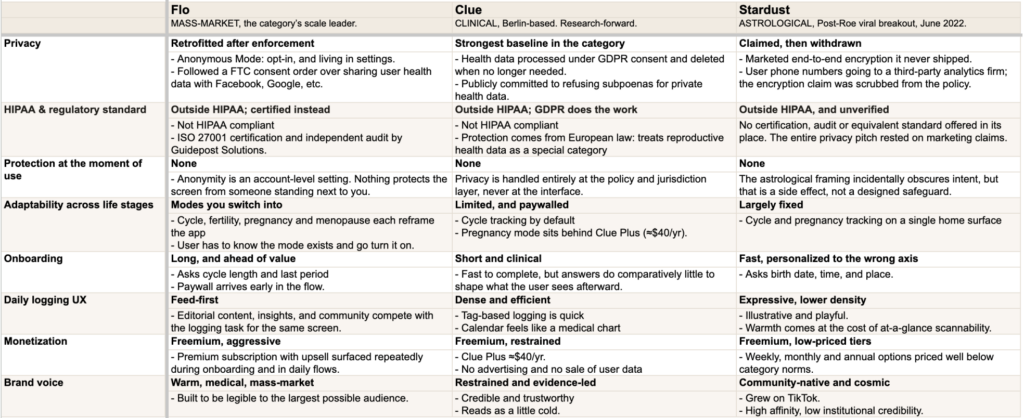
With no budget for primary research, I worked with the signal we had and treated it accordingly: recurring customer feedback relayed by Comma’s founder, stakeholder interviews and surveys, and a competitive teardown of cycle tracking apps like Flo, Clue, and Stardust.
↪︎ Every competitor argued privacy in a policy or a settings toggle, but none of it reached the interface.
↪︎ HIPAA doesn’t reach consumer period trackers, so the floor was whatever each company chose.
↪︎ Life-stage support existed, but only as modes users had to find and toggle. Adaptability was a setting, never a default.
Key Decision 1
Designing for distrust: privacy as a feature
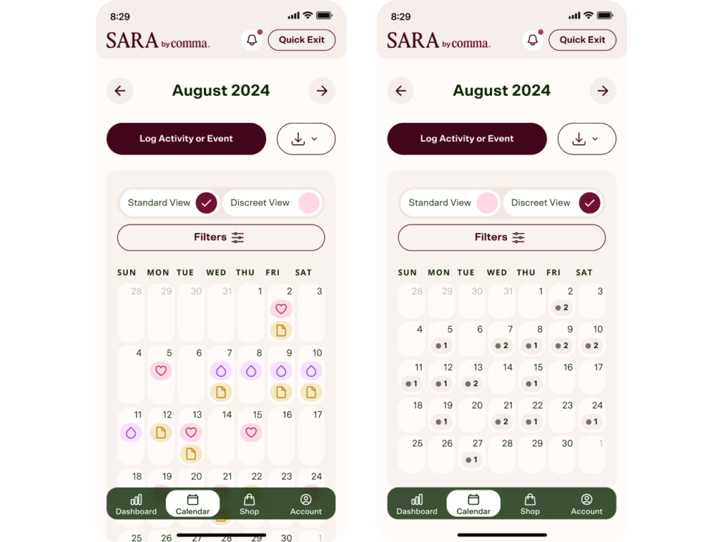
I designed privacy to be visible and operable—something users could see and touch, not a paragraph in a policy.
The call
↪︎ Quick Exit closes the app in one tap from a fixed, consistent position.
↪︎ Discreet View redacts identifying color and icons from the calendar but preserves activity counts.
What we rejected
↪︎ PIN-lock on every open. It added friction to every session for a threat model that was really about shoulder-surfing, not device access.
↪︎ Burying privacy controls in settings. Invisible trust-building doesn’t build trust.
Key Decision 2
One dashboard, every journey
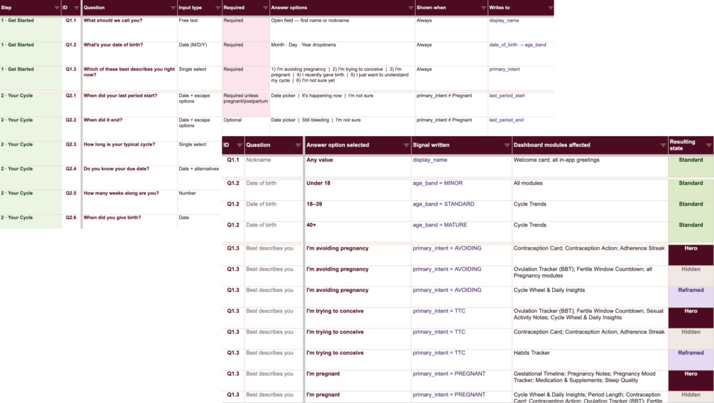
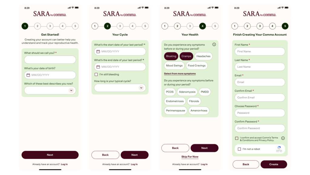
No two users need the same tracker, and the same user’s needs change over time. Instead of designing a fixed dashboard, I designed a system that configures itself.
The call
↪︎ A short onboarding questionnaire maps each answer to dashboard modules, so the first screen a user sees is already theirs.
↪︎ A per-module “hide” control keeps that fit accurate as goals change; no settings archaeology required.
What we rejected
↪︎ A customize later option. Empty-state dashboards with edit controls put the configuration burden on the user at the moment they’re least invested. The questionnaire does that work during peak motivation—right after signup.
Key Decision 3
Building the store before the product existed
The original engagement was the site alone for a brand with nothing yet to sell. I designed it as a promotional platform with “Notify me” as the driving CTA, but architected it as a store from day one. A pre-built product index switches on when inventory exists, and the design system means components move between promotional and shoppable states without new development.
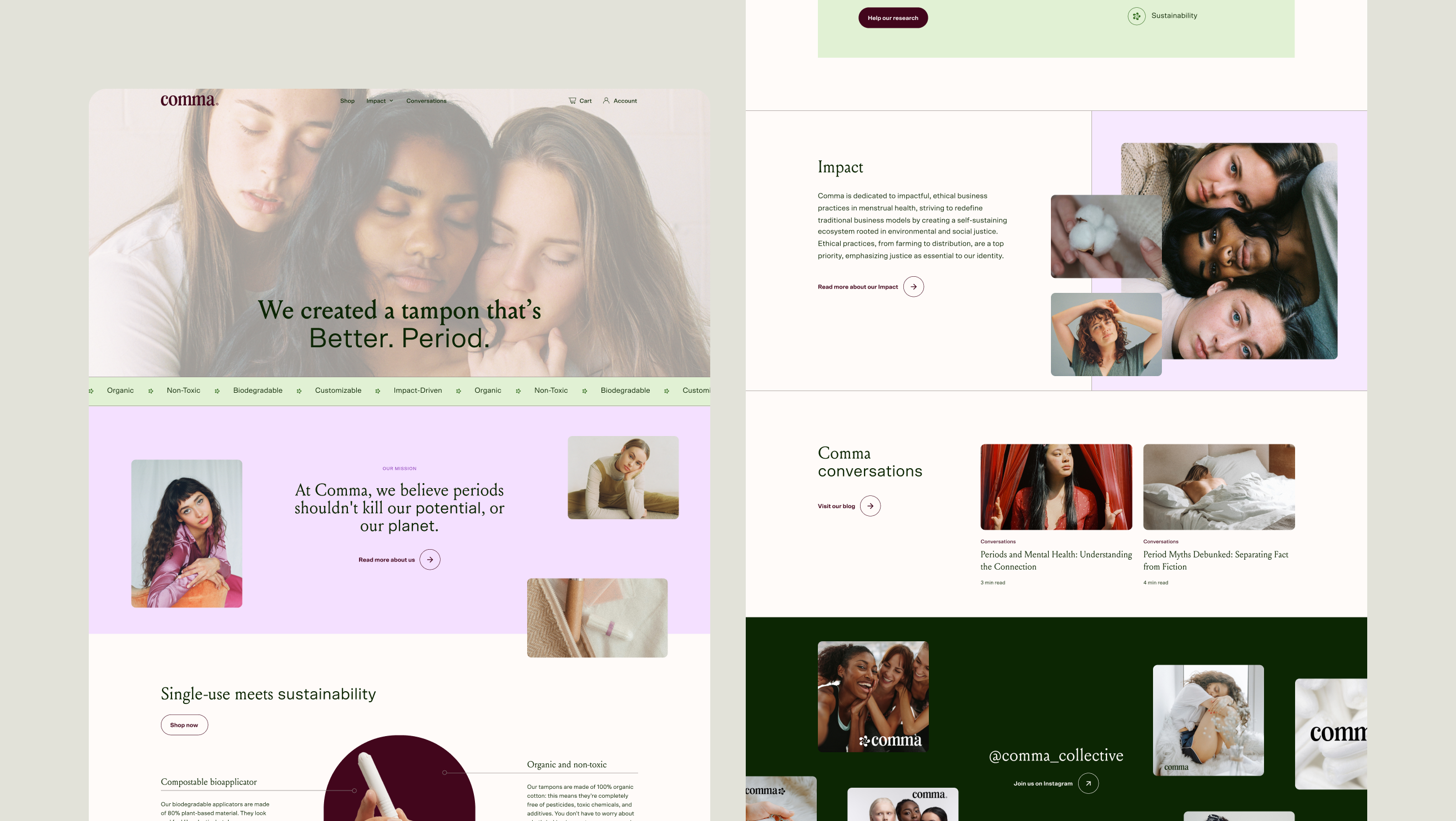
Launch state. The homepage sells the story before it can sell the product—”Notify me” converts interest into a launch list.
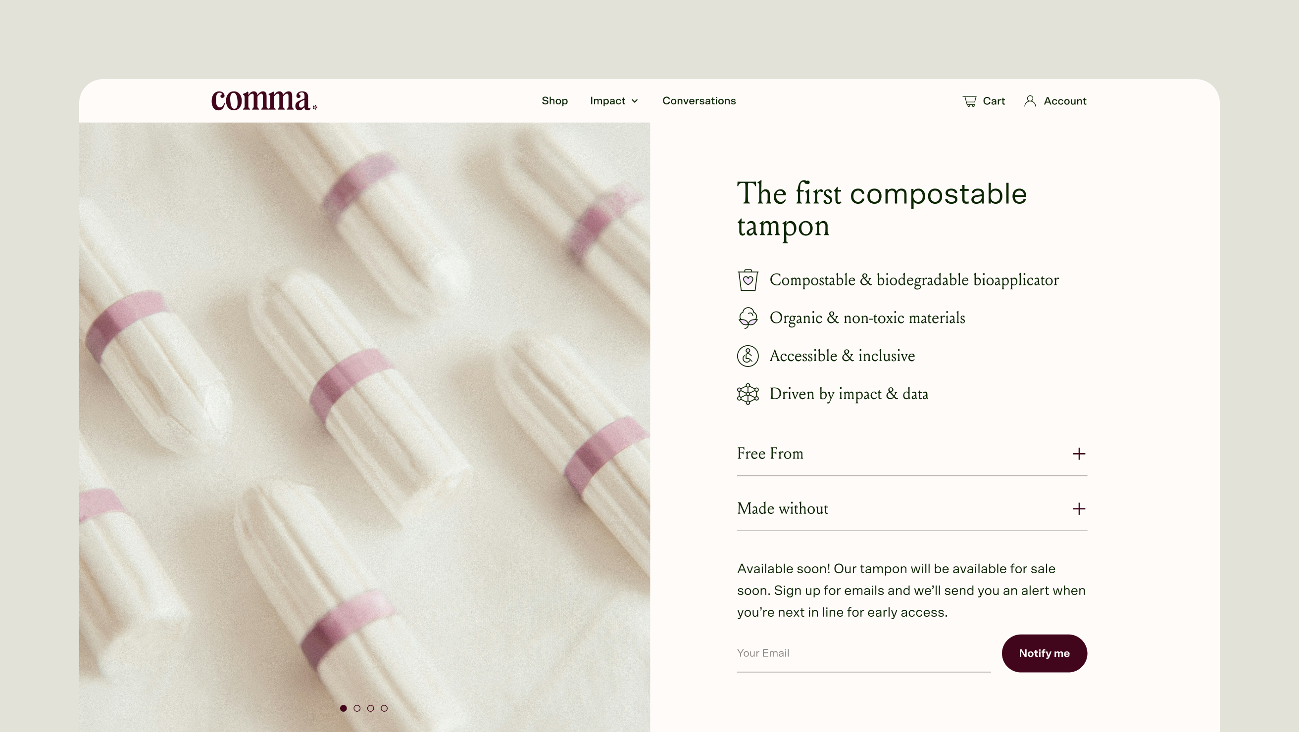
Store-ready underneath. The product template was built shoppable and shipped in promotional mode—flipping it live requires content, not redesign.
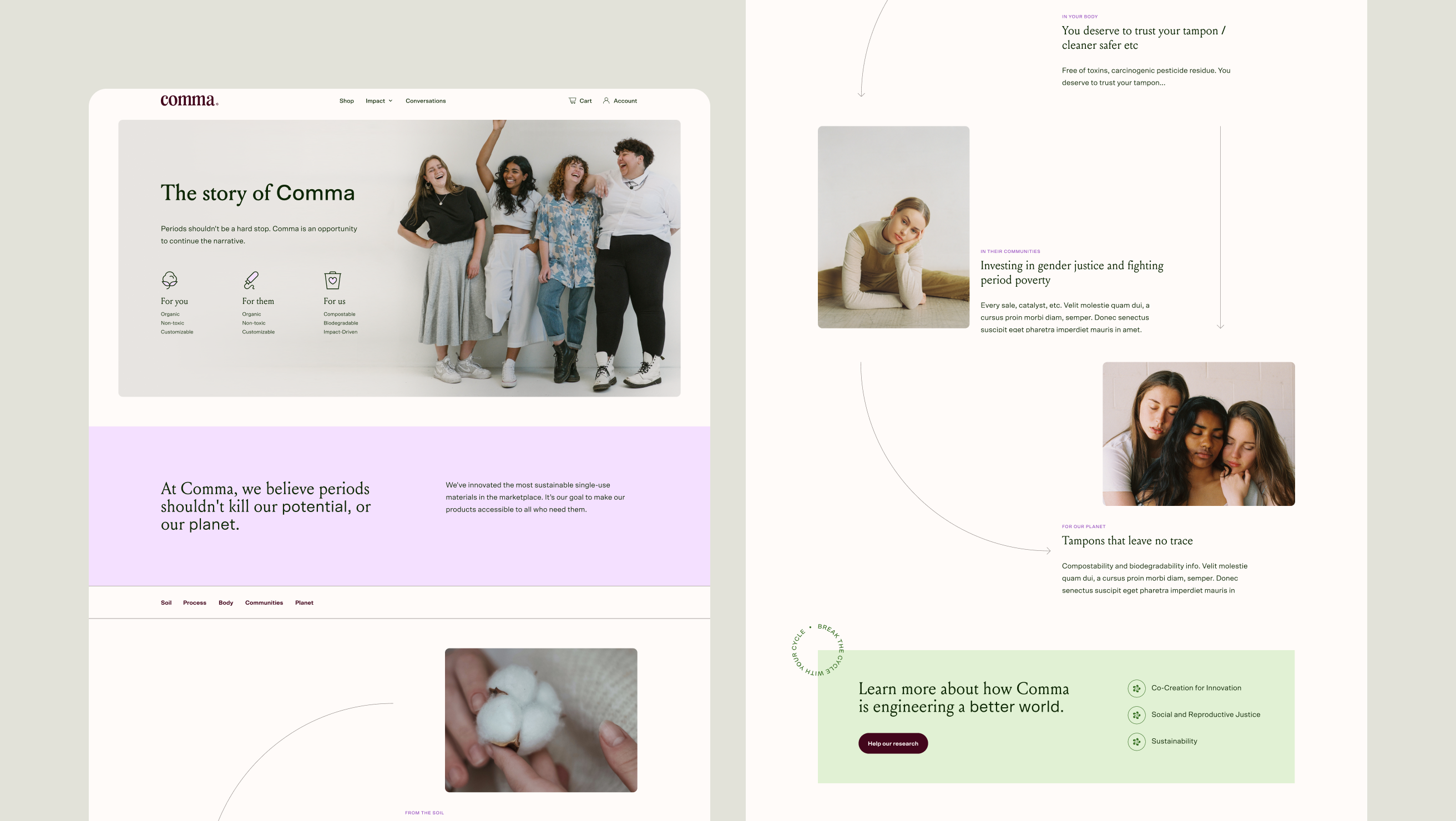
Trust for a brand with no history. I designed a visual diagram of the full product life cycle—sourcing to disposal—to close information gaps that new sustainable brands get interrogated on.

Custom iconography built as part of the shared system—the same set serves app modules and site content.
What shipped
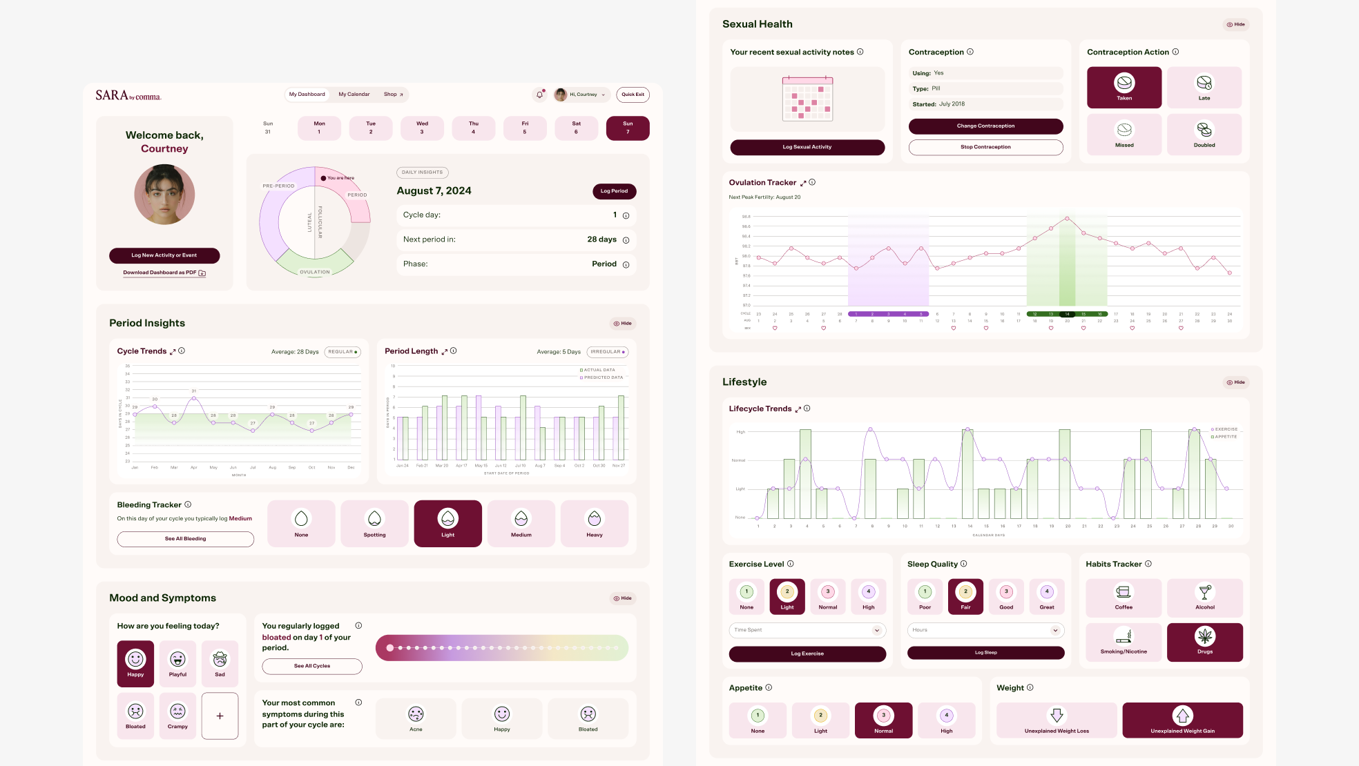
Main desktop dashboard view.
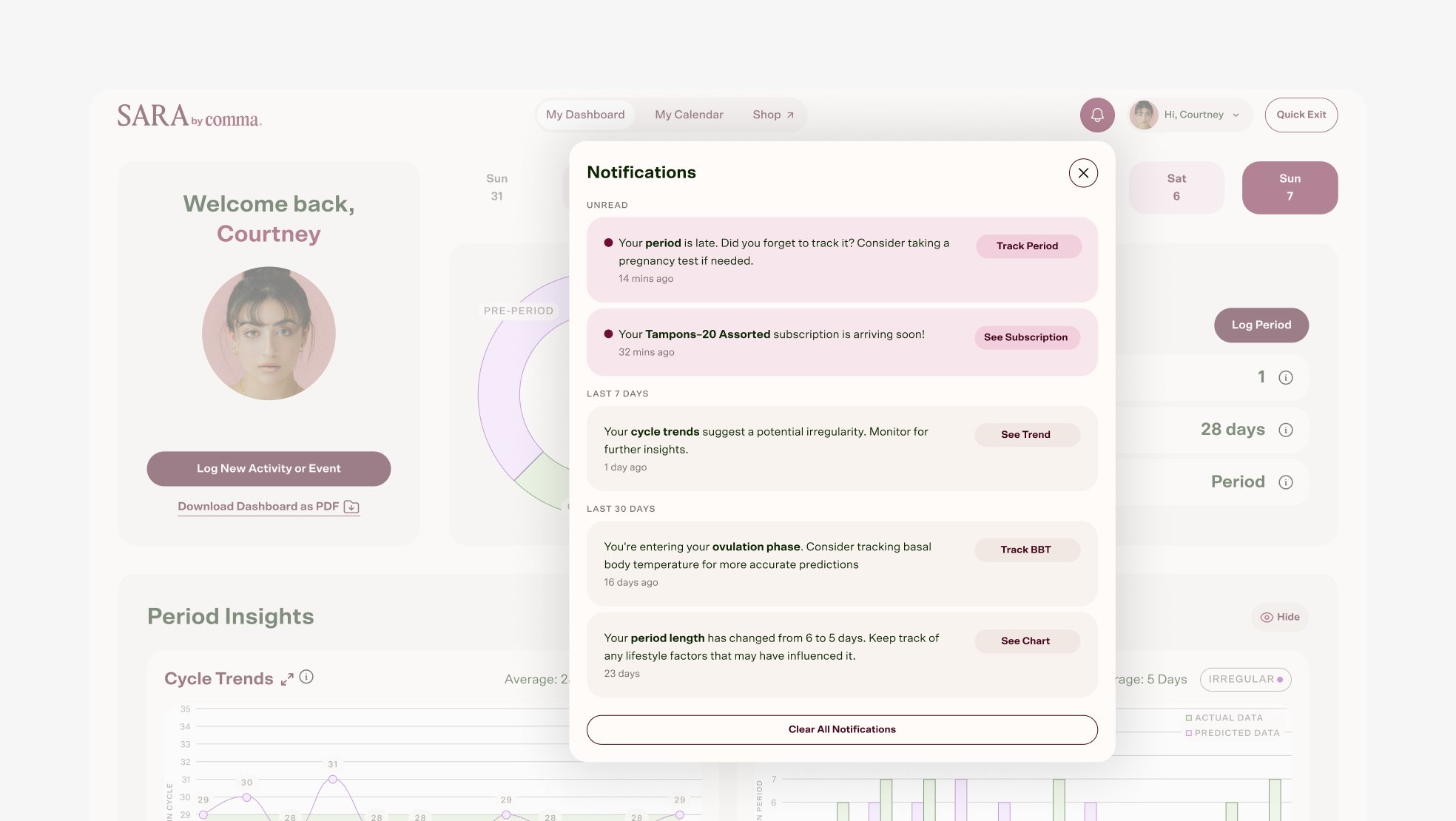
Desktop notification window. I proposed this window as a way to manage notifications. The goal was the user’s account will be seamlessly linked across SARA and e-commerce website so it will continue to drive sales within the app.
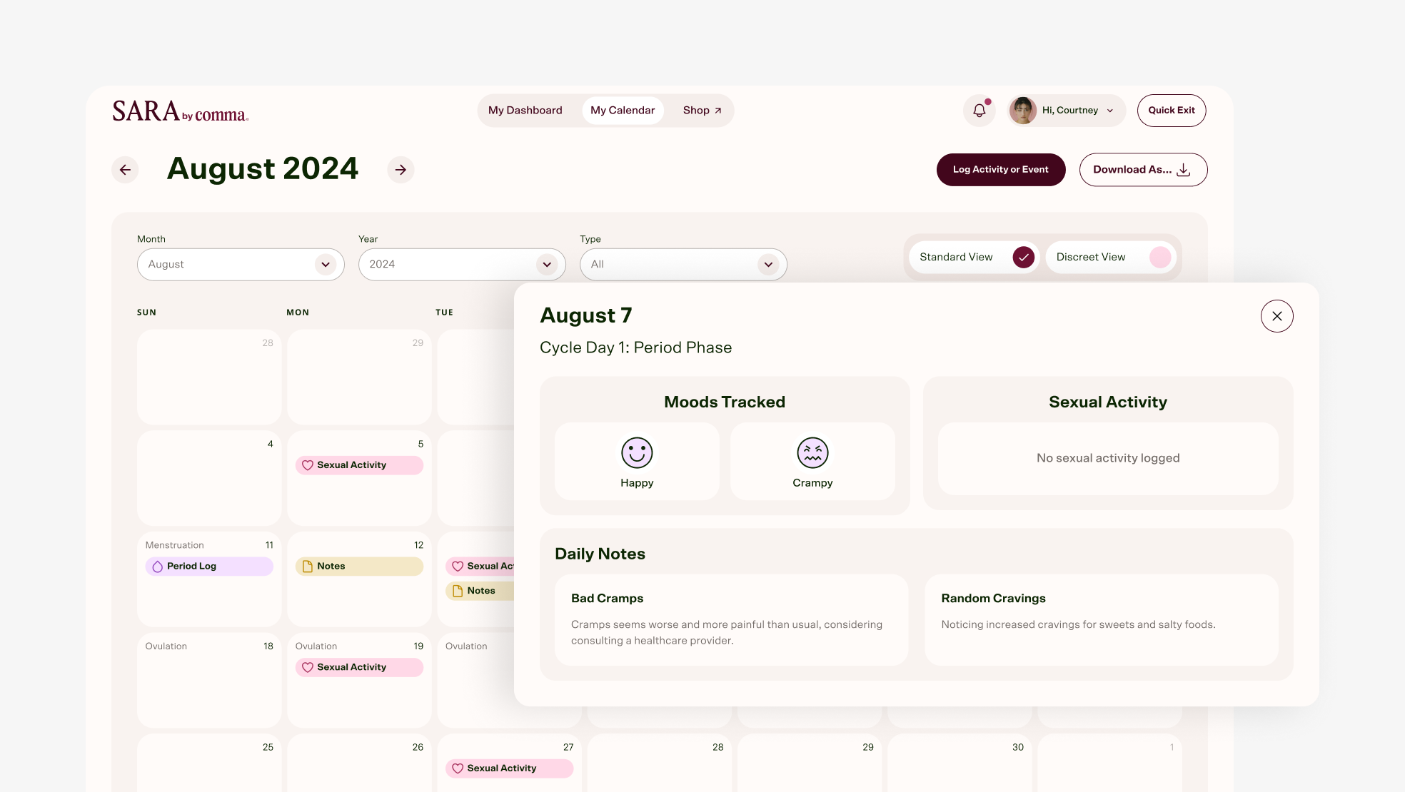
Desktop app monthly Calendar view with window to log moods, activity, or notes for specific day. This provides a high level, visual view with color coding for easy scanning. The more detailed window is accessed by clicking on the calendar day.
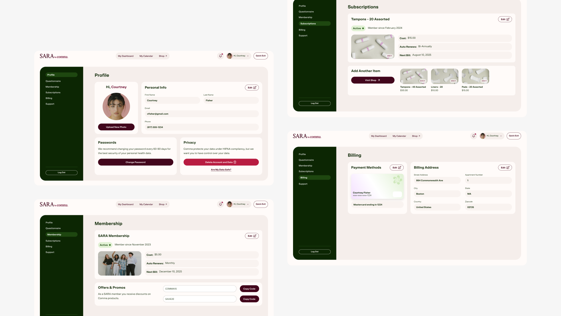
Desktop app view of Account Profile, Membership, Subscriptions, and Billing. Account is accessed by clicking on the avatar in the menu.
Reflection
I’d push for unmoderated testing on the onboarding questionnaire earlier. The answer-to-module mapping itself ran on some assumptions.
Designed at 829 Studios in collaboration with supporting designer Masha Zaytseva and strategist Brianna Feldott.