Berenson built its reputation over decades on ethics, long-term partnerships, and a close-knit culture, but their website didn’t reflect that story. Through a complete redesign, I transformed their digital presence into a modern, cutting-edge experience that brought their values to life, highlighted their people, and gave them a distinctive identity worthy of their name.
Role
Design Lead
Client
Berenson
Sector
Finance
Services
Stakeholder Interviews & Surveys, Competitive & Industry Analysis, Information Architecture, Wireframing, Web Design
Problem
👉 The website failed to communicate Berenson’s differentiators and overall ethos.
The homepage lacked storytelling and instead only provided two pathways to either Investment Banking or Private Equity pages. Through interviews we learned that partnership and ethics were important to them, but were not highlighted anywhere on the site. Berenson did not even have a dedicated company page. There was a strong need for a site that was content-rich, but still minimal.
👉 Navigation was unfamiliar and differed in layout between pages.
On the homepage, the navigation was contained within a small hamburger menu that was difficult to interact with. As a user ventured into the interior pages, they’re presented with a different navigation structure entirely that listed multiple tiers of links. This needed to be combined into a singular, cohesive navigation that felt immersive.
👉 The website was dated and not engaging.
From stakeholder interviews, we knew that Berenson desired a site that belonged in the current day that felt modern and tech-forward to reflect them as a company. They needed a design that helped grow their brand recognition.
Solution
👉 Transform website to highlight Berenson’s values and culture.
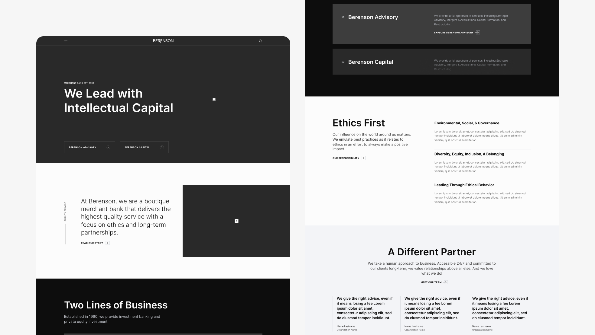
We started with fleshing out the homepage to feature three distinctive jumping off points that aligned with the areas we needed to elevate—their principle lines of business, investment banking and private equity, their identity, and their ethics. We continued to drive the message by using language that wove in their differentiators. We also brought Berenson’s values into the forefront by creating new dedicated pages for Ethics and Who We Are using engaging layouts from our custom design system. Knowing their team is important to them, we updated their careers page to show off high quality headshots in an easily browsable format boosted with messaging around culture.
👉 Create one cohesive, simplified navigation.
Since a modern, simplistic look resonated with Berenson and users, we opted for minimal slide-out menu design within a hamburger menu for increased flexibility and future growth. Accordion links with straightforward names help users to browse quickly and easily.
👉 Overhaul design to reflect Berenson’s brand and grow recognition.
Challenged with a complete lack of photography, we needed a visual theme that was impactful and aligned with the brand as it existed. The solution was two abstract interconnected orbs representing their two business lines through a
tech-forward lens. The fluidity of the animation represented the collaboration and partnership Berenson is known for. To further tie into their culture, we created an approachable News & Press page with humanistic filtering language like “Show me [all types] in [any line of business] associated with [any industry].” Layouts throughout the site were fresh and modern while still holding true to common paradigms and UX principles.
Research
“The minds at Berenson are unique and creative. People need to feel it instead of just reading it”
Stakeholder Quote from survey
“The website must communicate Berenson’s ethos, and reflect our reputation for quality”
Stakeholder Quote from survey
Initial Homepage wireframes before pivot to a more immersive and dynamic layout.
Design System
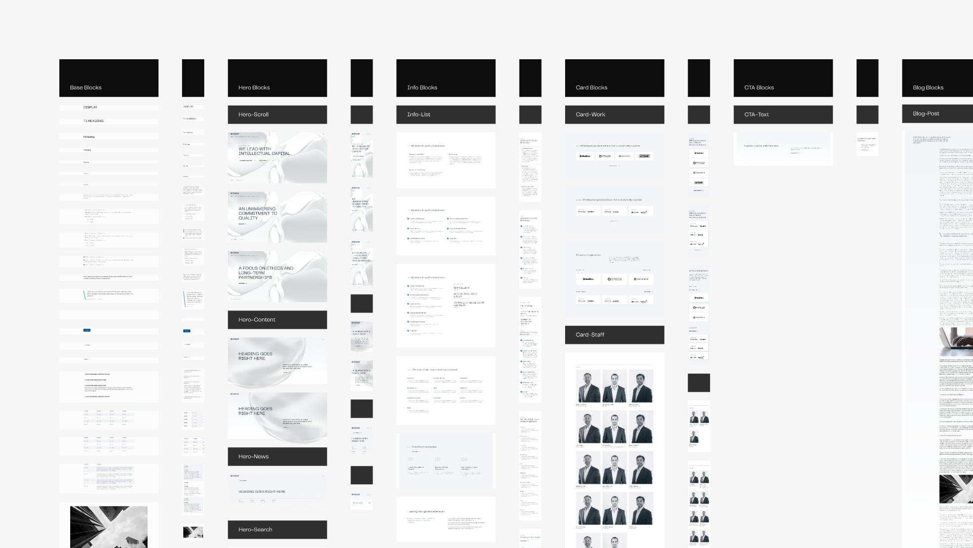
Organism section of design system.
Visual Design
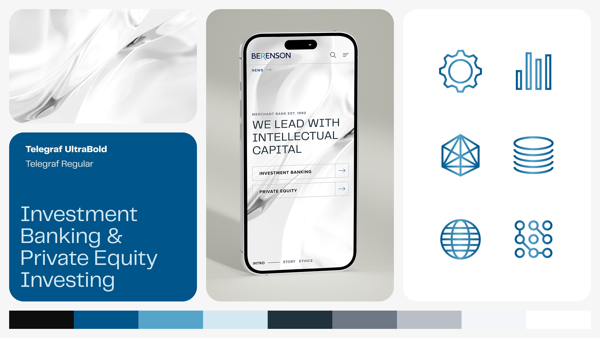
For Berenson’s new digital identity, I built on the single retained brand element—their signature blue—and expanded it into a modern, tech-forward system that reflects both sophistication and innovation. Clean, geometric typography and a refined color palette of deep blues, neutrals, and metallic gradients establish trust while signaling evolution beyond traditional finance.I designed a custom icon set and introduced abstract, flowing visuals as a metaphor for a fluid, interconnected ecosystem, reflecting Berenson’s focus on the people-centric outcomes at the core of their work. This combination of clarity and modern form not only brings their values of expertise, innovation, and integrity to life but also gives them a distinctive identity within an industry that often feels static and conservative.
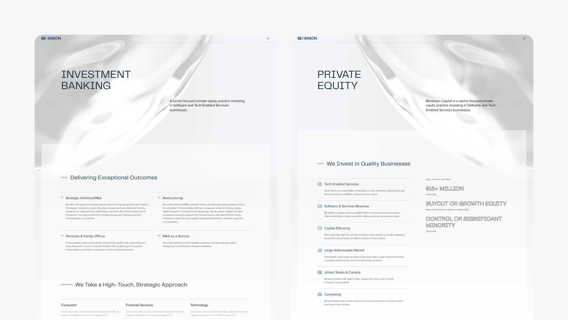
Desktop pages of Investment Banking and Private Equity lines of business.
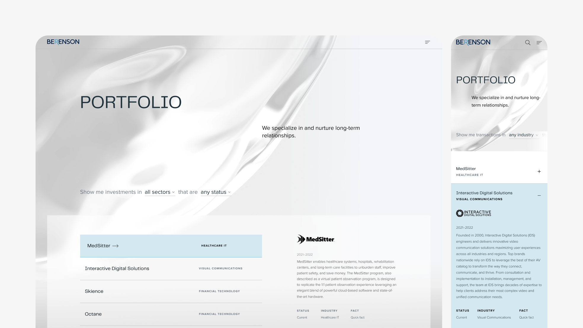
Desktop and mobile pages of Investment Portfolio to show responsive design.
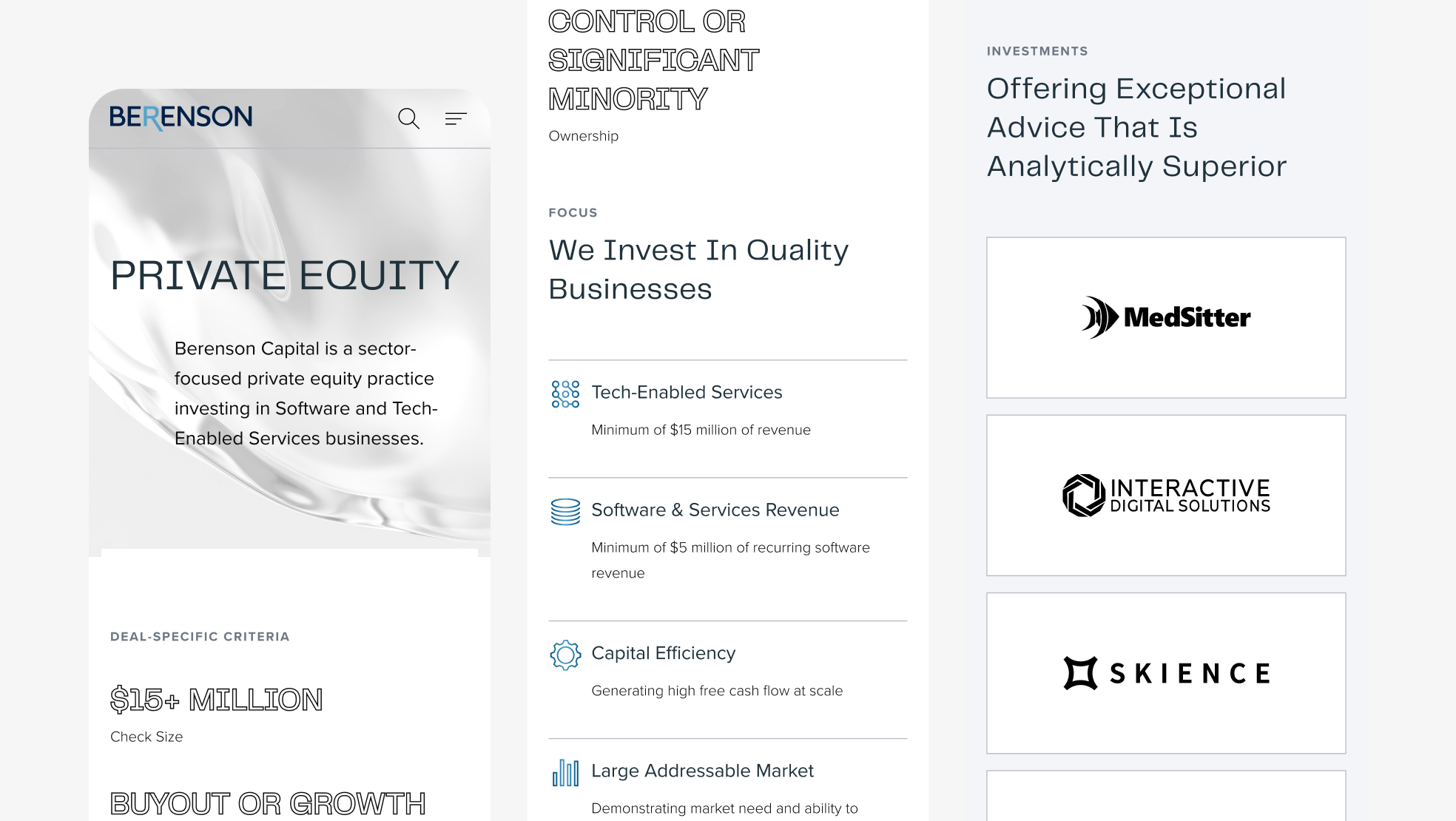
Mobile page of Private Equity with custom iconography.
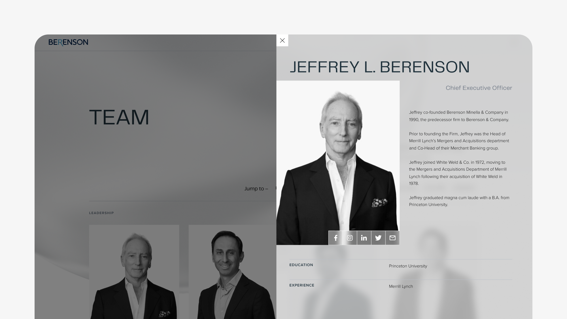
Desktop Team page with dynamic slide-out window for selected profile.
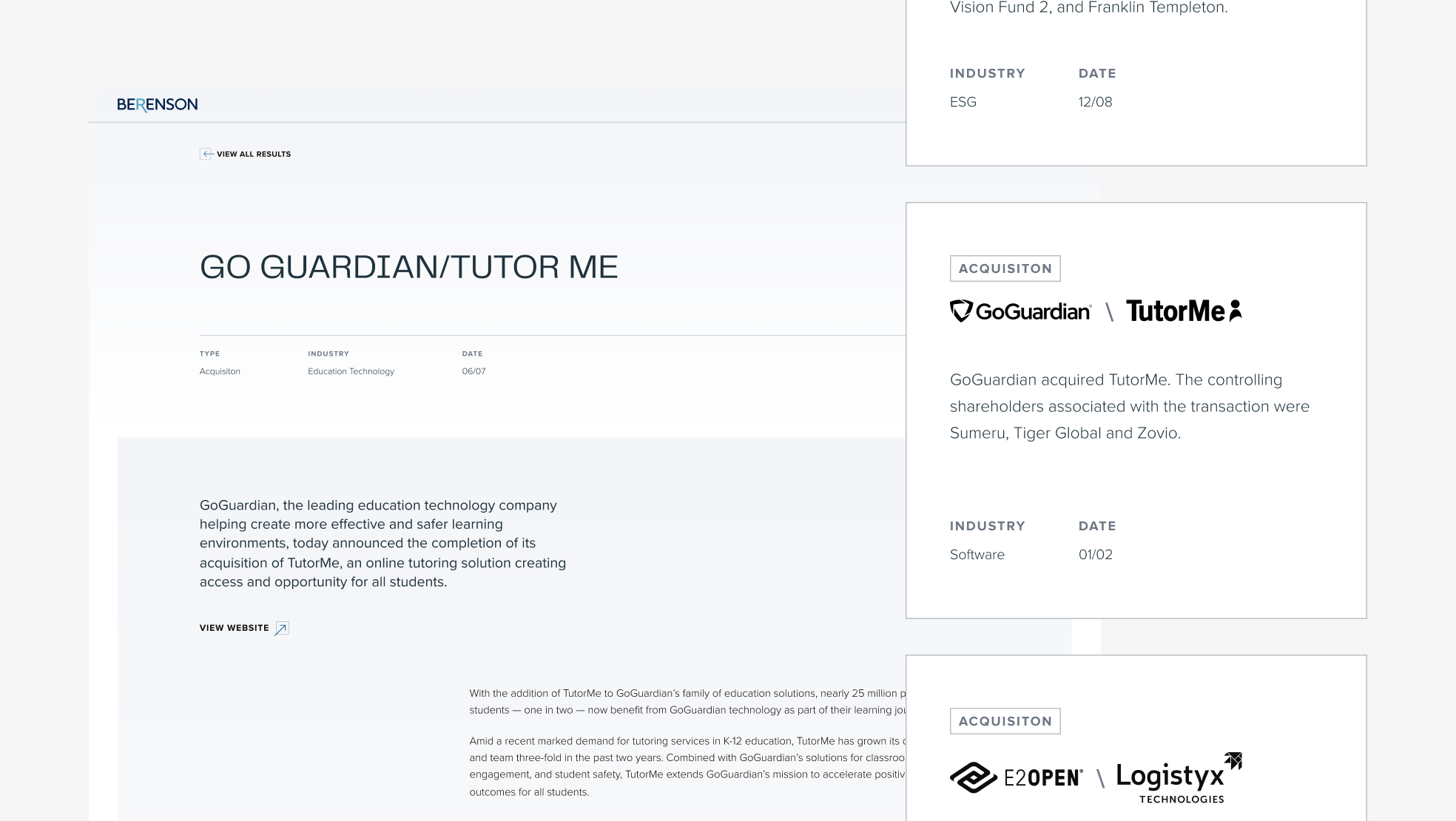
Desktop Advisory Results Profile page along with detailed view of results tombstones from Results Index.
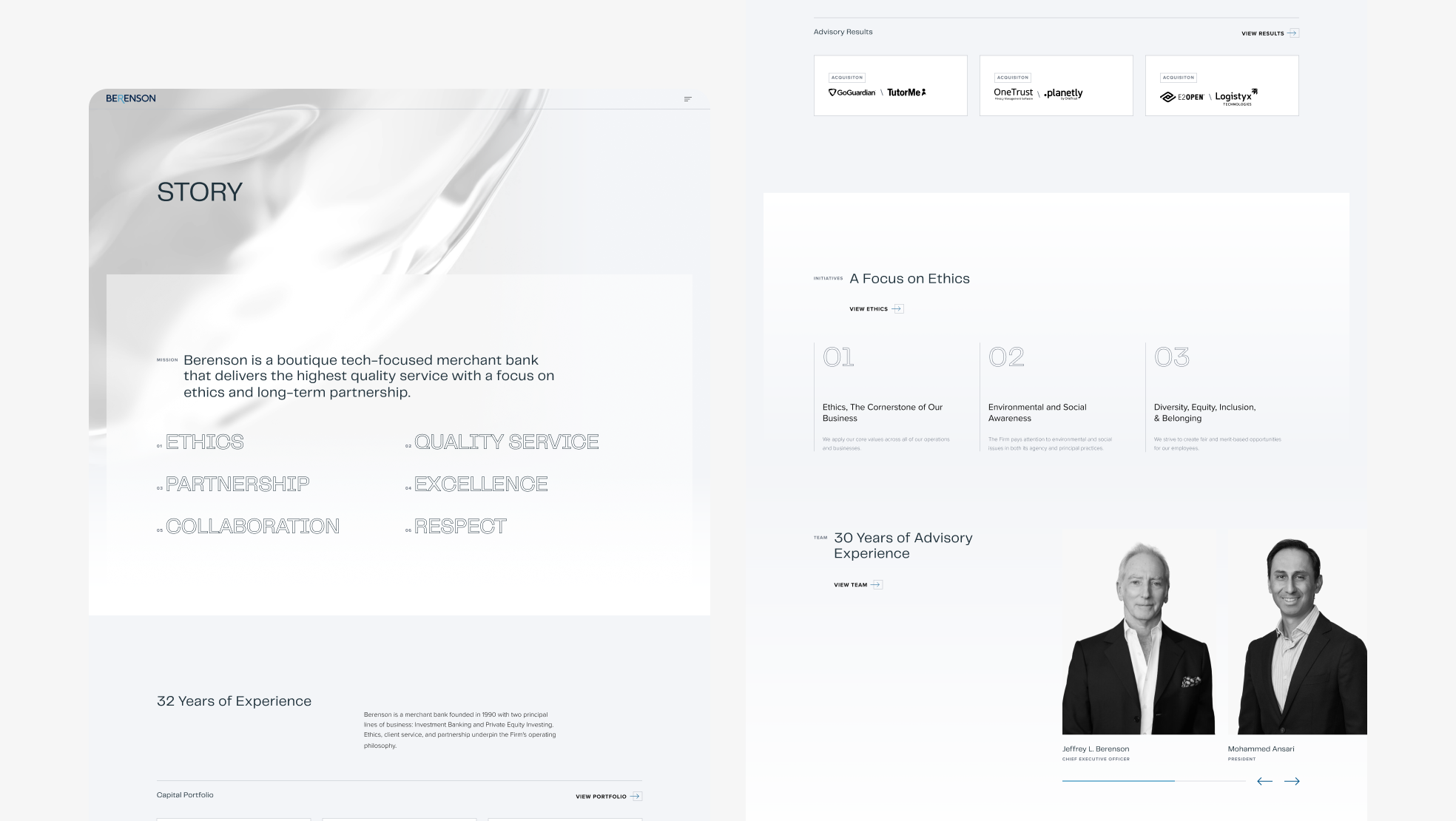
Desktop Story page.
Designed at 829 Studios in collaboration with supporting designer Chris Lenzi and strategist Gabrielle Balestrier.