Revitalizing the digital experience of a women’s healthcare destination for a transformative impact
Viva Eve is a fast-growing women’s health brand offering OB/GYN and fibroid care in one place, but their website wasn’t keeping up. With two established clinics and a newly refreshed brand identity, they needed a website that could scale, unify their offerings, and reflect their elevated standard of care.
Role
Design Lead
Client
Viva Eve
Sector
Healthcare
Services
Stakeholder Interviews & Surveys, Competitive & Industry Analysis, Information Architecture, Wireframing, Web Design
Problem
👉 Unifying two separate clinics.
Spectrafem was merging its fibroids practice, Viva Eve, with its ob/gyn practice, Forest Hills Medical Services. The challenge was to unify these two clinics—each with their own brand equity—into one cohesive site.
👉 Navigation was restrictive of growth.
The navigation was convoluted and didn’t cater to women in different stages of their healthcare journey. It also didn’t allow for future growth of the business, whether that was adding new services or locations.
👉 Unique differentiators were lost on users.
Viva Eve had some great differentiators that were not communicated well. Part of the issue was that they were hard to identify within dense copy throughout the site.
👉 Booking flow was disjointed.
The major issues with booking were that whether it was fibroids or OB/GYN care, it took users unexpectedly offsite to either a Salesforce form or Calendly. Users also needed to repeat information throughout the process and include insurance information, making it an unnecessarily long and repetitive task.
Solution
👉 Retain the brand equity of two existing clinics.
In order to unify the two clinics while still preserving their recognition within the community, we first closely adhered to newly redesigned brand guidelines. We built a fresh, detailed design system that ensured a cohesive look across the site. We also designed an introductory carousel inspired by app onboarding screens to familiarize patients with the new brand and website. In addition to this, we also helped orient the user with an introductory section on the homepage.
👉 Design a scalable, flexible navigation.
A critical aspect of this project was getting the navigation right—taking cues from leaders in the FemTech and Heathcare industries to design a navigation system that’s responsive and scalable to accommodate the addition of multiple locations and services in the future.
👉 Elevate their unique differentiators.
Differentiators were getting mixed up in dense, key-worded copy that wasn’t resonating with users. To solve this, we refined it to be more easily digestible with clear hierarchy. The aspects that set Viva Eve apart were now higher on the page in their own section, and accompanied by highly-stylized and impactful iconography.
👉 Simplify their booking flow.
We created two straight-forward pathways to book—Fibroids and OB/GYN care. We updated the button language to create clearer expectations of what’s to come that kept you onsite. We also were able to merge multiple third party integrations like Calendly and made it feel like a seamless experience between steps.
Visual Design
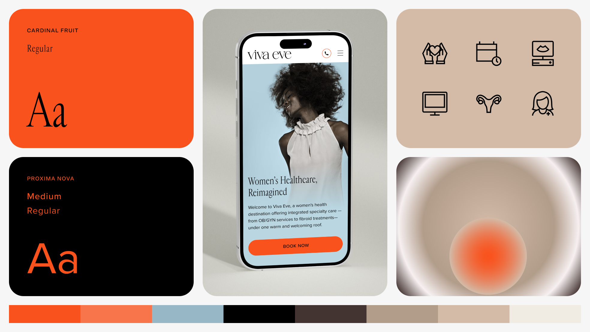
Viva Eve had limited brand assets like color, typography, and patterns, but I needed to evolve and expand it for a digital environment. In doing so, I was able to create a digital experience that balances professionalism with comfort. Vibrant orange was used for high-impact calls to action, while calming earth tones shaped a sense of trust and approachability throughout the site. I designed custom iconography to extend the brand’s visual language, making differentiators instantly clear. Gradient imagery acted as a visual metaphor for different treatments, adding softness and reinforcing the brand’s patient-first ethos. Together, these elements translate Viva Eve’s identity into a modern, welcoming, and story-driven healthcare experience.
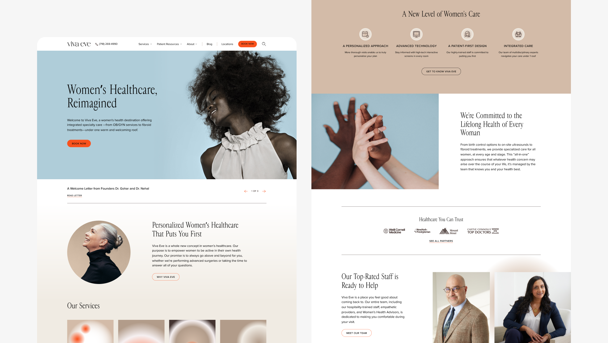
Desktop Homepage.
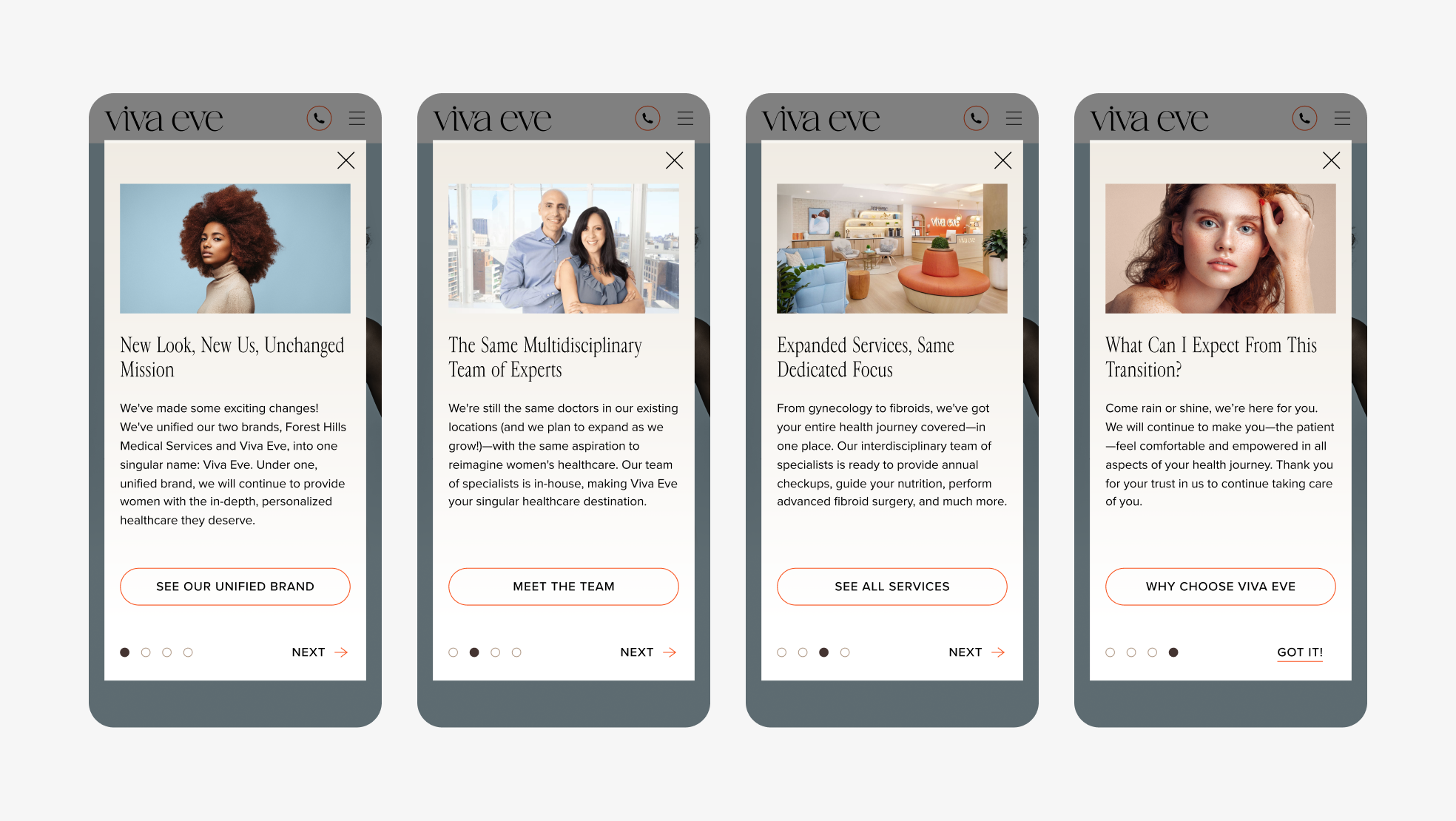
Introductory screens that appear when users land on the site to help orient them to the new brand.
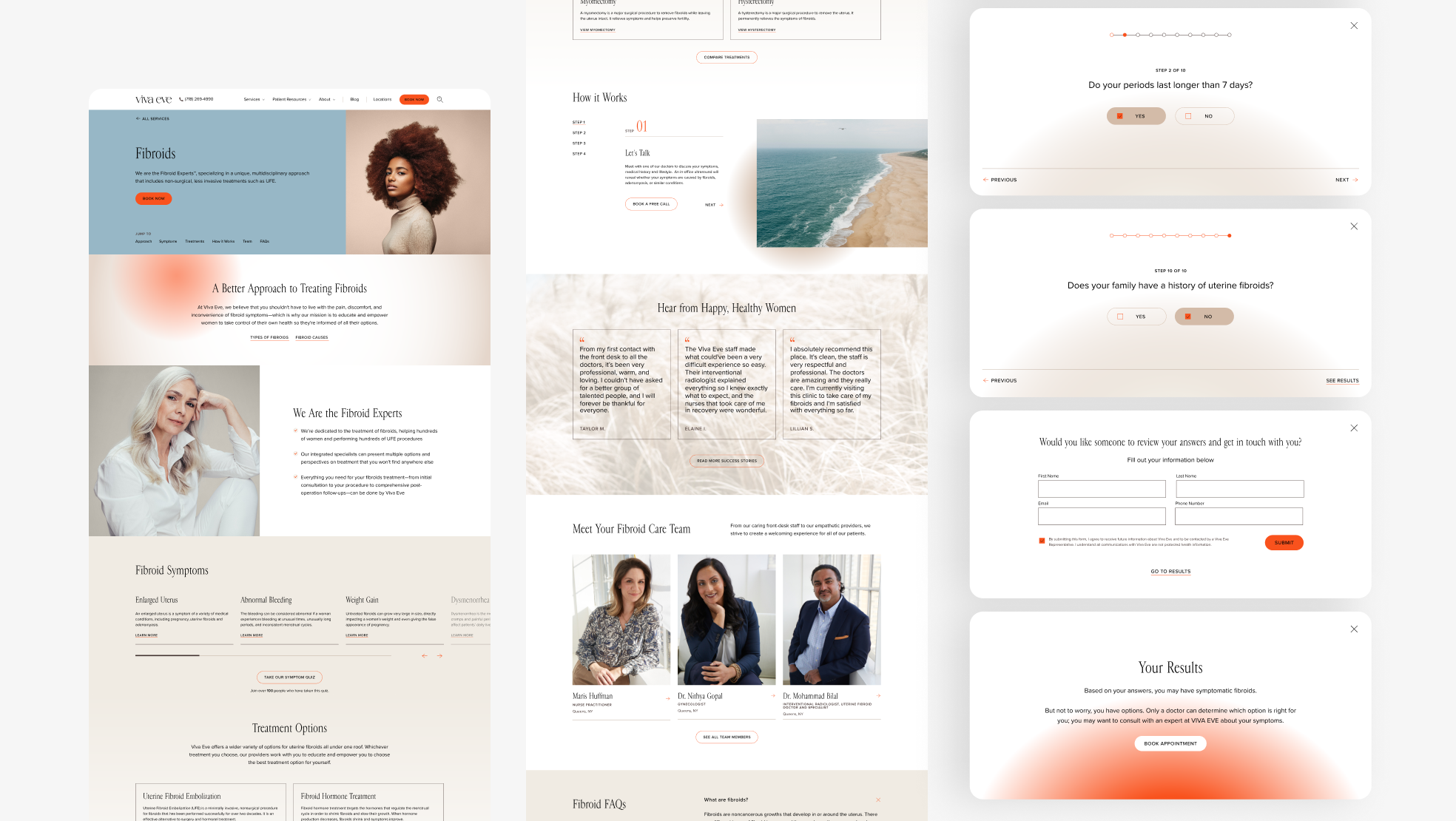
Desktop view of Fibroids Services page. The Fibroids Symptoms section includes a button that launches a 10 question sympton quiz that’s pictured to the right.
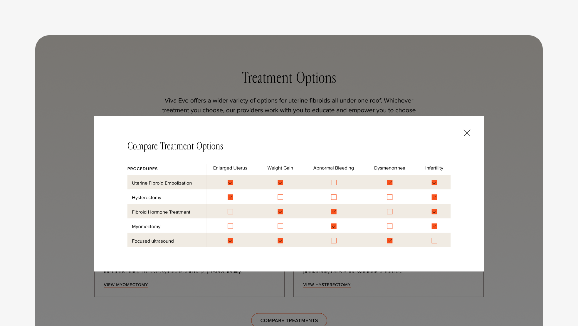
Another desktop view of Fibroids Services page. The Treatment Options section includes a button that launches a treatment comparison that lets users understand what’s best for them.
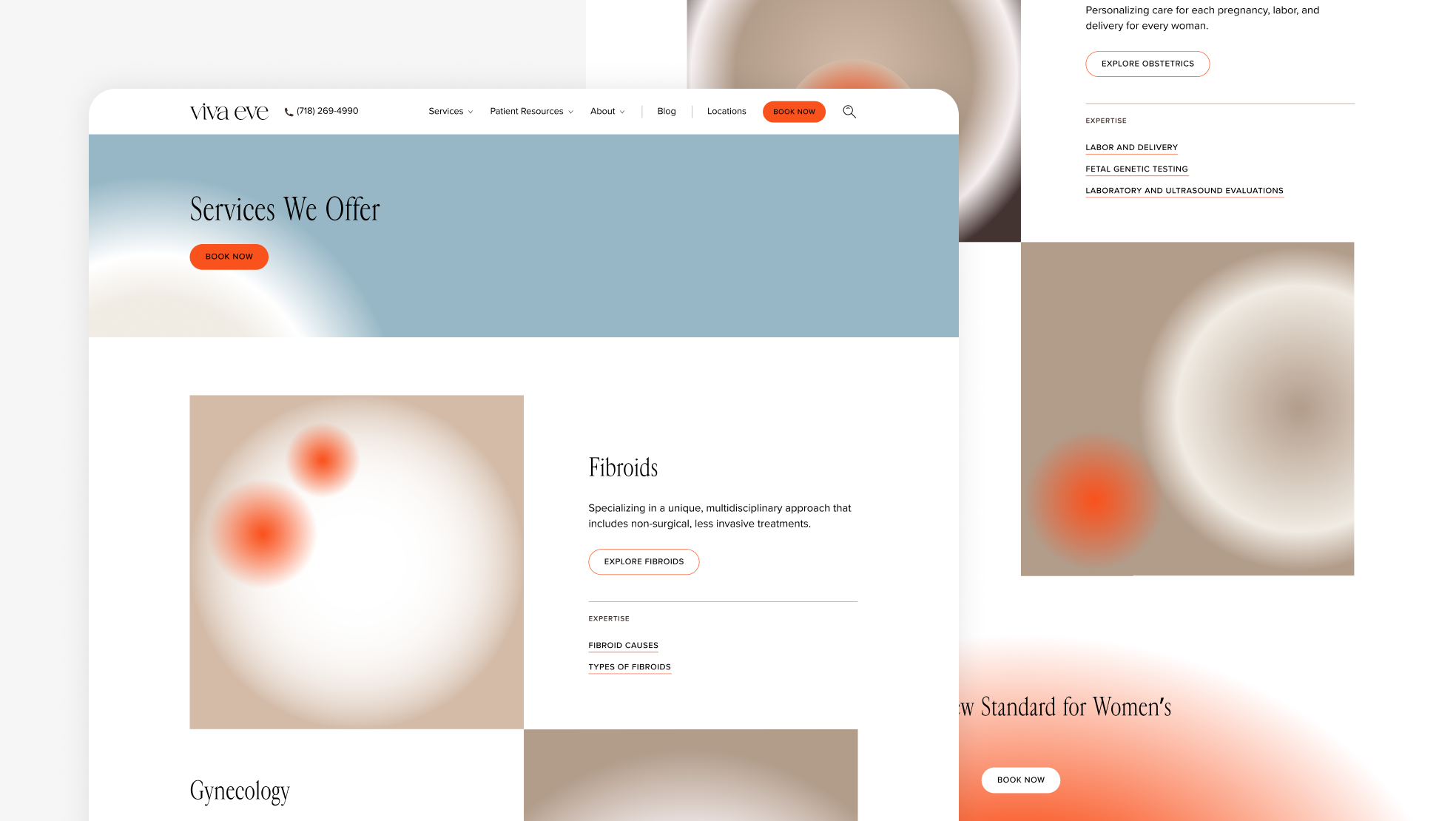
Desktop view of Services overview page.
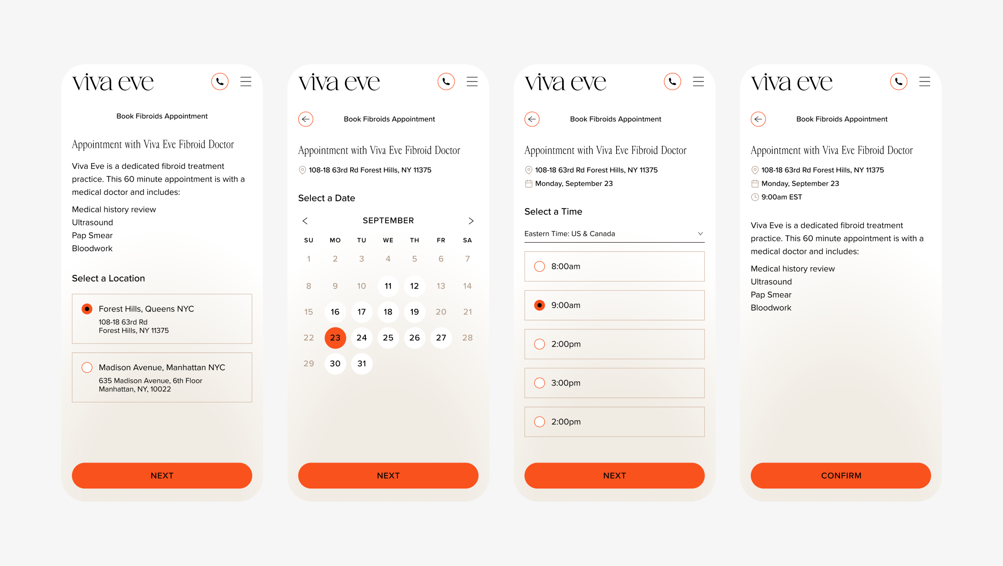
Mobile booking flow for fibroids appointment.
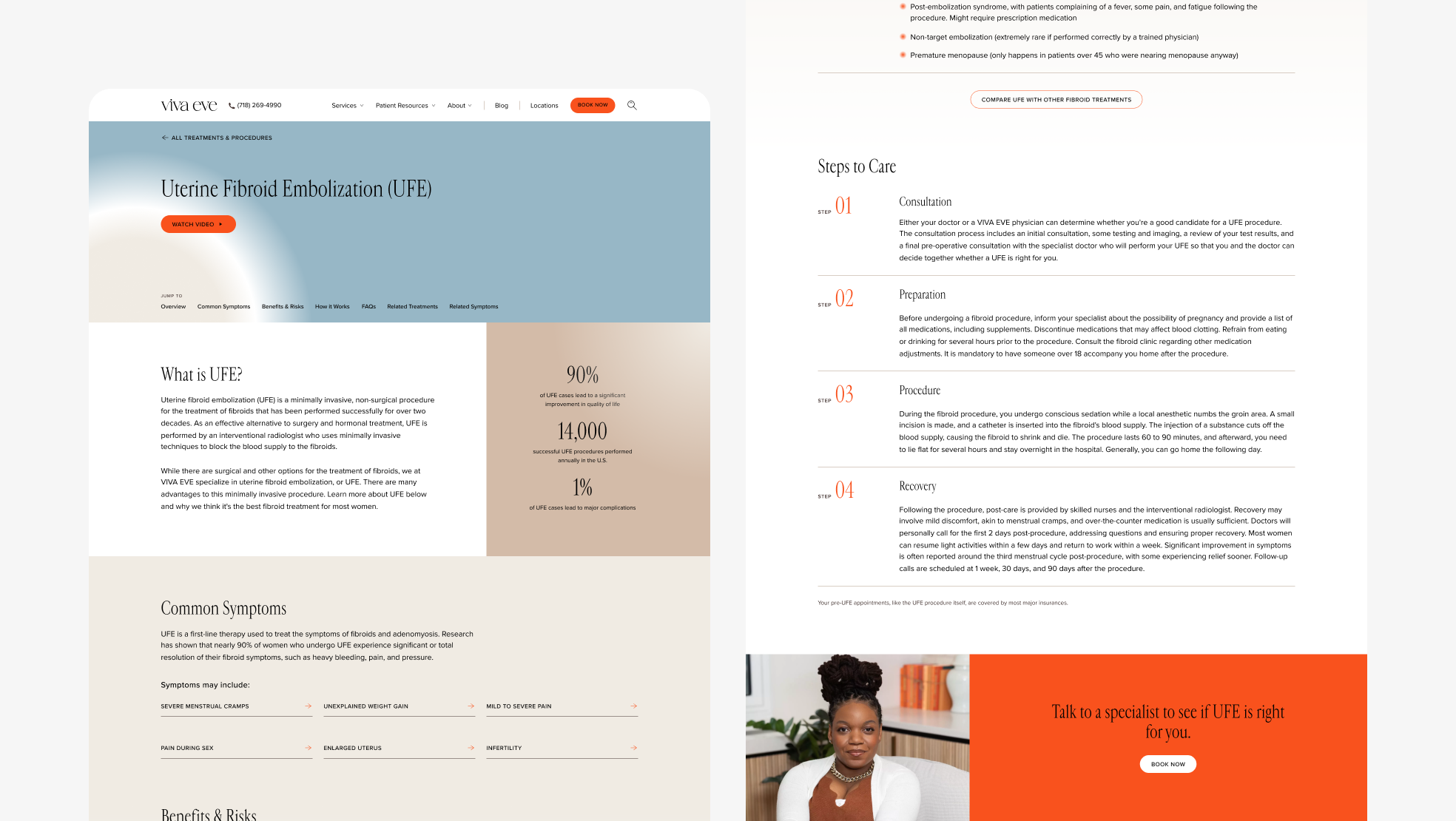
Desktop view of Uterine Fibroid Embolization (UFE) Treatment & Procedures page.
Designed at 829 Studios in collaboration with strategist Mae Beerman.