Optimizing a digital platform for a global non-profit
Textile Exchange is a global non-profit driving beneficial impacts on climate and nature across the fashion, textile, and apparel industry. I wireframed and prototyped multiple dashboards to better visualize and organize large amounts of data, creating hierarchy and enhancing the way users digest this information.
Role
Design Lead
Client
Textile Exchange
Sector
Non-Profit
Services
Stakeholder Interviews & Surveys, Competitive & Industry Analysis, Information Architecture, Wireframing, Data Visualization
Problem
👉 Navigation felt cluttered and needed restructuring.
The main navigation dropdown menus were robust, housing many links that were sometimes not intuitively categorized, requiring users to hunt them down. The wordiness of links and multiple call-to-actions also created clutter. In addition, an important area of the site—the Material Change Index—was directing users off-site, increasing bounce rates.
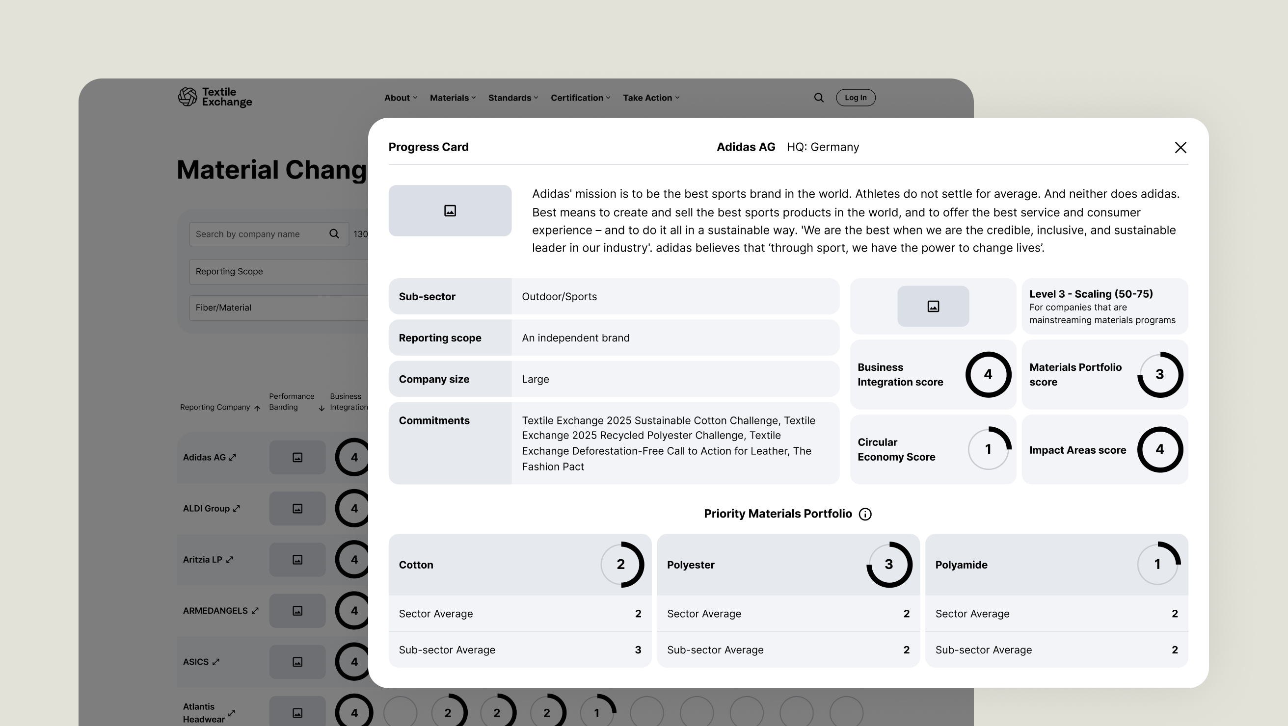
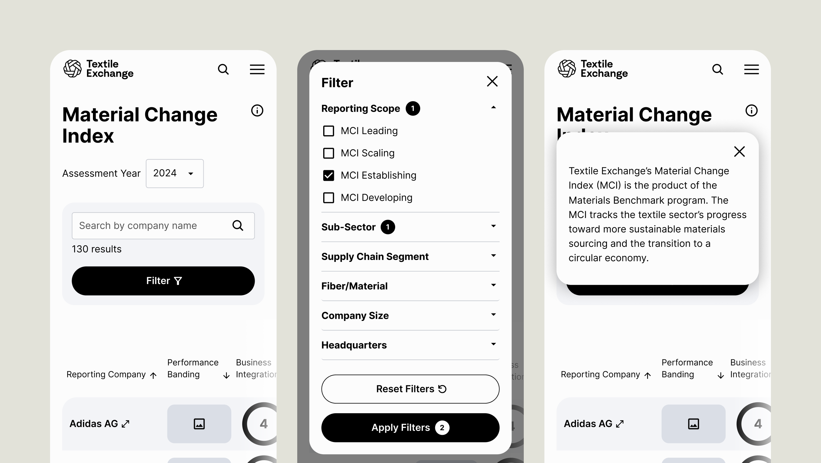
👉 Filtering options weren’t intuitive.
Another issue encountered on the Material Change Index is that users had trouble locating and using filtering options. Because of this, information was presented in an overwhelming and dense way.
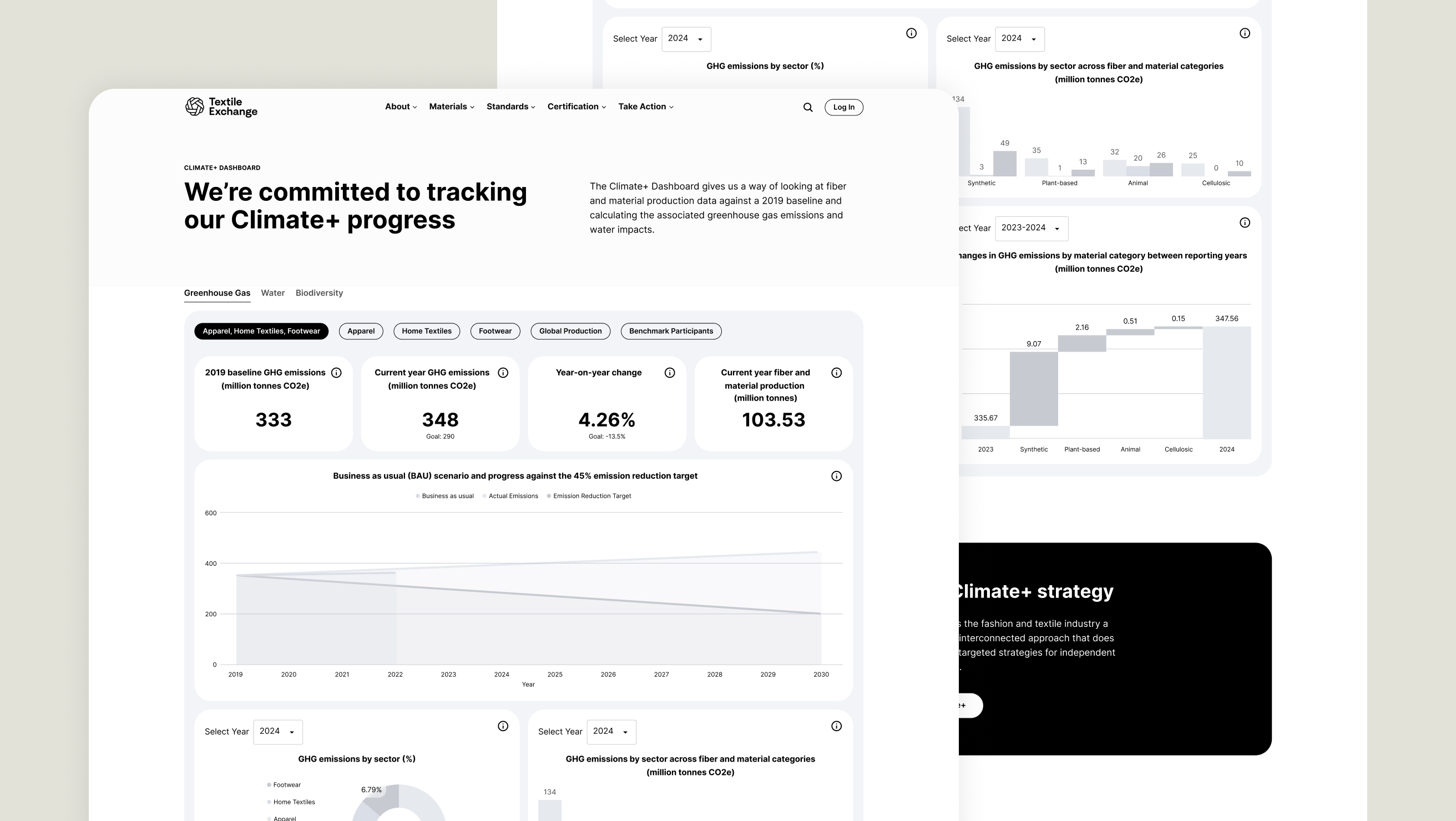
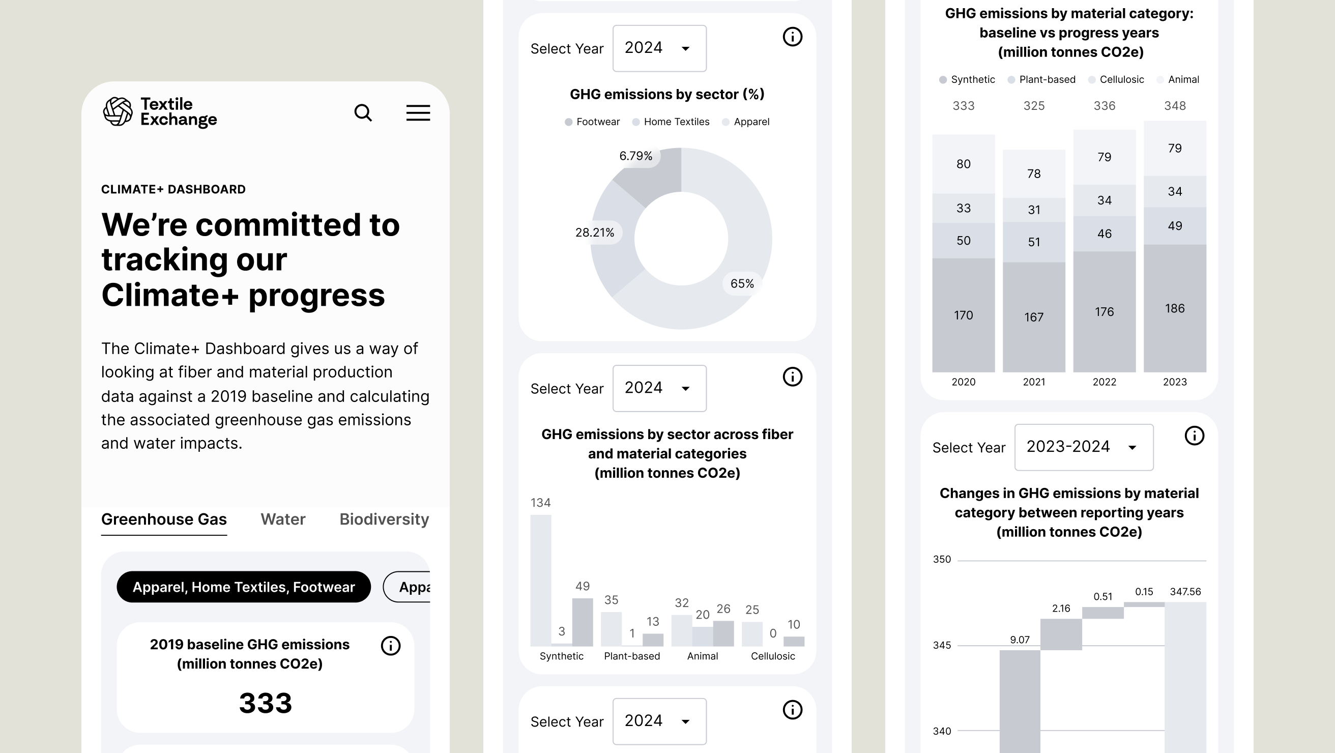
👉 Climate+ Dashboard was convoluted and lacked clear hierarchy.
The Climate+ Dashboard presented some issues because of its complex nature and need for nested tabs.
Solution
👉 Create a seamless and intuitive navigation.
We first wanted to integrate the Material Change Index into the main site to eliminate the external link. We then improved the verbiage to be more direct for users to easily predict what links would be contained in the dropdown menus without having to pars through each one. We gave links within dropdowns further categorizations with headings and hierarchy, and moved the former “Take Action” secondary call-to-action into its dedicated space alongside the main dropdowns.
👉 Improve filtering visibility and ease of use.
The Material Change Index has over 100 listings, which is a lot to have to read through. We made it so that the 6 filters were accessible by default. We also added a Reset Filter button so if the user wanted to alter multiple selections, they could do it quicker and easier than unchecking individually.
👉 Enhance Climate+ Dashboard and the consumption of its content.
Most of the work done to improve the Climate+ Dashboard was equipping it with familiar paradigms like tabs and segmented controls that were universally understood to the user. We used proximity rules to group related content and made sure charts’ space was maximized to its fullest potential for easy reading. Some of it required adjusting layouts and page architecture.
Research
Designed at 829 Studios in collaboration with strategist Brianna Feldott.