Spoonfuls is New England’s largest food recovery—rescuing fresh, healthy food that would otherwise be discarded. As they grew, they needed a modern brand and website that reflected their mission and made it easier for people to understand and support.
Role
Design Lead
Client
Spoonfuls
Sector
Non-Profit
Services
Stakeholder Interviews & Surveys, Competitive & Industry Analysis, User Personas, Information Architecture, Wireframes, Branding, Web Design
Problem
👉 Brand felt unprofessional.
Spoonfuls was ready for a total branding and web redesign to shed themselves of their kitschy image and name. Their current logo was a raster image, therefore problematic. The imagery used also wasn’t an accurate depiction of what they do.
👉 Navigation and website were clunky and unresponsive.
Spoonfuls’ current site didn’t follow responsive standards and the navigation was clunky and not intuitive. Partly due to its logo, it also had a large header section, taking away real estate from the content below.
👉 Confusion around what Spoonfuls actually does.
There were also issues with messaging. It wasn’t obvious to users that Spoonfuls is a food rescue, not a food bank, so we knew we needed to better convey what they do.
👉 Donation gets lost.
Donation calls-to-action weren’t prominent and not recognized as a primary driver. On top of that, buttons didn’t have a dedicated action color to make them easy to pick out amongst other content. There also wasn’t content that made users feel encouraged to donate.
Solution
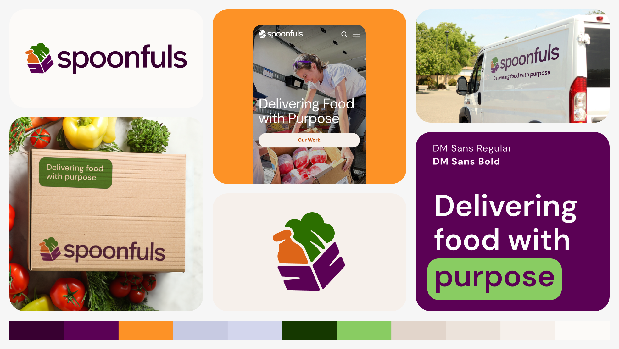
👉 Create a more professional, modern brand.
Previously called “Lovin’ Spoonfuls”, we advised to remove the “Lovin’” from the name to continue to retain the recognition of “Spoonfuls”, but keep it more simple and mature. I designed new branding that felt modern, professional, and more accurately embodied their values and mission. I designed the new logo to be minimal and more of an accurate depiction of what they do. I also went with a more mature color palette that was reflective of their fruits and veggies.
👉 Reimagine clunky, unresponsive navigation and website.
We reimagined both the navigation and website to follow modern, best industry practices and created a clear user journey. We continued to improve the previously dated site by creating a design system with around 100 responsive, web accessible components.
👉 Clearly communicate Spoonfuls’ mission and purpose.
We oriented their content around their mission and purpose in a universally understandable way. We started by creating a story on the homepage of the “why” and “how”. We also added dedicated pages like What We Do to outline key differentiator and a clear message. We made sure to elevate this content throughout the site.
👉 Increase donations through calls-to-action.
Being a non-profit, we wanted to drive users to donate, using bold calls to action within the navigation and throughout the site. The donate page is also visually impactful and features statistics and a simple form, making donation as easy as a click.
Research
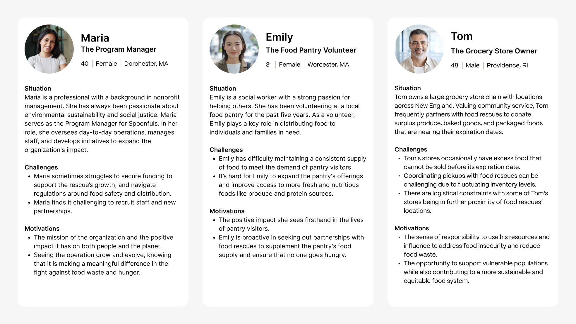
User personas.
This competitive analysis showed that while competitors often emphasize general food redistribution, Spoonfuls could stand out by highlighting its same-day delivery, impact on food waste reduction, and ability to deliver healthier, fresher food directly to communities. This directly informed the visual identity as well. After assessing competitor logos, I wanted to incorporate more modernity and fresh greens to feel familiar in the space while still standing out.
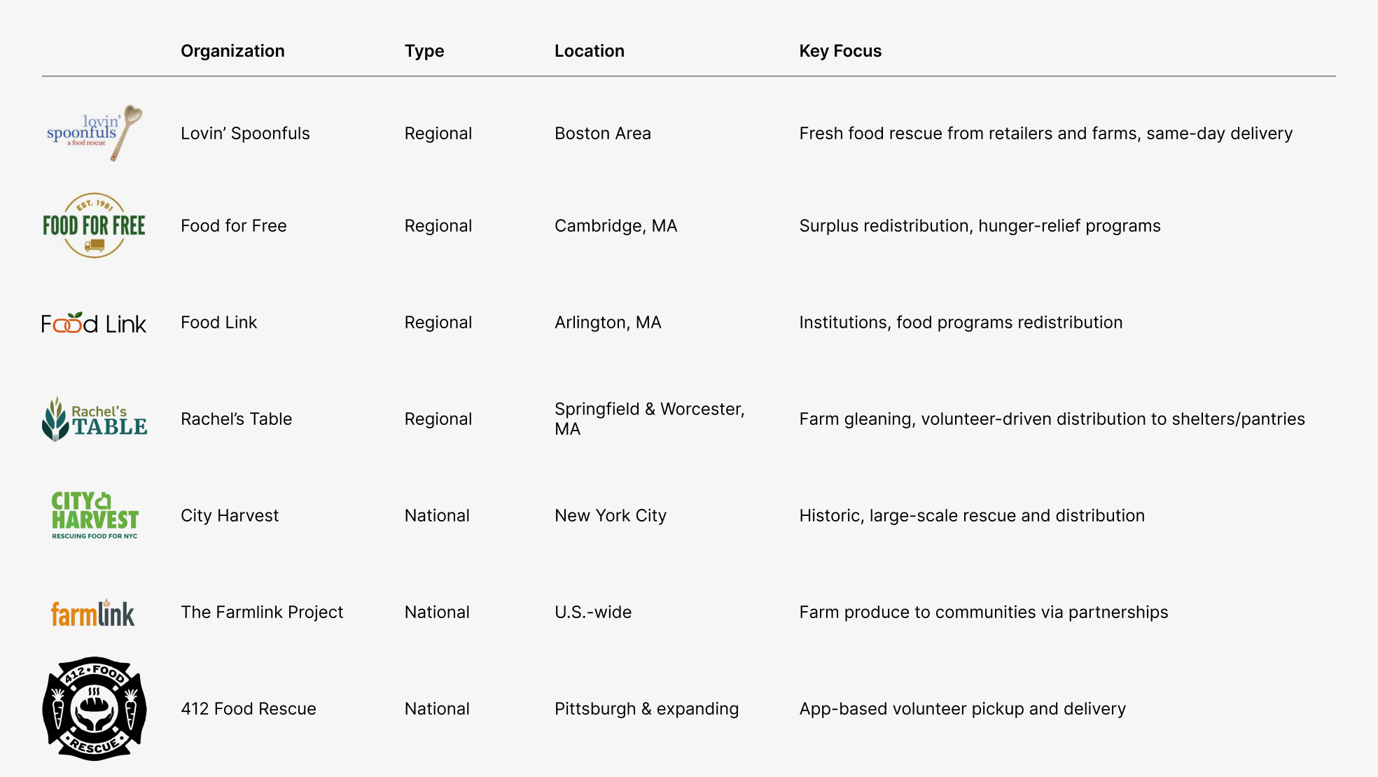
Competitive analysis.
Design System
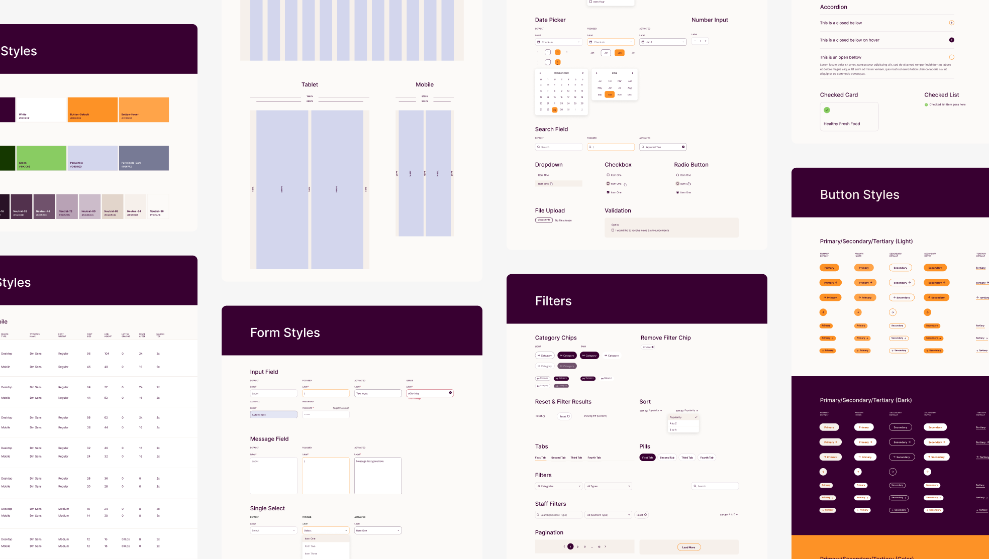
A portion of atoms and molecules section of the design system.
Visual Design
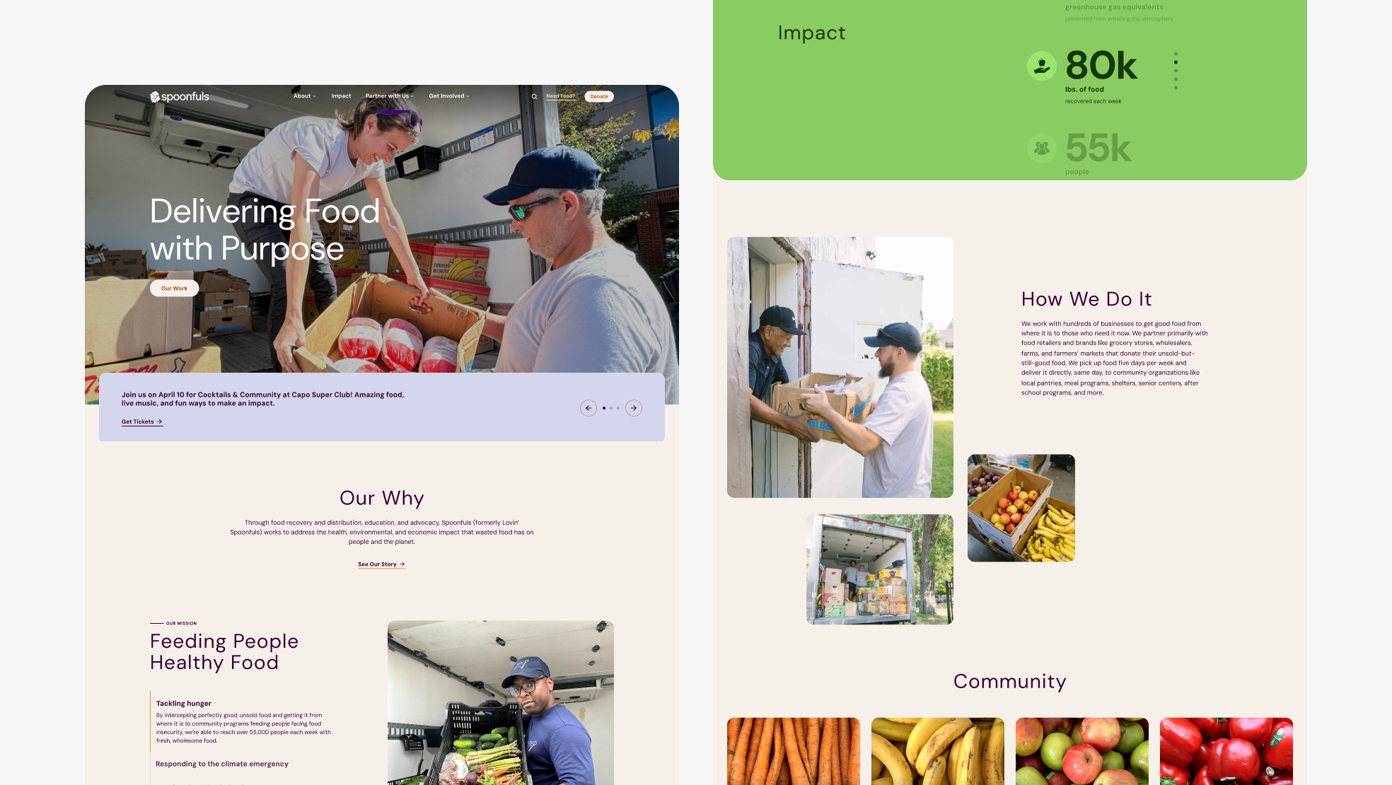
Desktop version of Homepage. Donation button is bold and within the navigation, now a constant call to action throughout the site.
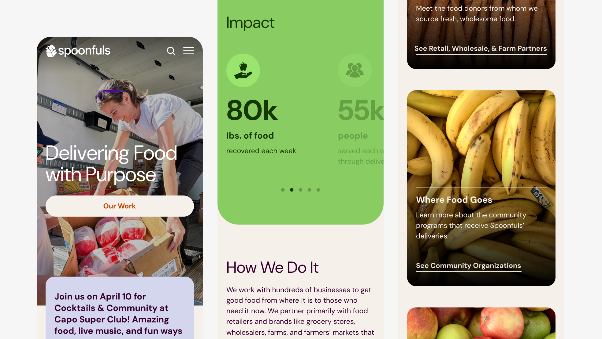
Mobile version of Homepage.
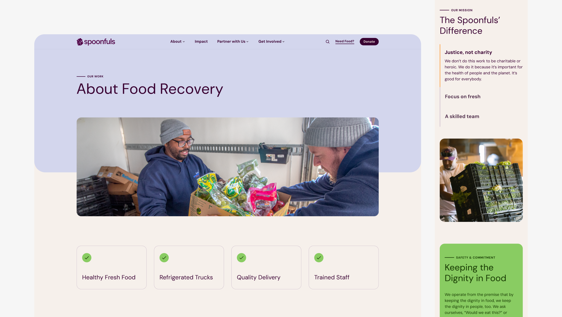
Desktop and mobile views of What We Do page to show responsive design. Important differentiators are elevated and eye catching, and mission is clear and easily digestible. Trust is being reinforced through safety and commitment content.
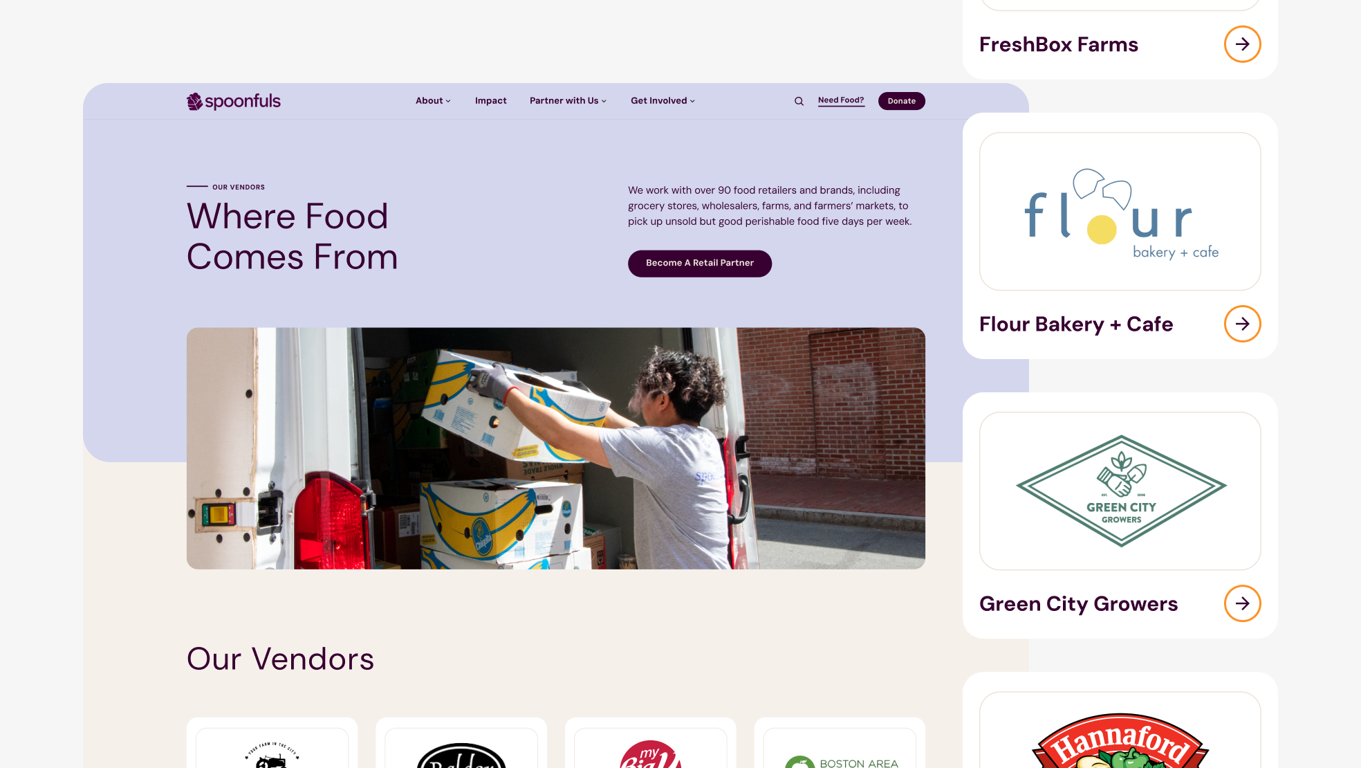
Desktop view of Our Vendors along with detailed examples of vendor cards.
Custom iconography.
Designed at 829 Studios in collaboration with supporting designer Masha Zaytseva and strategist Brianna Feldott.