After 25 years supplying world-class Chilean salmon to top restaurants, Salmones Austral launched Secret Island Salmon—their first direct-to-consumer brand. Their goal was to connect directly with home cooks, build trust through transparency, and share the story of their sustainable practices. I brought that vision to life with a fresh brand, scalable e-commerce site, and content that speaks to their audience.
Role
Design Lead
Client
Salmones Austral
Sector
Food & Beverage, E-commerce
Services
Stakeholder Interviews & Surveys, Competitive & Industry Analysis, User Personas, Information Architecture, Wireframing, Branding, Visual Design, Usability Testing, Iconography
Problem
👉 No brand presence in the United States.
Secret Island’s brand awareness was severely limited in a major market. It needed a strong, recognizable brand in order to access a significant portion of consumers and revenue, and compete with the brands that are already established here.
👉 No website to sell their product.
Since Secret Island was a new brand that was still establishing themselves in the industry, the need for growth was imperative. The new site not only needed to sell fish, but tell users why they should buy their fish.
👉 Lacking brand story and a name Americans could pronounce.
New brands always have the potential issue of gaining user’s trust and confidence because of the lack of history. Our research told us that more specifically, in the food industry, costumers are paying closer attention to where their food comes from and the environment impact it has. This was something we knew we needed to address.
Solution
👉 Create a brand that captures the essence of the business as well as the target audience.
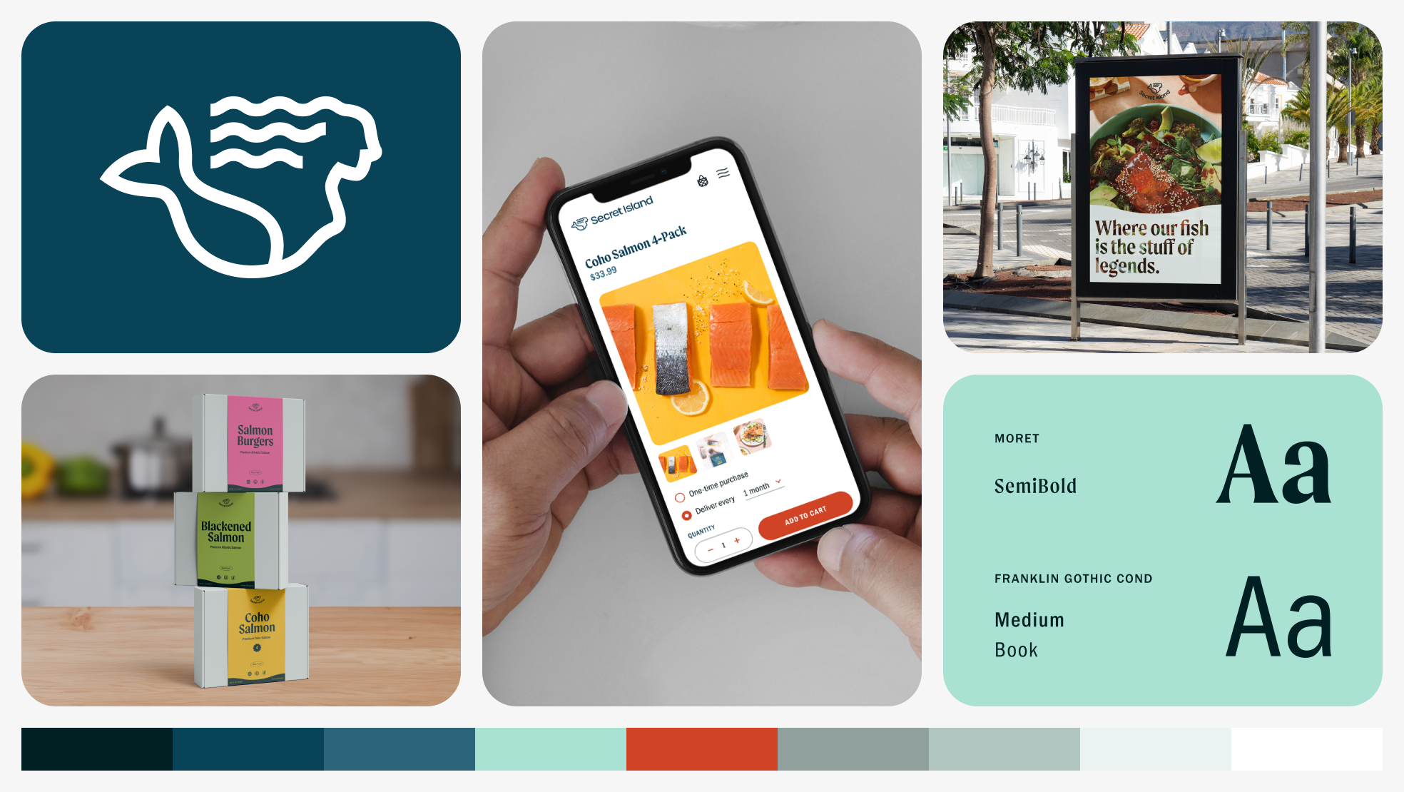
In order to create a visual that was near to the Secret Island brand and also resonated with our millennial target audience, we created a mermaid symbol. It was inspired by Pincoya, a mermaid based in Chilotan mythology that’s said to represent abundance. Through A/B testing, we refined a fresh and bright color palette. To further appeal to our audience, we included a Recipe index for adventurous eaters that also draws organic traffic and cross-pollinates products.
👉 Construct a flexible, compelling e-commerce site to sell fish.
We gathered through research that the millennial audience was very comfortable shopping online, and was willing to pay for quality. Being a new brand, Secret Island needed a site that would grow to accommodate new products. We built in different ways of filtering to solve this. The Collections page allows users to easily browse categories at a high level, while All Products provides the ability to sort and drill down. We also featured real customer testimonials throughout the site to establish trust with our users.
👉 Clearly convey mission, vision, values, and the Secret Island story.
To better articulate Secret Island’s story, we elevated their brand-building sections on the homepage to give the user history. We also called out their core values—quality, sustainability, and dedication—with custom iconography to draw appeal. We also created a high level About section in the main navigation to house pages like Our Story and Sustainability. Product pages also display various certification badges to highlight quality and sustainability practices to ethical shoppers.
Research
These two personas show that the site must combine ethics, quality, and style. Clear sourcing, sustainable practices, and curated bundles appeal to Aidan’s entertaining lifestyle, while striking visuals and shareable content speak to Zoe’s social media savvy. Together, they guide a design that’s premium, engaging, and lifestyle-focused for millennial foodies.
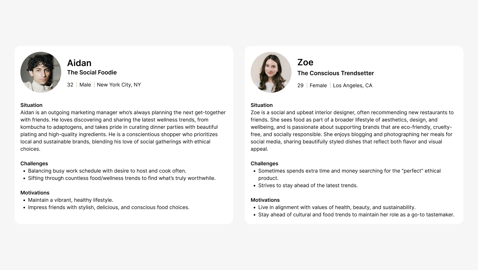
User Personas.
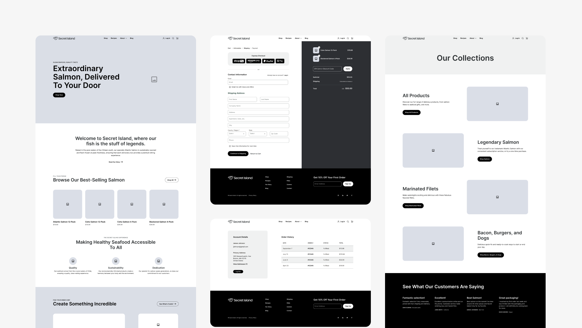
Wireframes for Homepage, Checkout, Account, and Collections.
Visual Design
The Secret Island brand tells the story of a modern seafood brand rooted in quality, sustainability, and dedication. The freshness of the colors and fluid movement of the typography evoke an immersive coastal experience. Each element comes together to create a premium and personal feeling. Calm yet confident, the design is approachable enough for weeknight dinners and polished enough for gifting. It speaks to a new generation of food lovers who want better choices without the overwhelm.
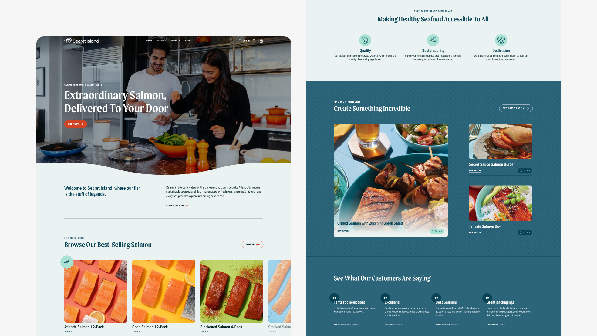
Desktop view of Homepage.
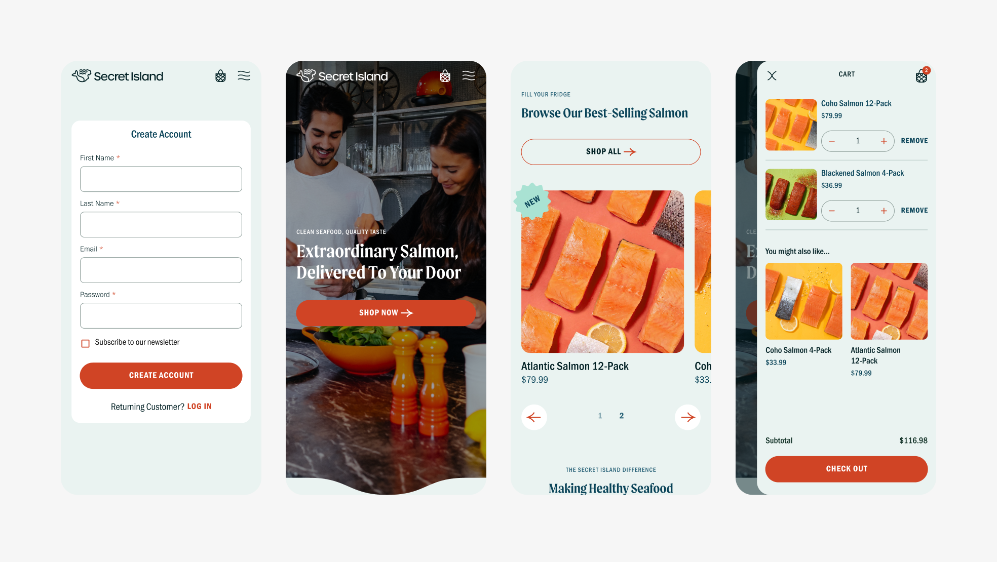
Mobile views of Create Account, Homepage, and Cart slide-out window.
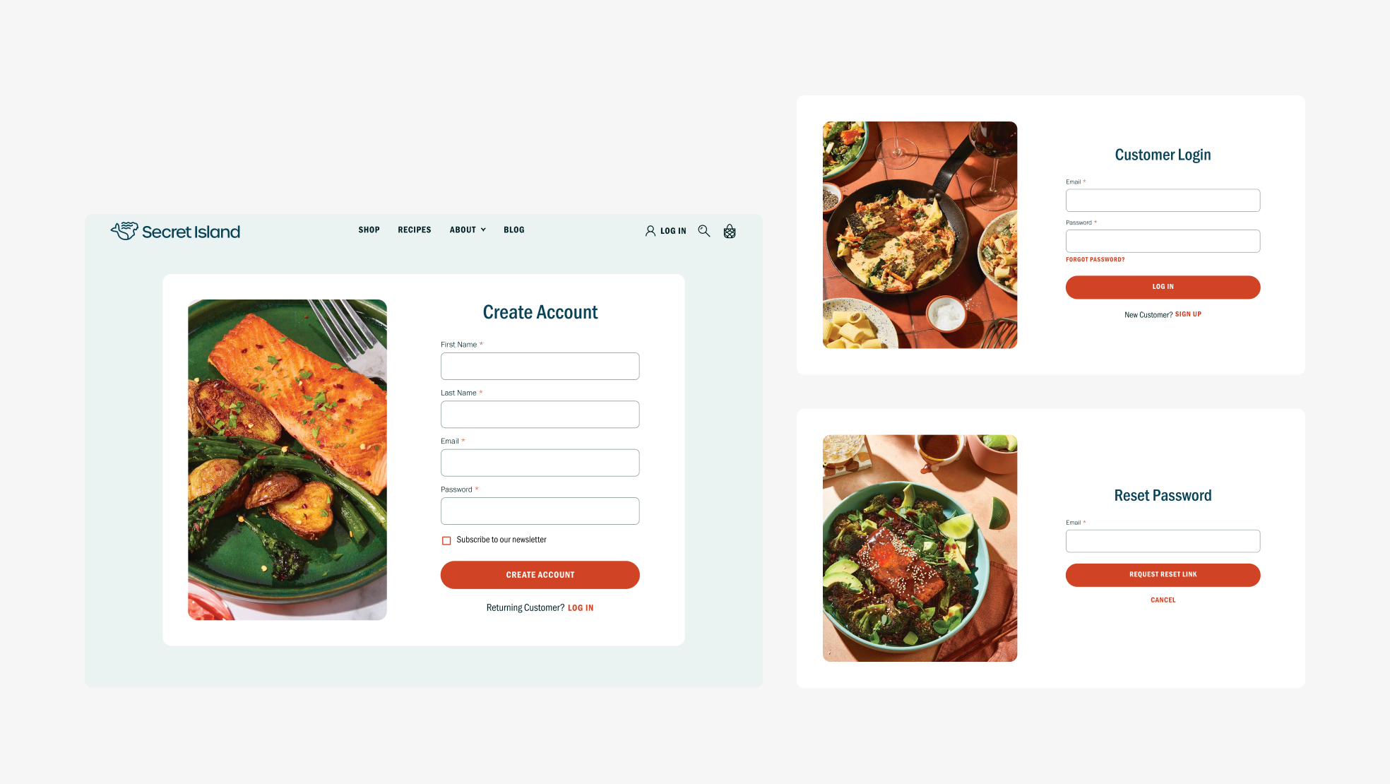
Desktop views of Create Account, Customer Login, and Reset Password.
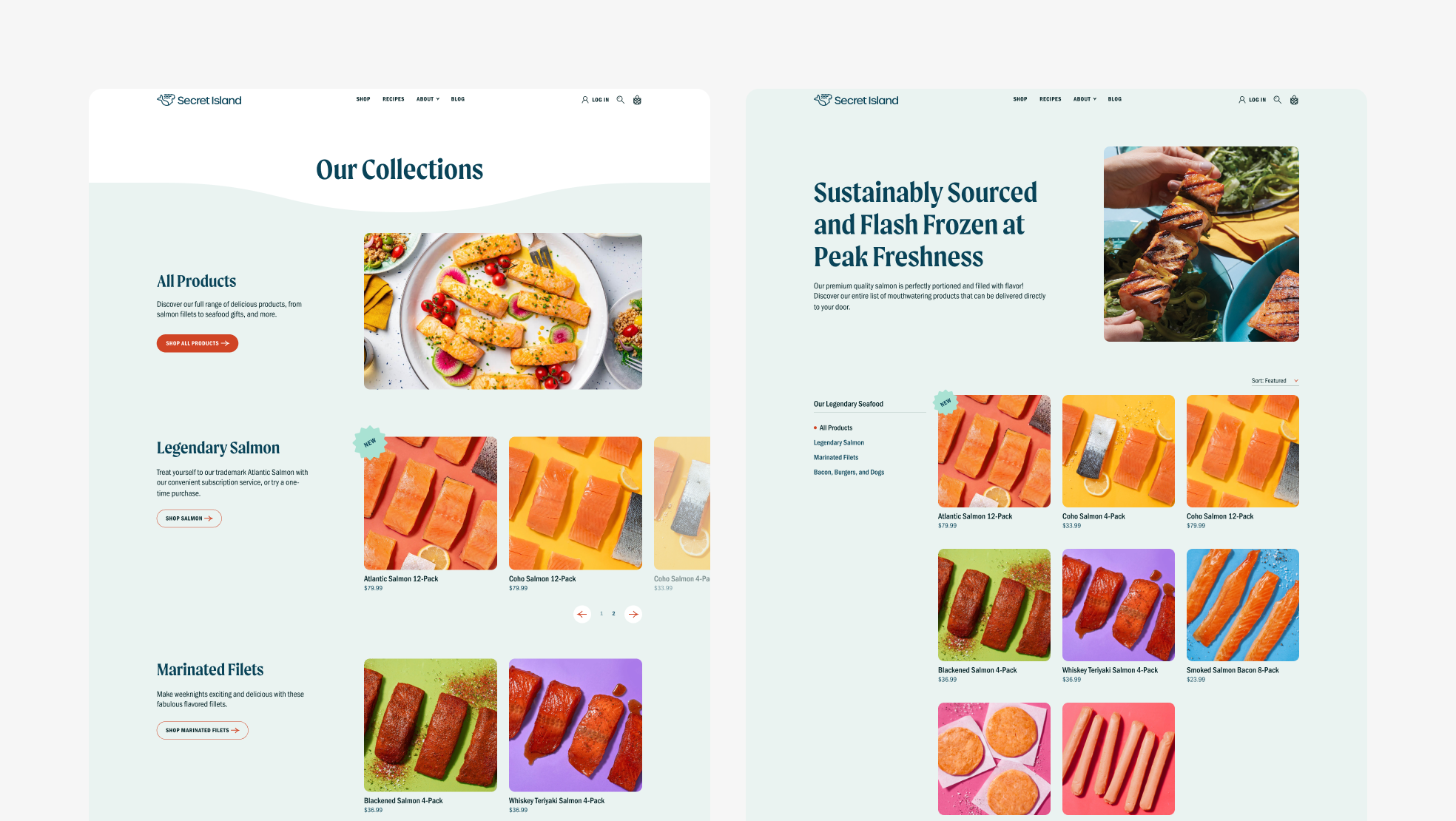
Desktop views of Collections and Product Index. Secret Island first launched with just a product page since salmon was their only offering. As their product variety quickly grew, I added two new features in phase two—the Collections page to see offering categories at a high level, and Product page filtering to focus on a particular category.
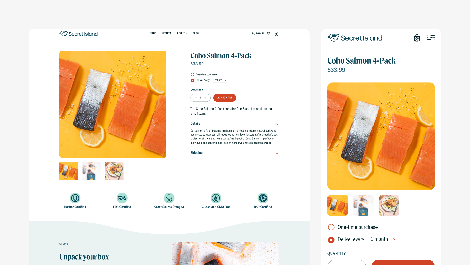
Desktop and mobile views of Product Profile to show responsive design.
Designed at 829 Studios in collaboration with supporting designer Tony Pham and strategist Mae Beerman.