Monadnock Humane Society has long been a pillar of animal welfare in New Hampshire, but their brand and website weren’t fully capturing the breadth of what they do beyond adoptions. Through a full rebrand and website redesign, I created an intuitive, engaging digital presence that makes it easier for people to adopt, access services, and support their mission.
The overhaul of Monadnock Humane Society’s brand and website resulted in a 116% increase in site traffic.
Role
Design Lead
Client
Monadnock Humane Society
Sector
Non-Profit
Services
Stakeholder Interviews & Surveys, Competitive & Industry Analysis, Information Architecture, Wireframing, Branding, Web Design
Problem
👉 Extremely disorganized browsing experience.
The previous site navigation was very confusing with multiple rows of links with no clear hierarchy. It also didn’t follow common menu paradigms that users are used to. It had secondary information within it that would best live outside the navigation.
👉 Offerings were not well communicated.
Our findings showed that users did not understand the breadth of offerings Monadnock Human Society provides beyond adoption—dog daycare and boarding, spay/neutering, grooming, microchipping, vaccinations, fostering, and more. This is partly due to navigation issues, but also because the homepage wasn’t being utilized to its potential and instead acting as a secondary navigation.
👉 Lack of donations.
The donate button and language around donations were clearly getting lost. That is mostly because the navigation and website as a whole lacked any hierarchy and a solid architecture. The donation page itself needed a drastic improvement as well. It lacked content around ways to give, and the form itself was a clunky third party integration that didn’t feel cohesive with the site.
👉 Establish the brand as the local authority for all aspects of animal wellness.
The previous site lacked content in general, displaying a lot of image links with little context. There was no storytelling and nothing to highlight community, such as featured events or blog posts.
Solution
👉 Create an intuitive browsing experience.
We completely restructured the navigation to cater to the browsing needs of a variety of target users: prospective adopters, individuals seeking animal support services, and those interested in donating or volunteering. Now there are simplified main buckets of information that instantly communicate hierarchy.
👉 Highlight offerings that extend beyond adoption.
To make users aware of all of Monadnock’s offerings, we featured a Services dropdown prominently in the main navigation that housed an organized architecture of pathways. We also added a section to feature popular services on the homepage with visuals to increase attention.
👉 Increase donations.
We used “donate” as the main call to action, placing it under the homepage hero, within the main navigation, and in strategic locations throughout the site. We also totally overhauled the current donation page, seamlessly integrating a third party form with multiple donation amounts to choose from. We placed this above the fold so it doesn’t get missed. Ways to give are also supported with custom, eye-catching iconography.
👉 Establish the brand as the local authority for all aspects of animal wellness.
We used the previously limited homepage to feature messaging around leadership, calling out stats and testimonials that build credibility. We also laid out dedicated sections to services, featured events, and resources via blog to continue to build that community aspect. We also reworked the Calendar and Blog to be visually striking, exciting users and increasing engagement.
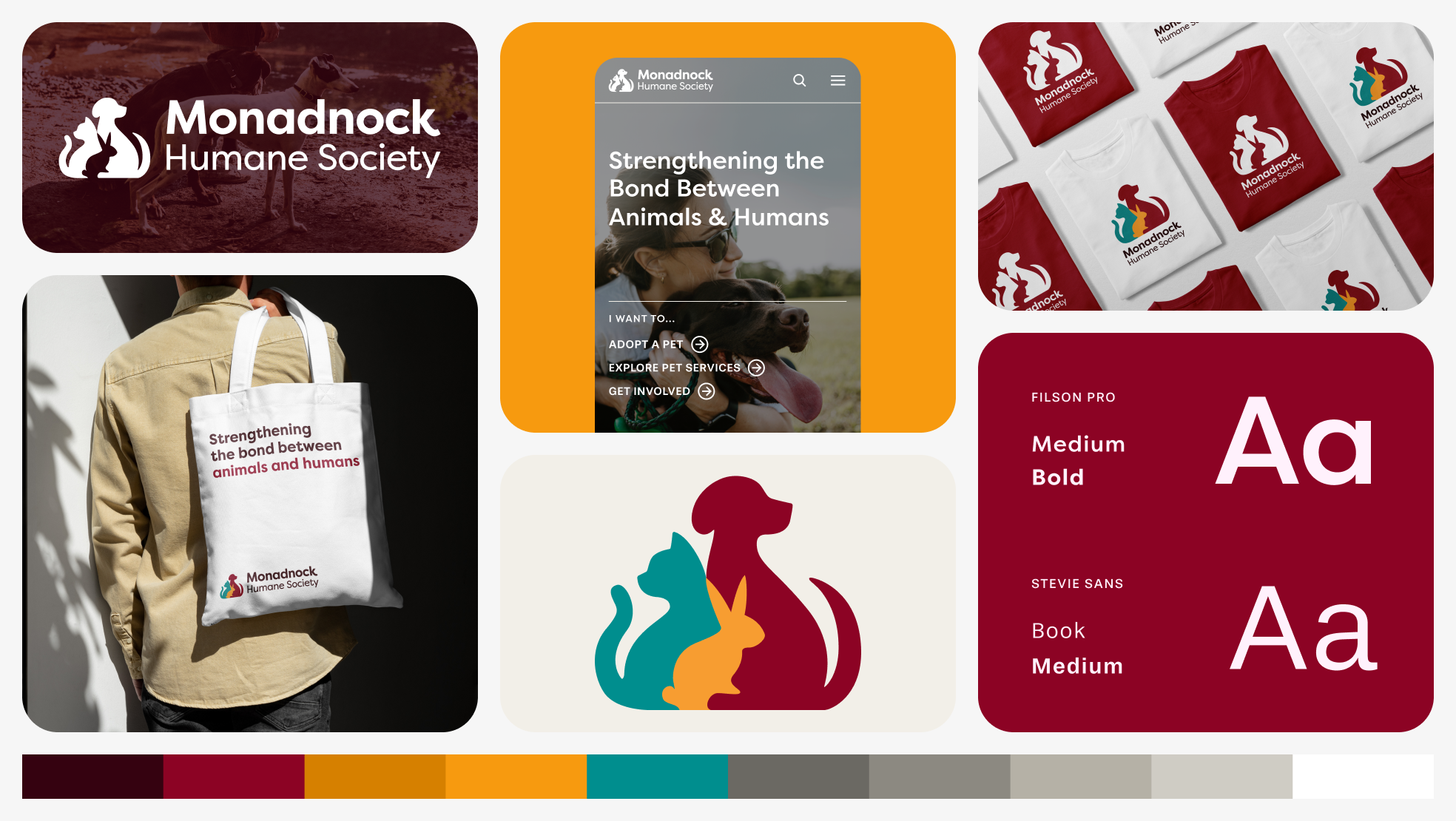
Visual Design
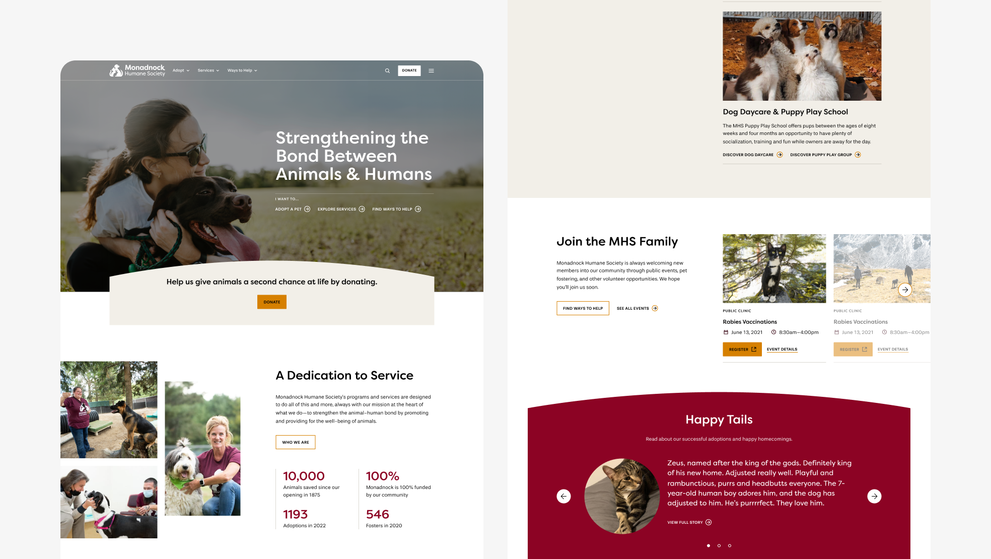
Desktop version of homepage.
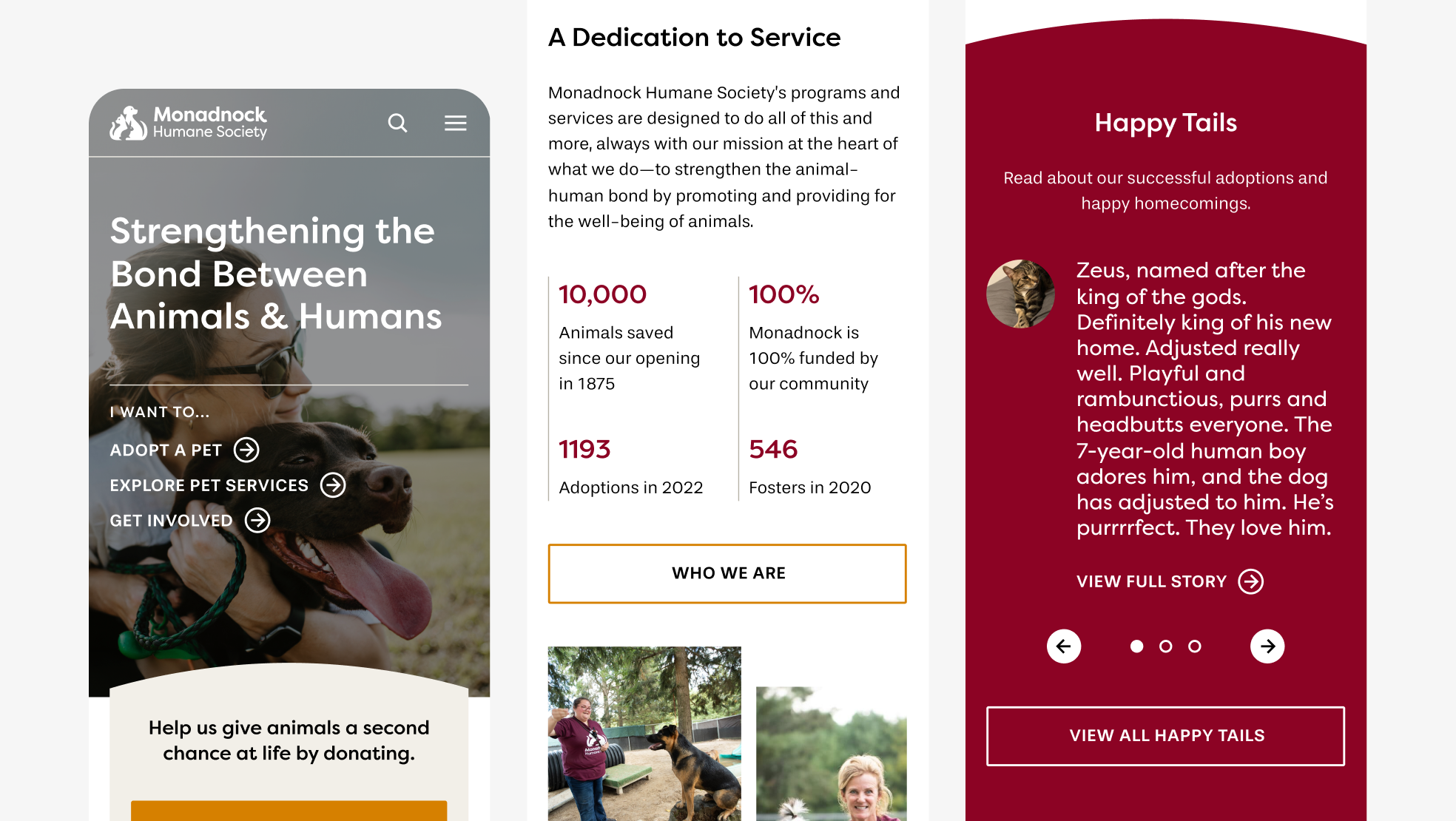
Mobile version of homepage.
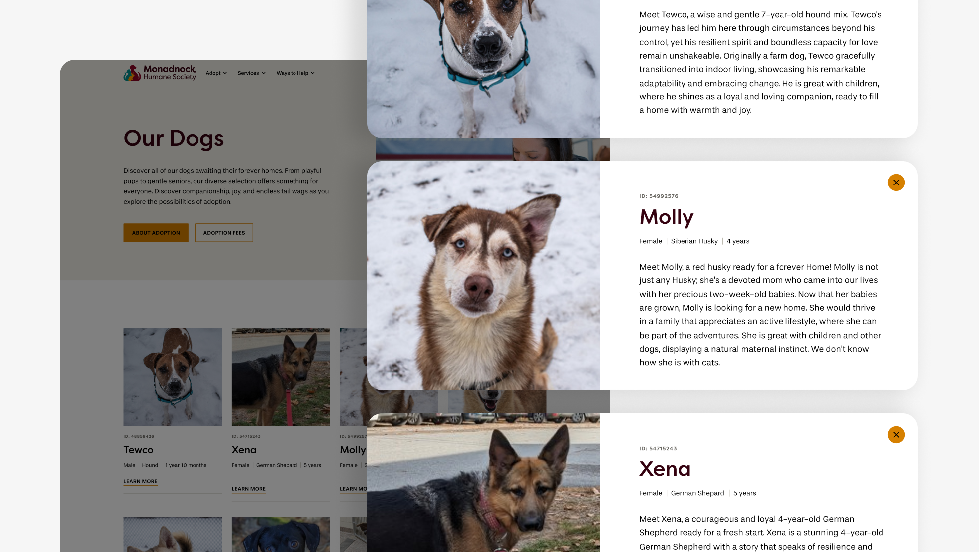
Desktop version of Donation page with pet details view. Because Monadnock Humane Society was already leveraging a plugin that managed pet adoptions, we couldn’t build individual pages for each pet’s details. We were able to opt for a modal window that I custom designed to fit the theme.
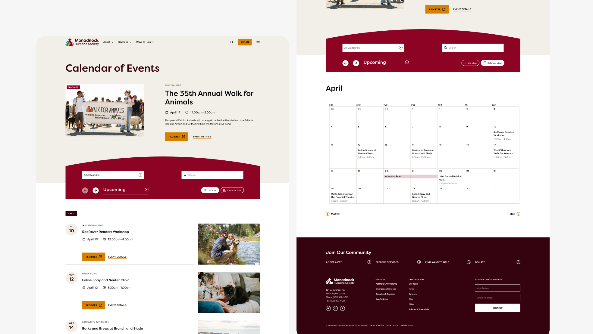
Calendar of events desktop page with both list and grid view.
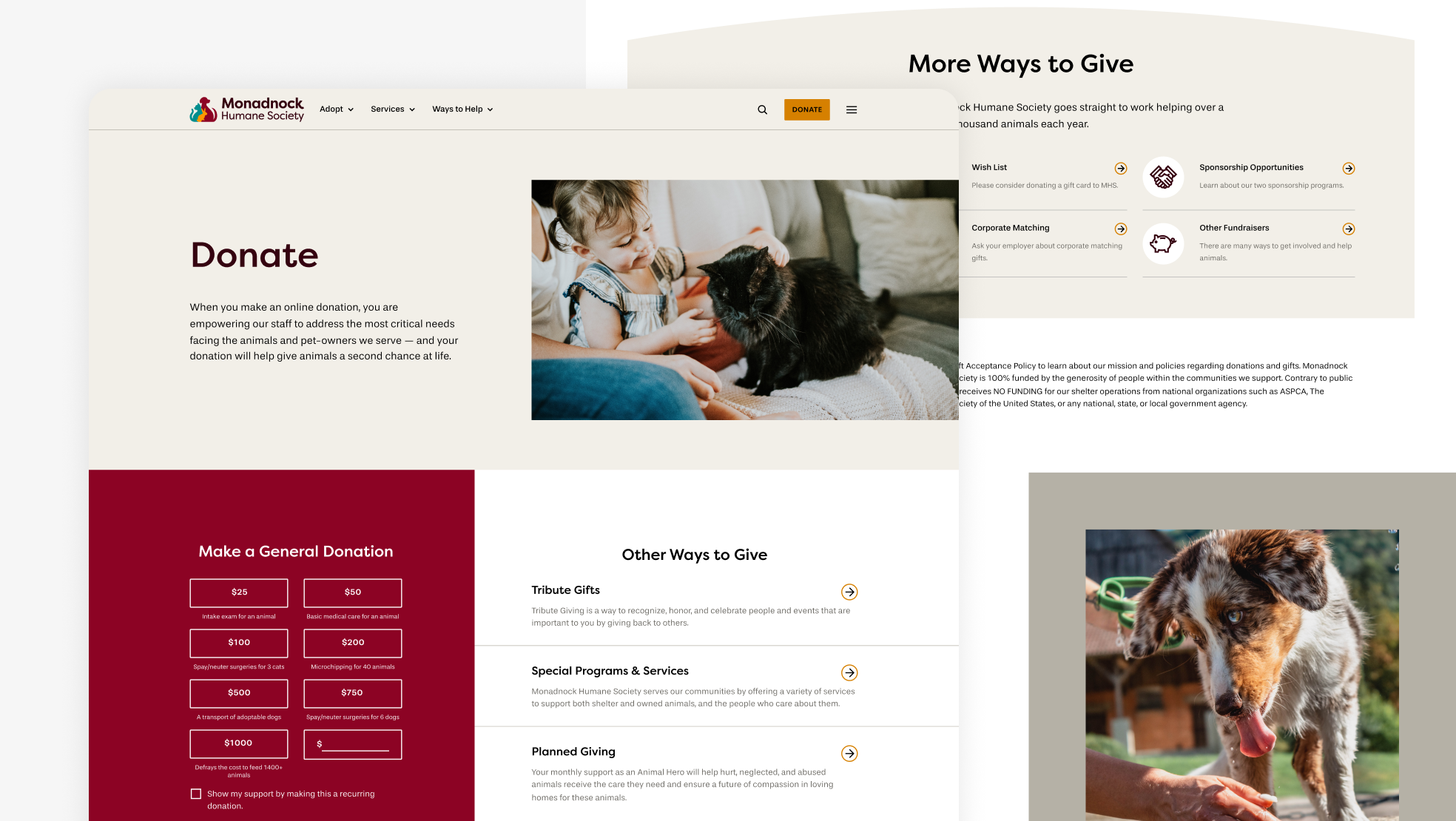
Donation desktop page. I was able to customize their current plugin handling general donations and elevate it on the page. It’s beside “Other Ways to Give” so that users can see the breadth of options in one view. Because “More Ways to Give” are a bit lower on the page, I highlighted each with custom iconography to create visual interest and weight.
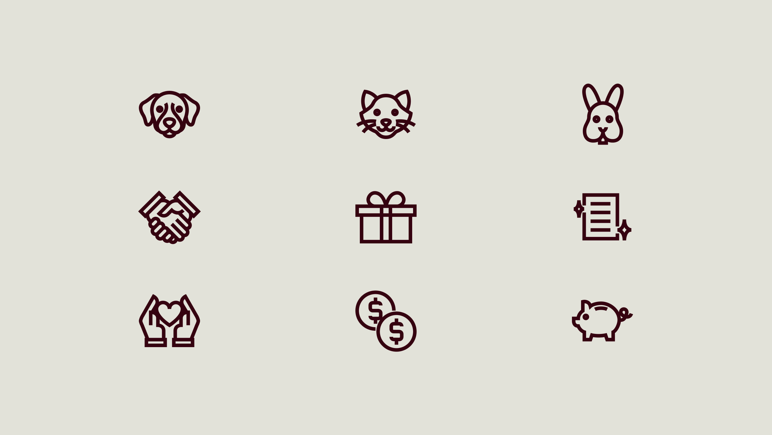
Custom iconography.
Designed at 829 Studios in collaboration with strategist Gabrielle Richter.