Born from the belief that period care should be sustainable and accessible to everyone, Comma set out to change the conversation around menstrual health. I designed both their first-of-its-kind HIPAA-compliant cycle tracking app and e-commerce site, crafting an experience that puts personalization and privacy at the center while laying the foundation for future product launches.
Role
Design Lead
Client
Comma
Sector
Healthcare, SaaS
Services
Stakeholder Interviews & Surveys, Competitive & Industry Analysis, Information Architecture, Wireframing, Visual Design, Iconography
Problem
👉 No user’s journey is the same.
We know that users will have different needs when beginning to use the tracker, and it can even change halfway through if they want to focus more on ovulation because they’re trying to get pregnant. It can change even further if they do become pregnant. With this information, we needed a way to present users with a custom dashboard on sign up, and the ability to update that dashboard later on.
👉 Health data is sensitive and personal for users.
We’ve seen people are generally cautious about inputting personal health information into an app. There is this fear that their data could be sold.
👉 There is currently no product for sale.
Comma is a new brand, and the goal was to release a minimum viable product with the hope that it will scale to accommodate new products and features in the future. The problem is how to build in scalability at the start so that minimal rework is needed to implement this potential growth when needed.
Solution
👉 Prioritize dashboard customization.
As a part of the users’ onboarding process, we have them fill out a short yet comprehensive questionnaire where the answers will tailor the dashboard modules to their needs. To further create a unique experience, we included a “hide” feature on each module so the user can focus on what’s important to them.
👉 Ensure users’ safety and privacy.
It was a must to guarantee the safety and privacy of users by implementing some key features like the “Quick Exit” to easily close the application with one click that’s consistently in the same space and easy to find. Another was the “Discreet View” on the calendar—it hides sensitive information while still giving the user the ability to browse in public settings. We also sprinkled messaging across the dashboard centered around the importance of privacy and transparency about how their data is being handled.
👉 Design a scalable e-commerce platform that can accommodate new products.
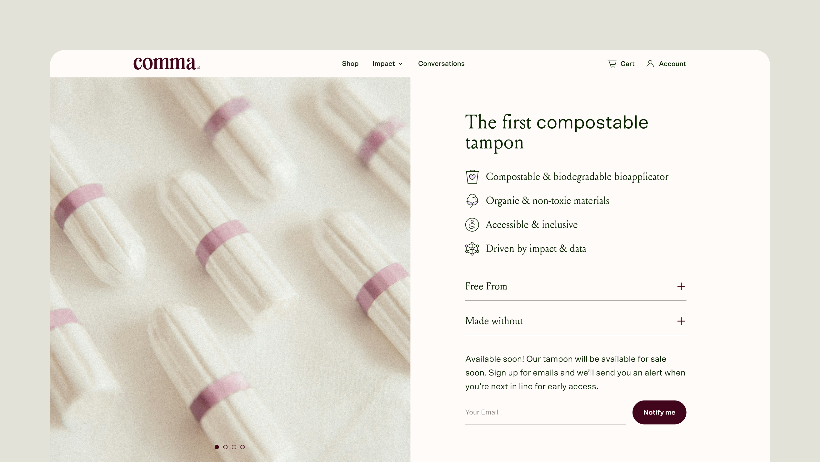
Since Comma’s site currently doesn’t have a product for sale, it acts as a promotional tool with a “notify me” as the driving call-to-action. We set up the site in a way that when the product hits the market, we can seamlessly pivot into a fully operational store. An index is pre-built and can be switched on as new products are added. The Comma website also has a robust design system so that components can be swapped in and out as needed with no additional development.
App Design
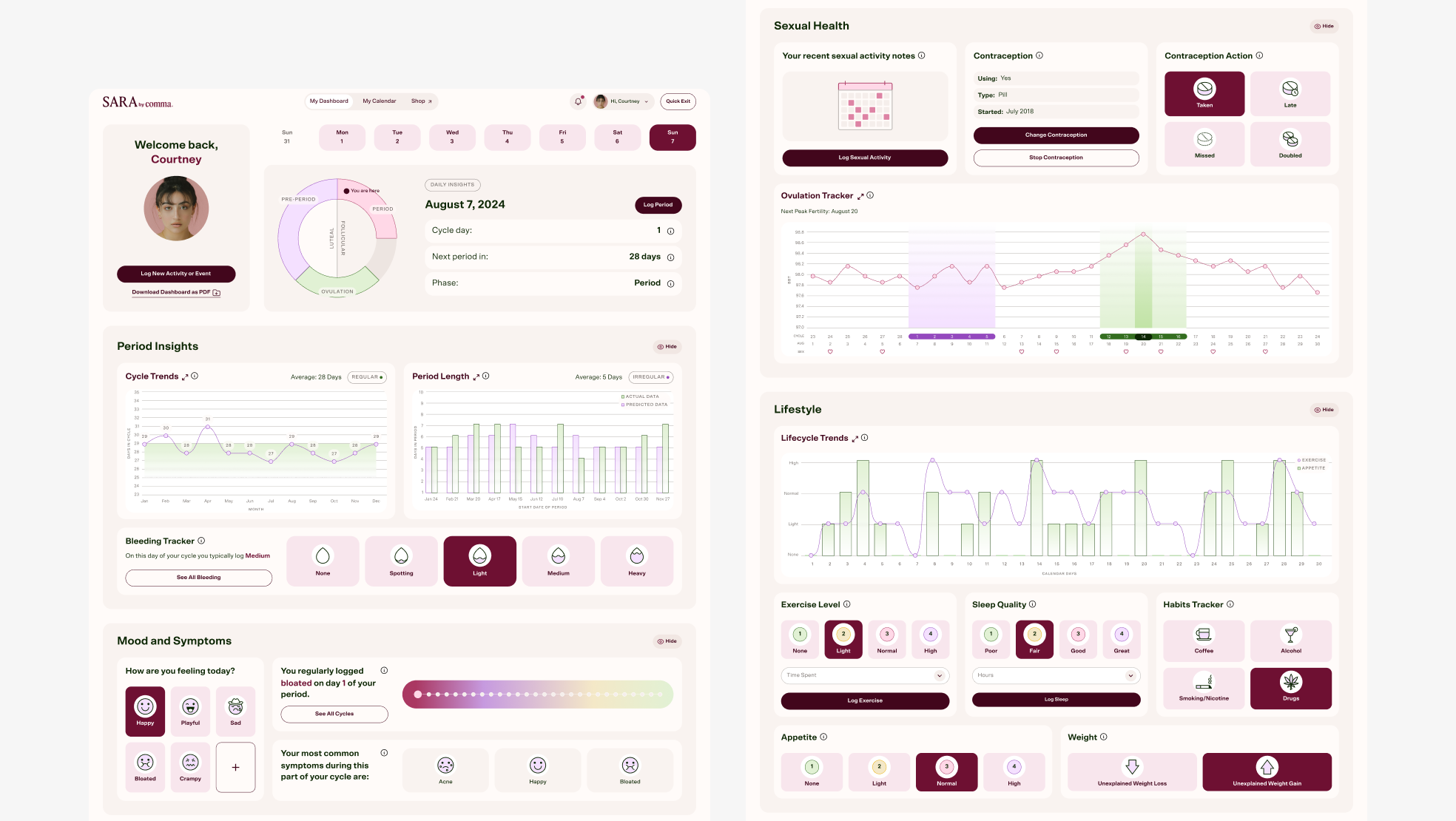
Main desktop dashboard view.
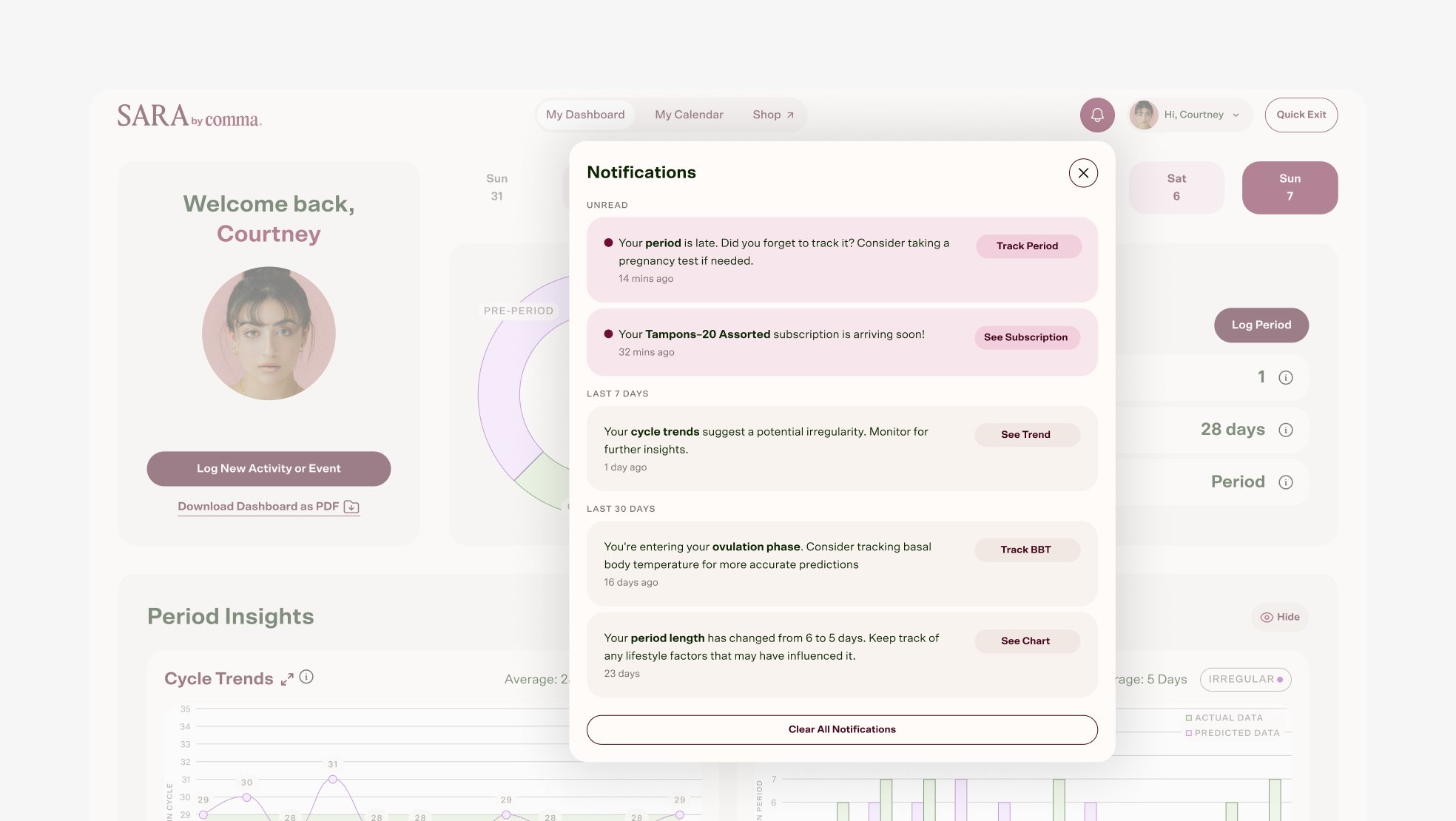
Desktop notification window. I proposed this window as a way to manage notifications. The goal was the user’s account will be seamlessly linked across SARA and e-commerce website so it will continue to drive sales within the app.
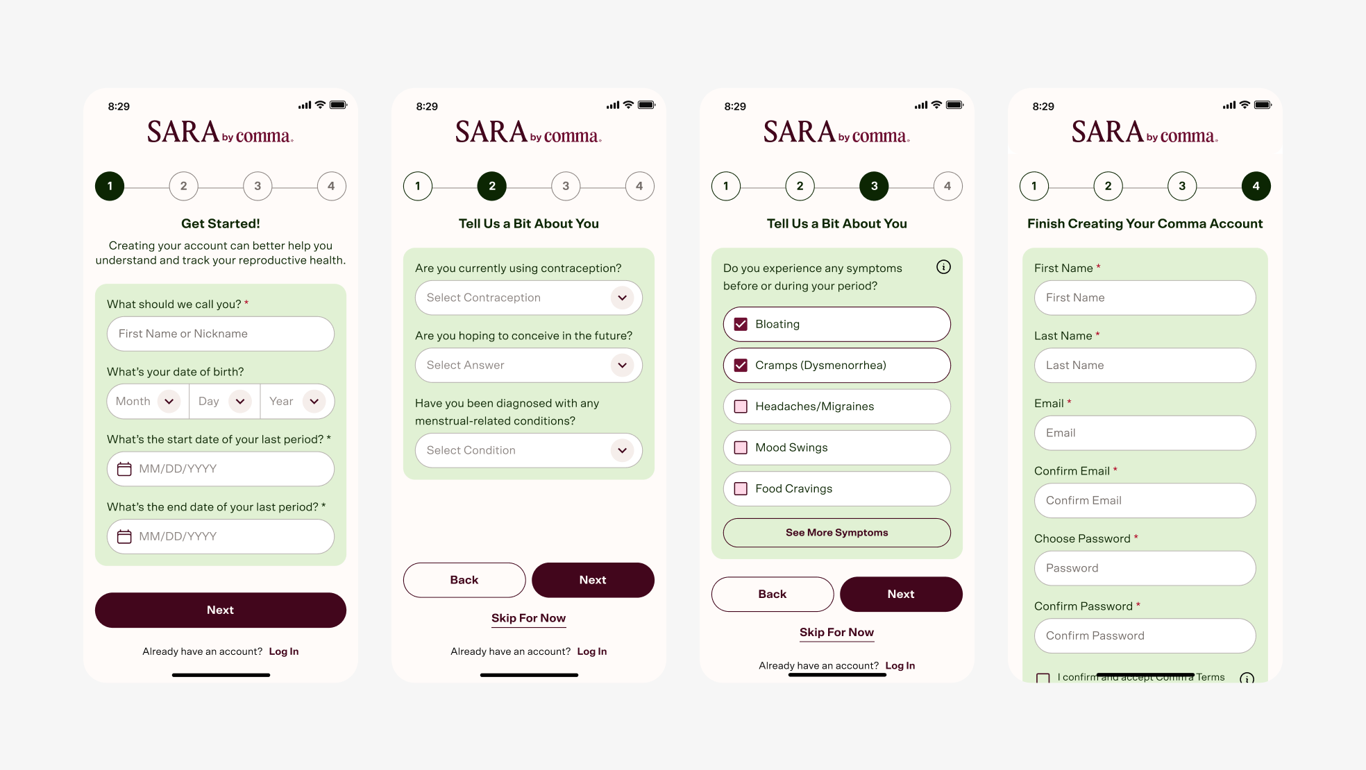
Mobile app Sign Up flow. Stepper gives transparency to the user about sign up process. The short, approachable questionnaire part of onboarding that I imagined directly influences the dashboard modules that will be displayed, creating a custom experience for each user. That way, each user can focus on what’s important to them, whether it’s tracking fertility, managing their active pregnancy, or more.
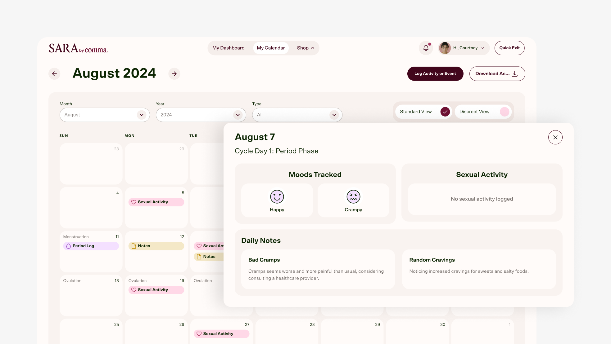
Desktop app monthly Calendar view with window to log moods, activity, or notes for specific day. This provides a high level, visual view with color coding for easy scanning. The more detailed window is accessed by clicking on the calendar day.
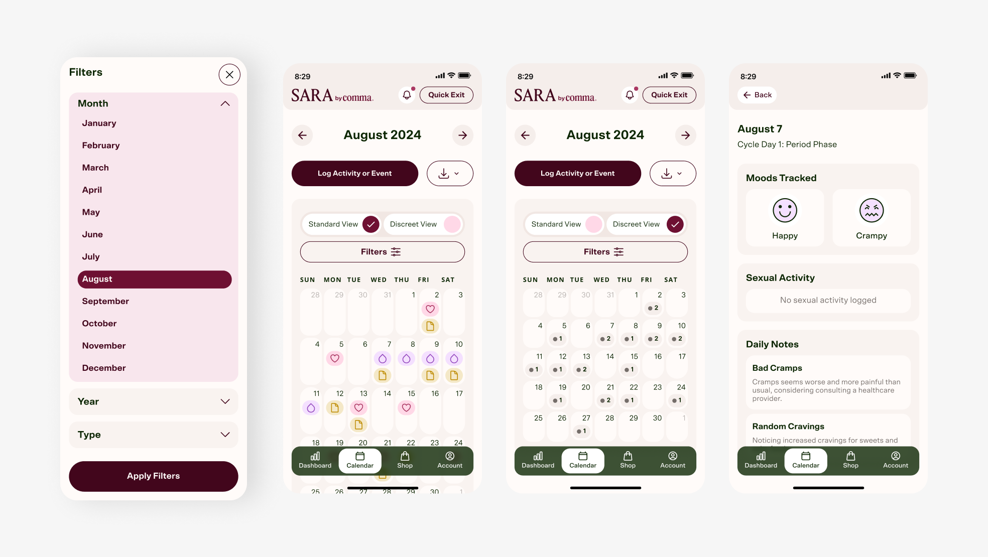
Mobile app view of Calendar filtering, Calendar standard view, Calendar discreet view, and day tracking window. Discreet view option is available in case the user needs to log in a public setting. I removed all icons and colors that would give away any identifying information, but I still wanted the user to know how many activities were logged on that particular day.
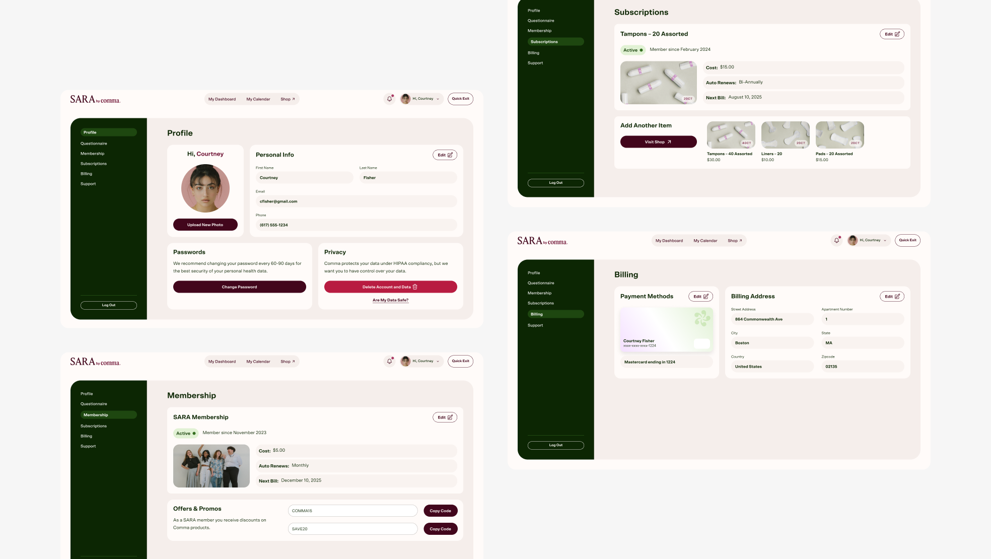
Desktop app view of Account Profile, Membership, Subscriptions, and Billing. Account is accessed by clicking on the avatar in the menu.
Website Design
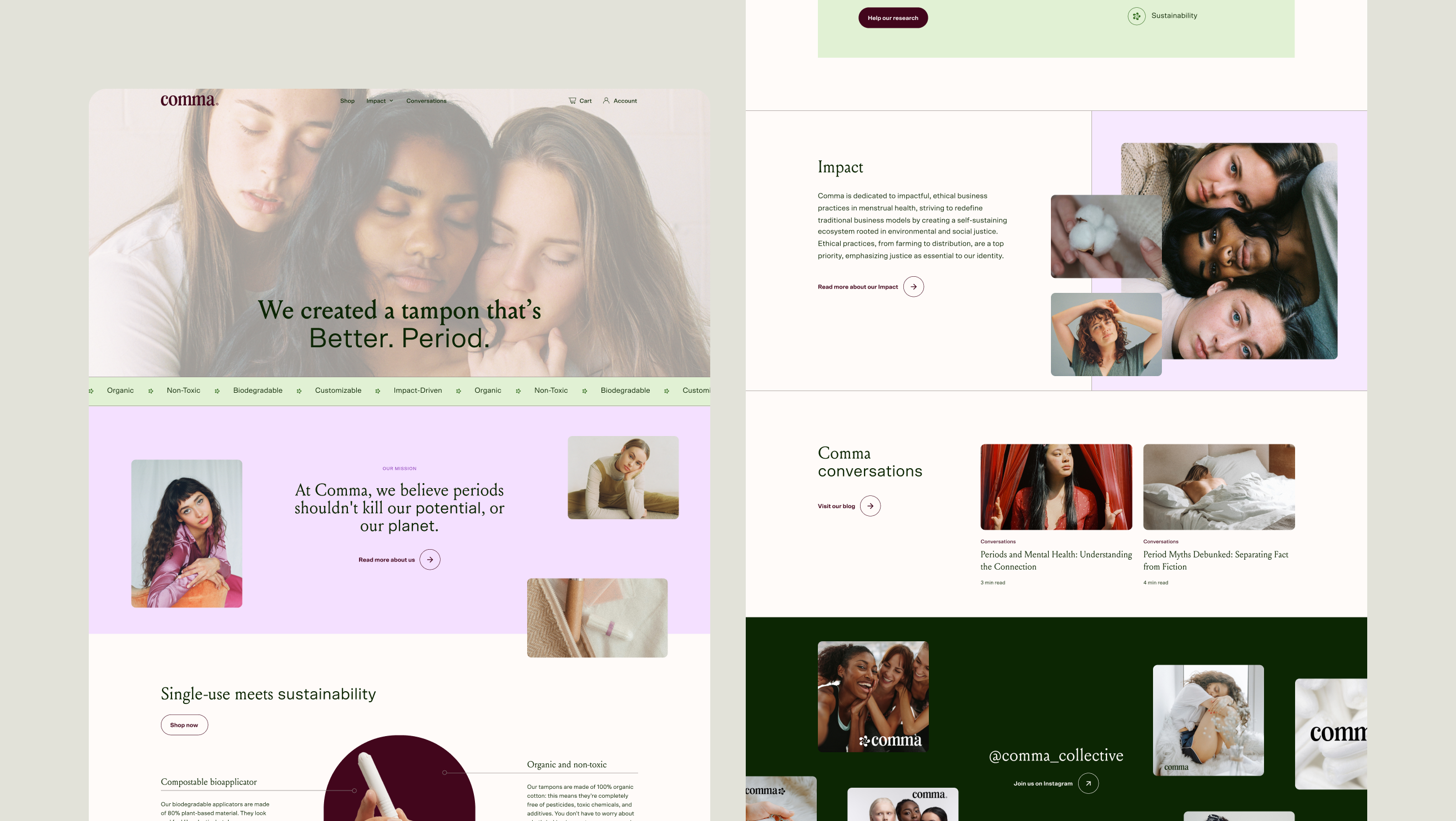
Desktop view of website’s homepage.
Desktop view of Product Profile.
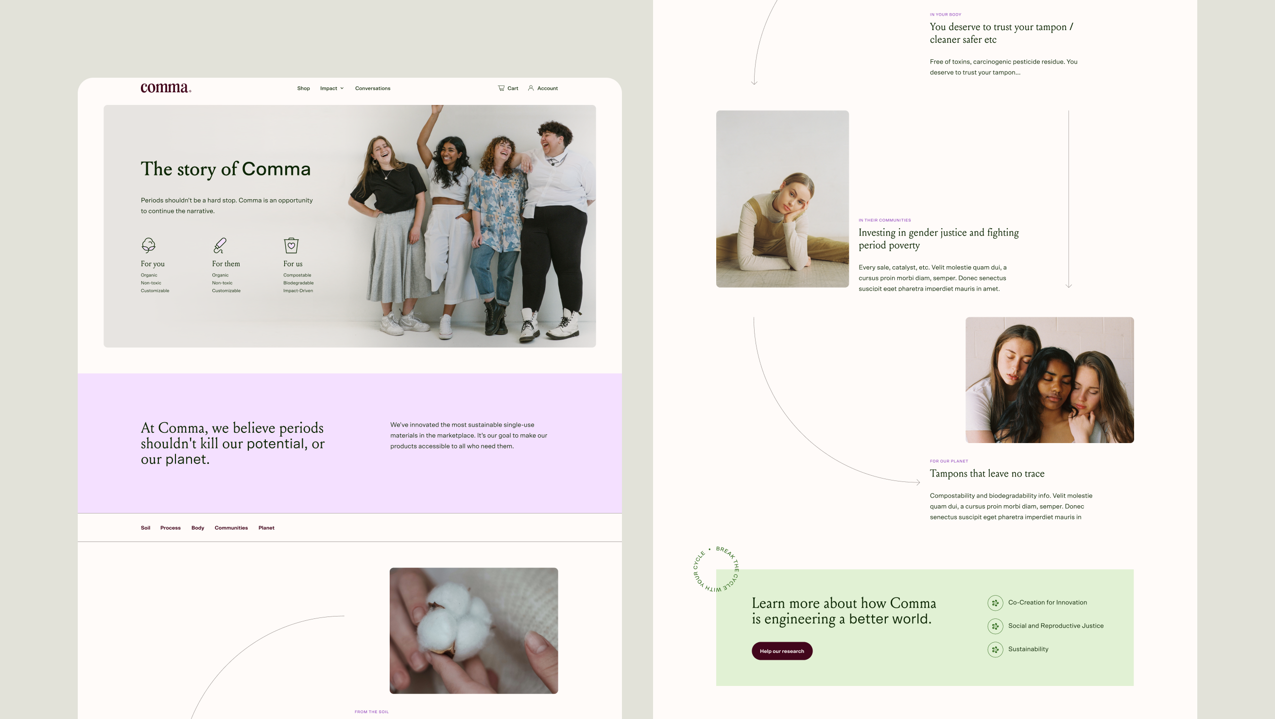
Desktop view of Our Story. I created a visual diagram of the full product’s life cycle to reduce friction and gaps in information and increase trust. I wanted to create strong storytelling on this page for emotional resonance, differentiation, and credibility; all important for a new brand.
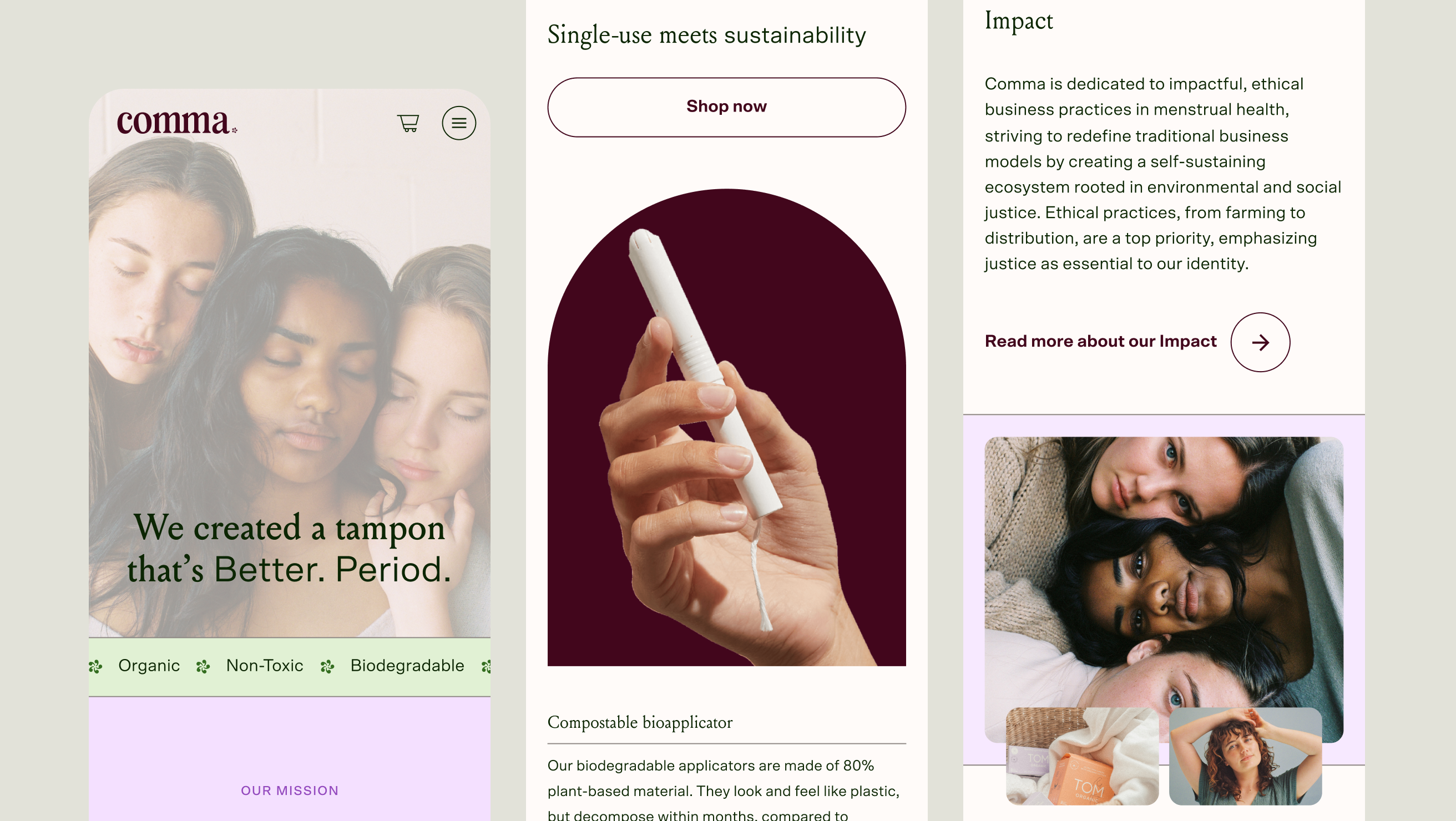
Mobile view of homepage.
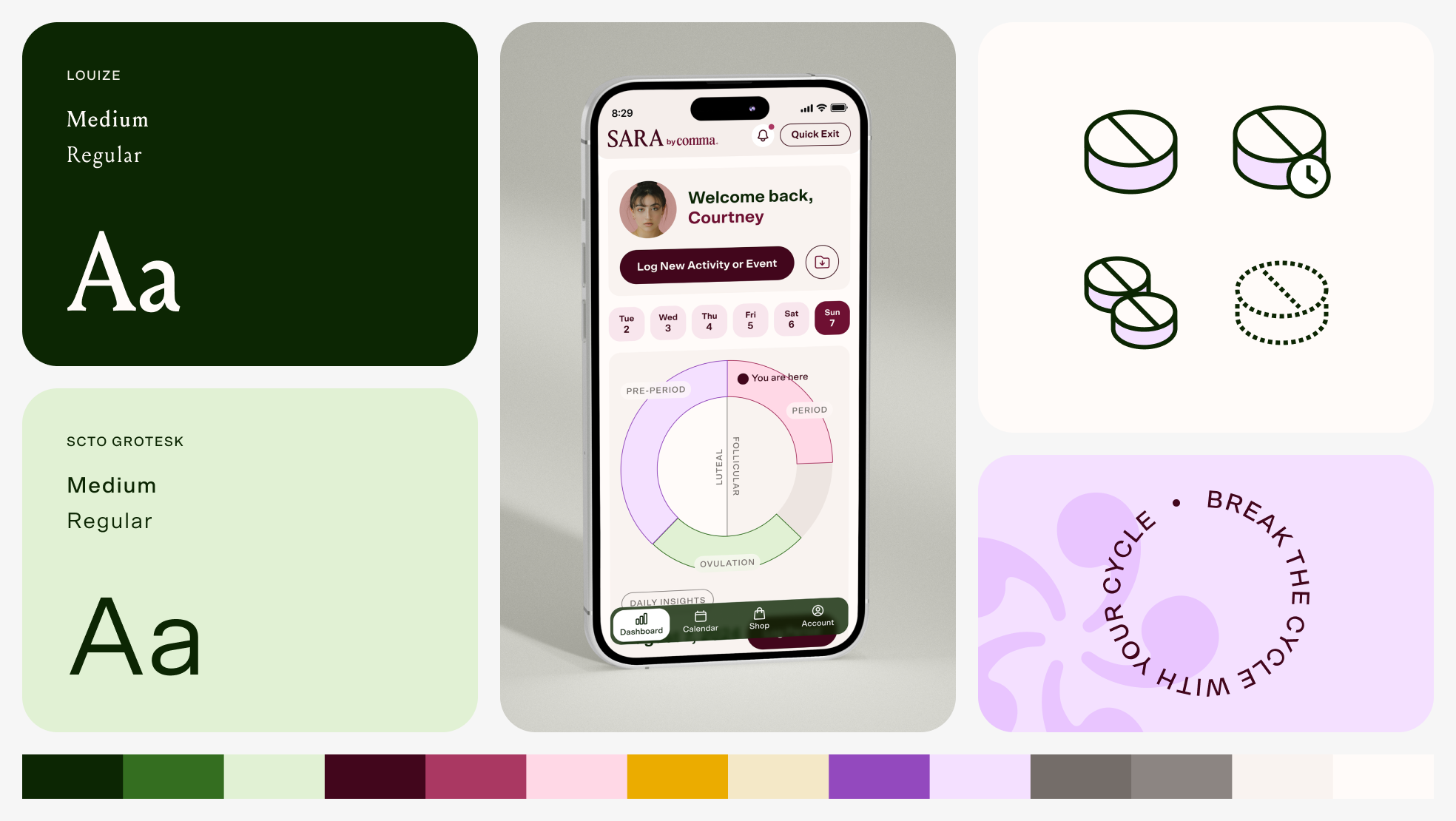
Custom iconography.
Designed at 829 Studios in collaboration with supporting designer Masha Zaytseva and strategist Brianna Feldott.